

Walk into a builder-grade living room and you can feel the sameness. Flat drywall. A single skinny line of crown. Thin trim stapled around the windows. Everything technically finished, nothing actually considered.
Then walk into a home someone built with intention. The difference hits before you can name it.
It’s the shadow line where three pieces of molding stack together. The bookcases that hug the fireplace like they grew there. The doorway that curves instead of squares off.
None of it is magic. Most of it is woodworking, proportion, and a refusal to take the cheap way out.
Here are 30 living room features that quietly tell everyone the home was designed — not just assembled.
1. Built-In Bookcases Flanking the Fireplace
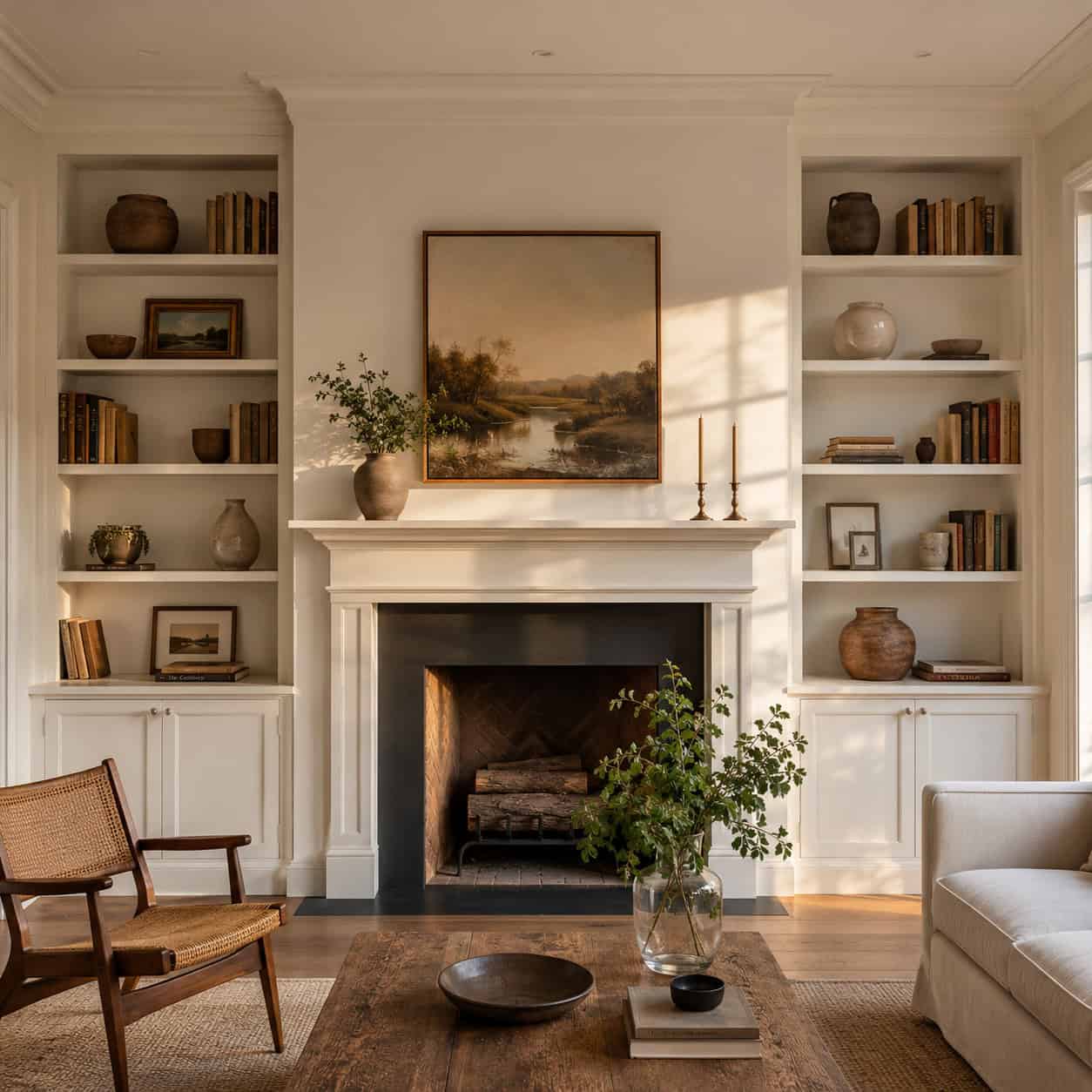
This is the clearest custom tell there is. Symmetrical cabinetry framing the hearth reads as designed-in, not furnished.
Freestanding shelves float in a room. Built-ins belong to it.
The magic is in the symmetry — matching towers on either side of the firebox, aligned tops, consistent reveals. Get the proportions right and the whole wall becomes architecture.
You don’t need a factory to pull it off. A pair of matched cabinets with a face frame and adjustable shelving gets you 90% of the way there. If you’re building your own, shelving that looks custom without custom prices is where most people start.
2. A Custom Mantel and Surround
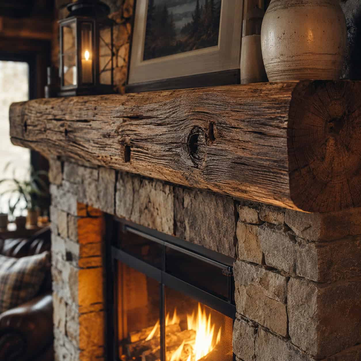
The mantel is the room’s anchor. It’s where the eye lands and where craftsmanship shows.
A builder-grade fireplace is a tiled box with a slab of MDF screwed above it. A custom surround is something else entirely — reclaimed timber, hand-carved detail, or stone stacked to the ceiling.
Material tells the story. A reclaimed barn beam brings age and grain no lumberyard board can fake. Stone cladding — real or thin-cut veneer — turns the firebox into a monument. Marble or limestone reads formal; fieldstone reads warm and rustic.
Then there’s the wood mantel itself. A chunky floating beam of walnut or white oak, waxed and left to show its figure, does more for a room than any store-bought shelf.
Just respect the clearances. Codes generally require combustible mantels and trim to sit a set distance off the firebox opening — often 6 inches minimum, and more if the mantel projects out over an inch and a half. Check the manufacturer’s spec and your local code before you mount anything wood.
Those numbers matter for a real reason. A deep mantel shelf traps rising heat against the wood, and a mantel mounted too close is a slow-cook fire hazard. Build it beautiful, but build it to the clearance.
HGTV catalogs dozens of surround styles worth studying before you commit. And if you want to see how far the look can go without a working firebox, a DIY fireplace that looks completely real proves the surround is what people actually notice.
3. Built-Up Crown Molding
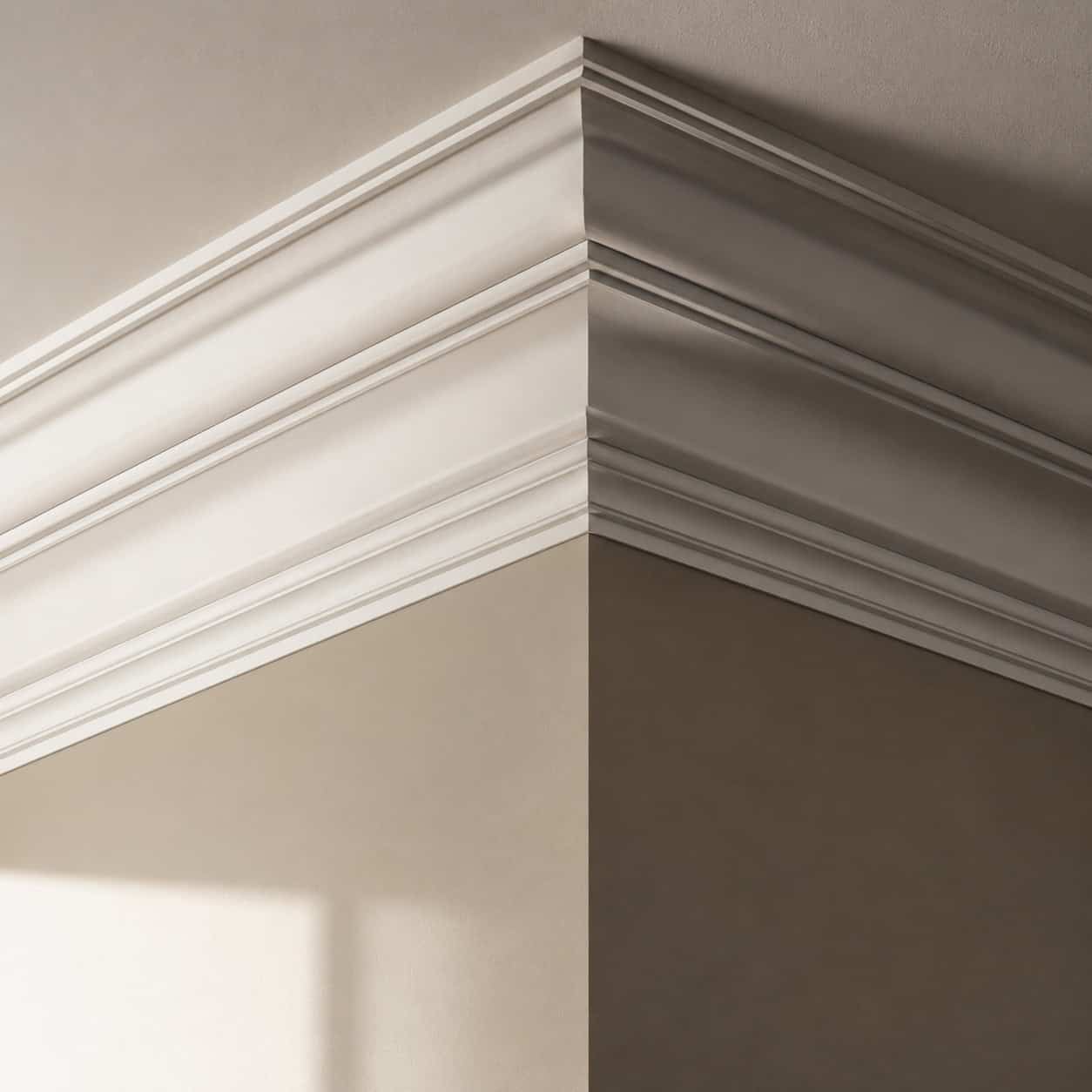
One thin strip of crown screams builder-grade. Every designer knows it on sight.
Stack two or three profiles together and the whole thing changes. A crown, a filler, a bed molding — layered into one deep, multi-dimensional transition that throws real shadow.
The trick is combining simple stock pieces into something that looks milled from a single expensive run. A base cap here, a cove there, a flat spacer to build depth.
Paint it all one color and the seams disappear. What’s left reads as substantial and old-house solid. This Old House walks through how the layering actually goes together.
4. Substantial Door and Window Casings
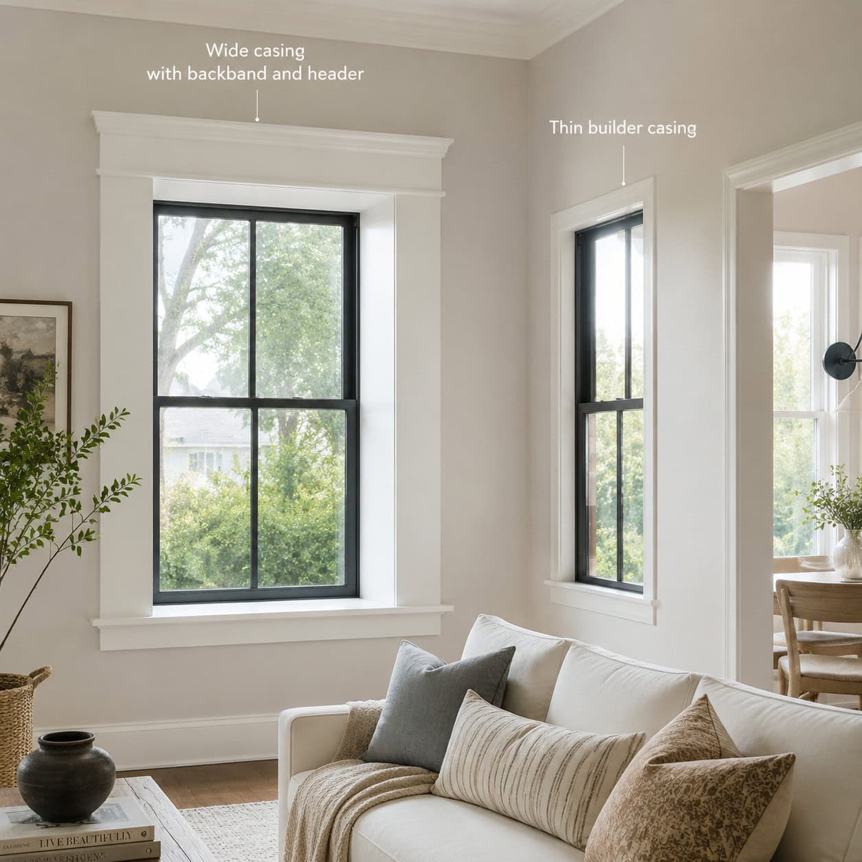
Spec builders cut corners here first. Thin, flat casing is cheap and fast.
Swap it for something with heft. Wider stock, a backband to add depth, a proper header over the opening.
The change is quiet but it’s everywhere. Every door and window in the room suddenly looks deliberate.
Older homes used casings four to six inches wide with real profile. Tract homes default to two and a quarter inches of nothing. Close that gap and the room grows up.
5. Wainscoting and Raised-Panel Walls
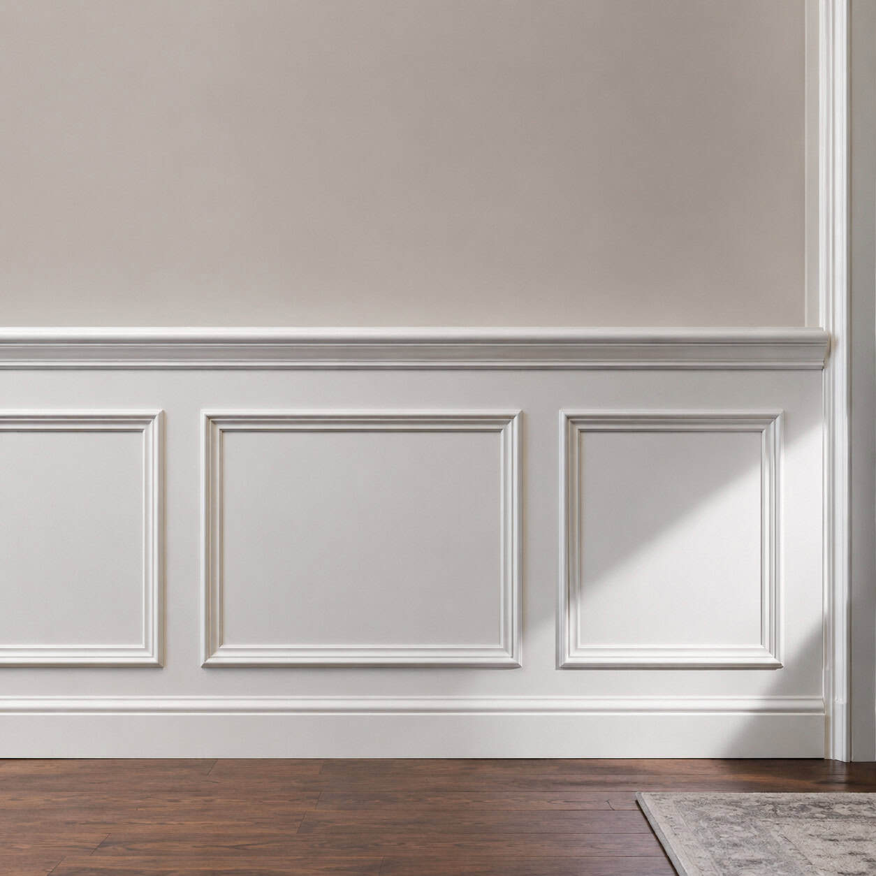
Wainscoting has been signaling craftsmanship since the 1700s. Colonial builders used it to protect and dress the lower wall, and the look never left.
Raised panels read formal. Flat recessed panels read cleaner and more modern. Both add depth a painted wall can’t touch.
Proportion is everything. The classic rule puts the wainscot at roughly one-third the wall height — go too tall or too short and it looks amateur.
Get the rail heights and panel spacing right, and it looks like it’s been there a century. Rush it and it looks like a weekend that got away from you.
6. A Board-and-Batten Accent Wall
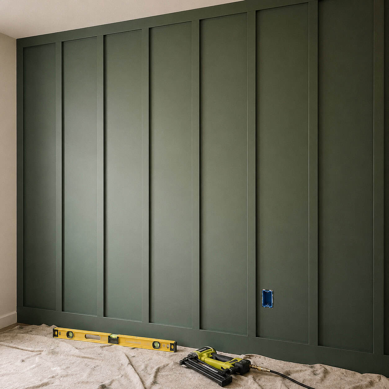
Board-and-batten started as a way to hide the seams between wide wall boards. The battens covered the joints. Function became style.
Today it’s the most approachable millwork move going. Flat vertical strips over drywall, evenly spaced, capped with a top rail.
It adds height and rhythm to a dead flat wall. And it’s a genuine weekend project — a level, a nail gun, some caulk, and paint.
Space the battens evenly and the wall gets a cadence the eye likes. That rhythm is what sells the custom look.
7. Picture-Frame Box Molding
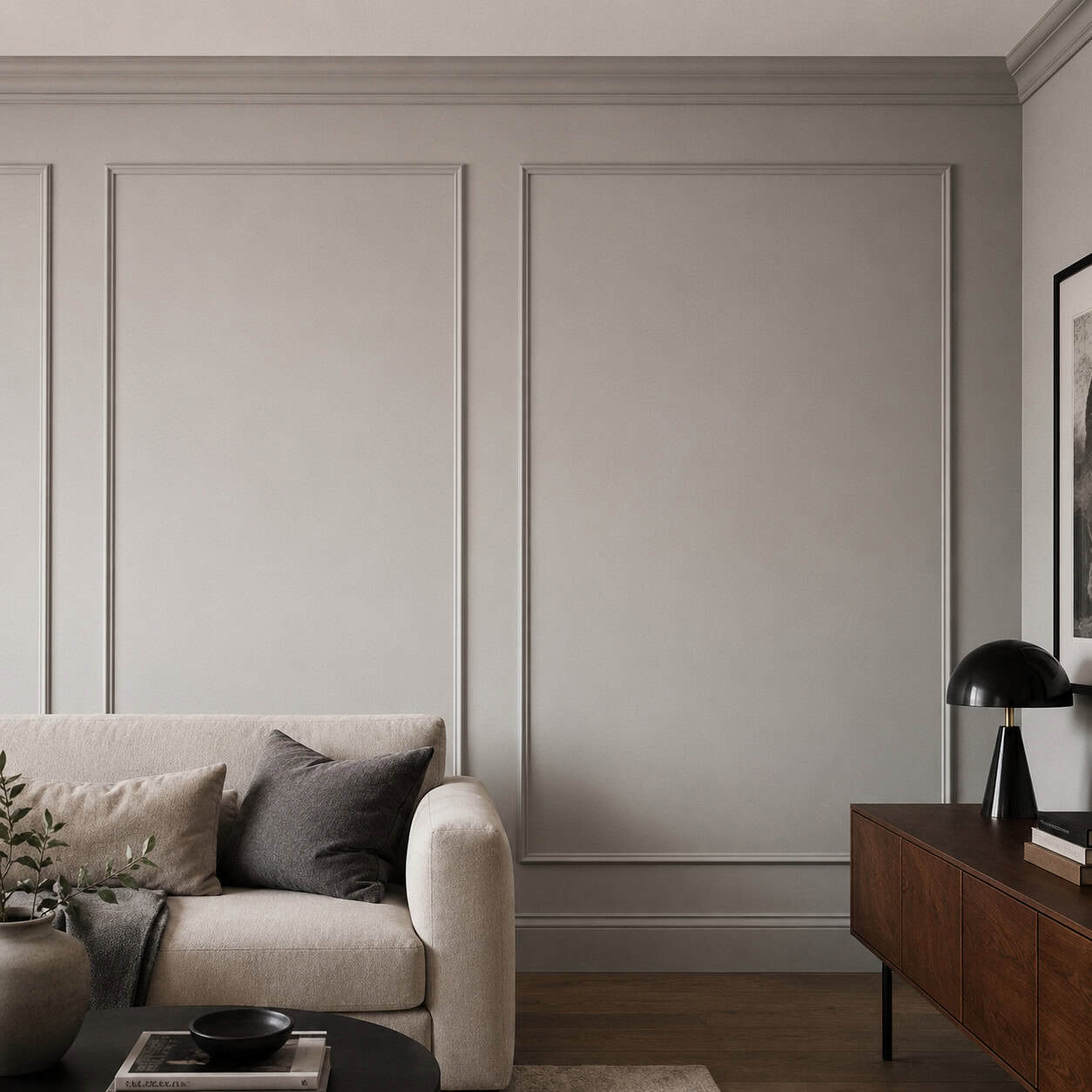
Low effort, high impact. This is the trim trick that punches above its cost.
You apply small molding boxes directly to the existing wall, then paint wall and molding the same color. The flat wall reads as paneling.
No baseboards to rip out. No drywall to touch. Just measured rectangles of thin molding, mitered and glued.
The all-one-color paint is the secret. It erases the “applied-on” look and turns the trim into architecture.
8. Beadboard or Shiplap Paneling
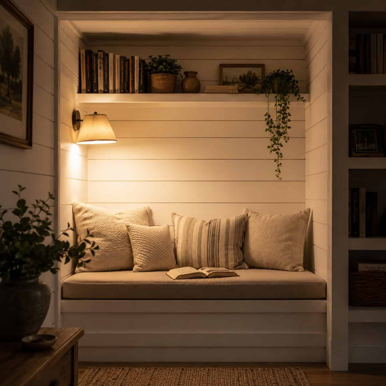
Beadboard and shiplap carry cottage and farmhouse DNA. Both give a wall texture and a finished, cocoon-like feel.
Beadboard’s tight vertical grooves read cozy and traditional. Shiplap’s horizontal planks read relaxed and casual.
Either one shines framing a nook or wrapping a lower wall. The plank lines pull your eye across or up the space.
Run it behind a window seat or a reading corner and the whole nook suddenly feels intentional. There are plenty of shiplap projects to practice the look on before you commit a whole wall.
9. A Wood-Paneled Feature Wall (Boiserie)
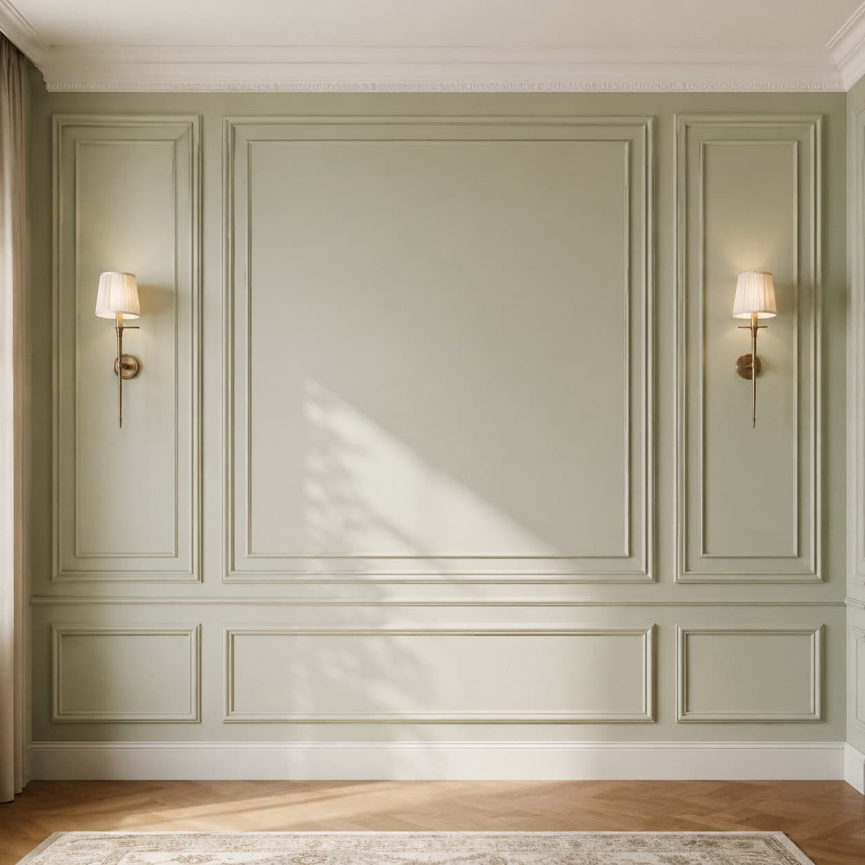
Boiserie is the French word for full decorative wall paneling, and it reads old-world every time. Period homes have it carved and gilded. You don’t need to go that far.
The idea is a wall dressed corner to corner in framed panels — rails, stiles, and recessed centers arranged in a considered grid.
It’s the deep end of millwork. Done well, nothing in a room signals bespoke more clearly.
Reproduction panel systems bring the look to newer builds without a master carver on payroll. The trick is keeping the layout symmetrical and the proportions calm.
10. A Fluted or Wood-Slat Accent Wall
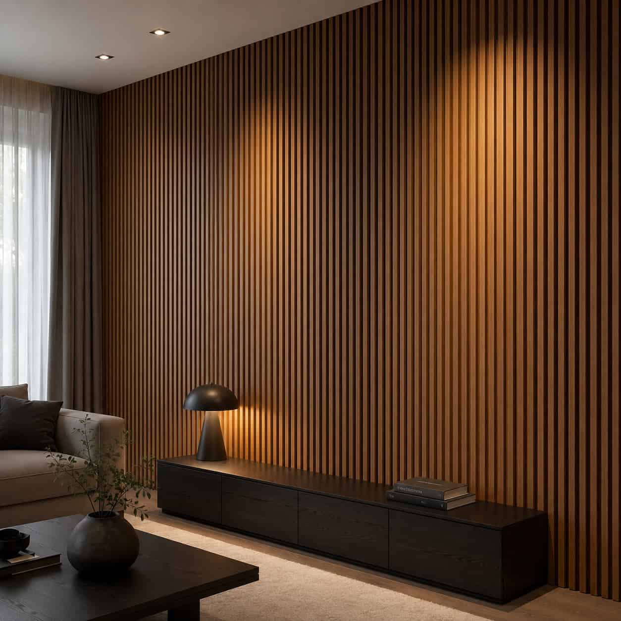
This is the contemporary answer to the flat feature wall. Vertical reeded or slatted wood, run floor to ceiling.
The repeating lines catch light and cast fine shadow. The wall gets texture and a modern, architect-designed edge.
Fluting is tighter and more refined. Slats are chunkier and warmer. Both beat a painted accent color hands down.
Cabinet-grade plywood ripped into strips and spaced over a backer will get you there. The router work is where the fluted router technique earns its keep.
11. A Coffered Ceiling
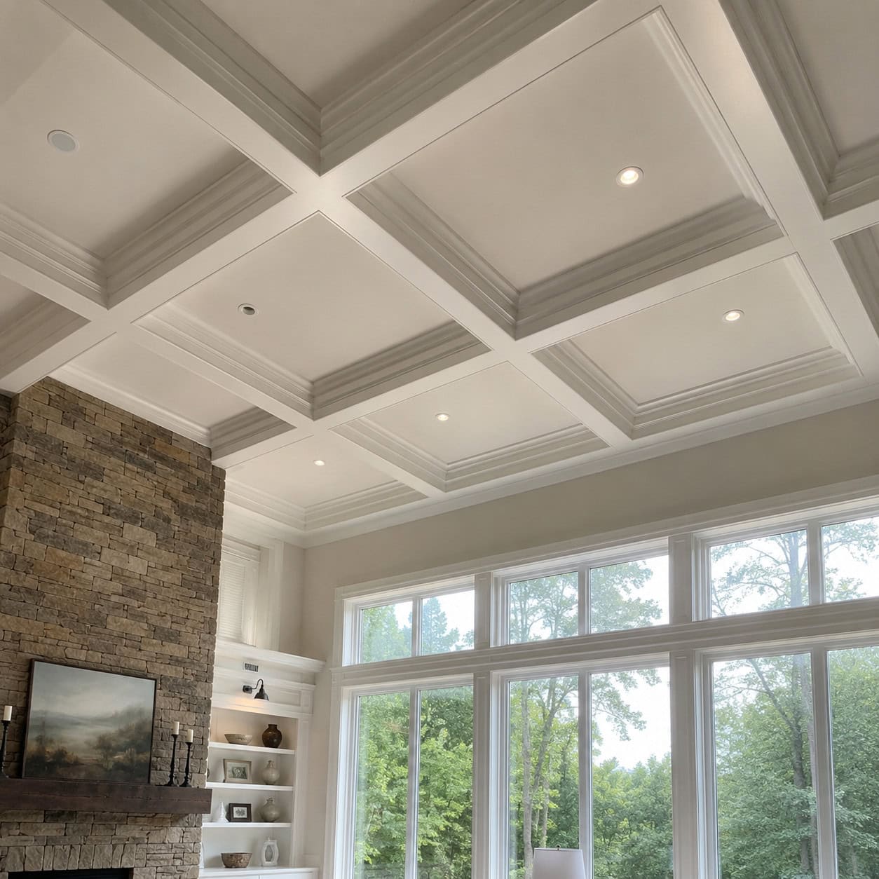
Coffered ceilings trace back to the Renaissance, and they’ve read as status ever since. Sunken panels framed by a grid of beams.
They need room to breathe. Nine-foot ceilings or taller — anything lower and the grid closes in on you.
This is real carpentry. Squaring a beam grid across a ceiling and keeping every coffer consistent is advanced work, and it shows in the price and the payoff.
The reward is a ceiling nobody can ignore. HGTV has a gallery of grid layouts worth studying before you cut a single board.
12. Exposed (or Faux) Wood Beam Ceiling
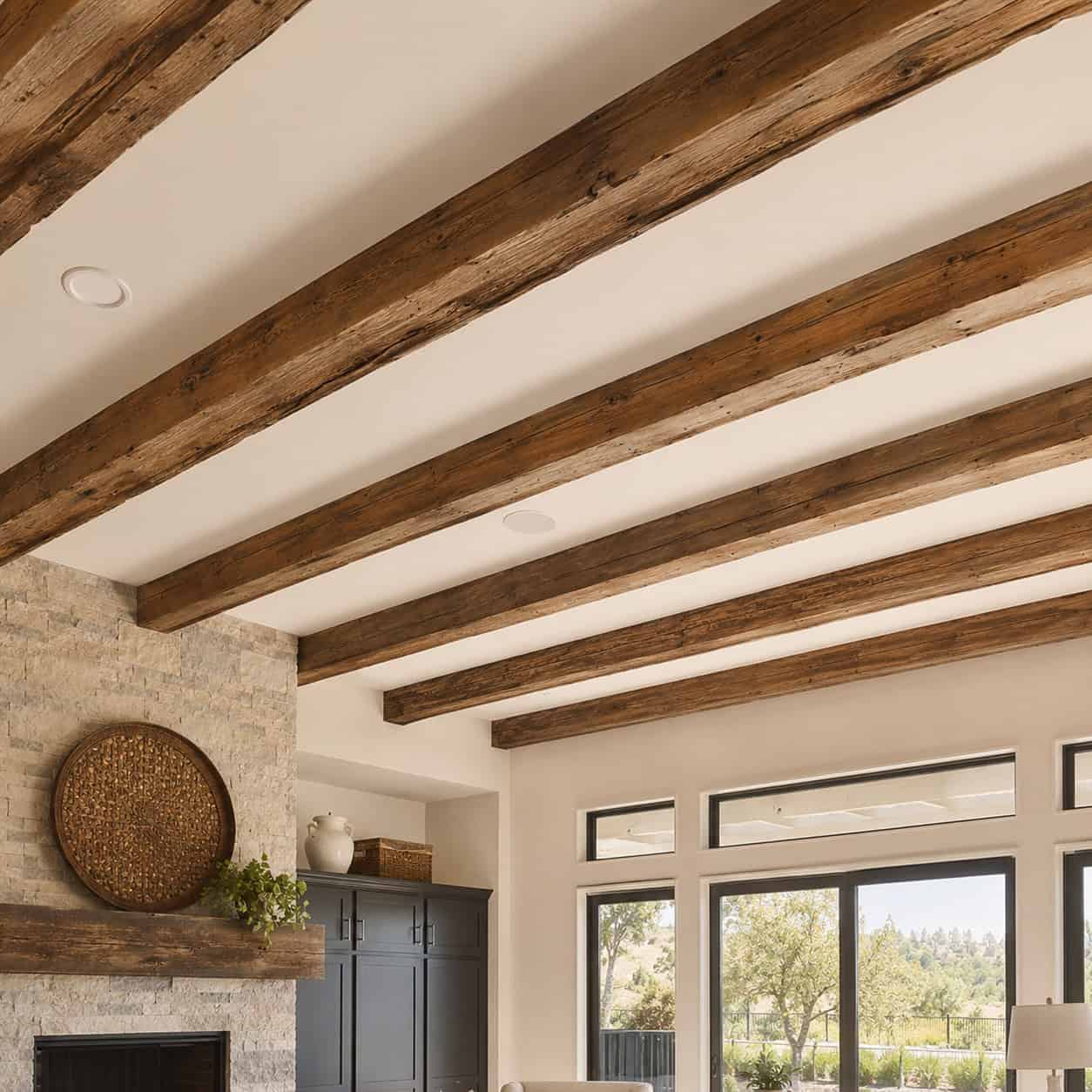
True structural beams are getting rare in new construction. So most beamed ceilings you see today are faux — real wood boxes built over drywall.
That’s not a downgrade. A three-sided beam of real oak or reclaimed timber reads exactly like the structural thing from below.
Beams add warmth overhead without the complexity of coffers. One direction, evenly spaced, and the ceiling gains character.
Reclaimed stock brings instant age. If you’d rather build from new lumber, faux beams built from real wood are lightweight and forgiving to install.
13. A Tray Ceiling
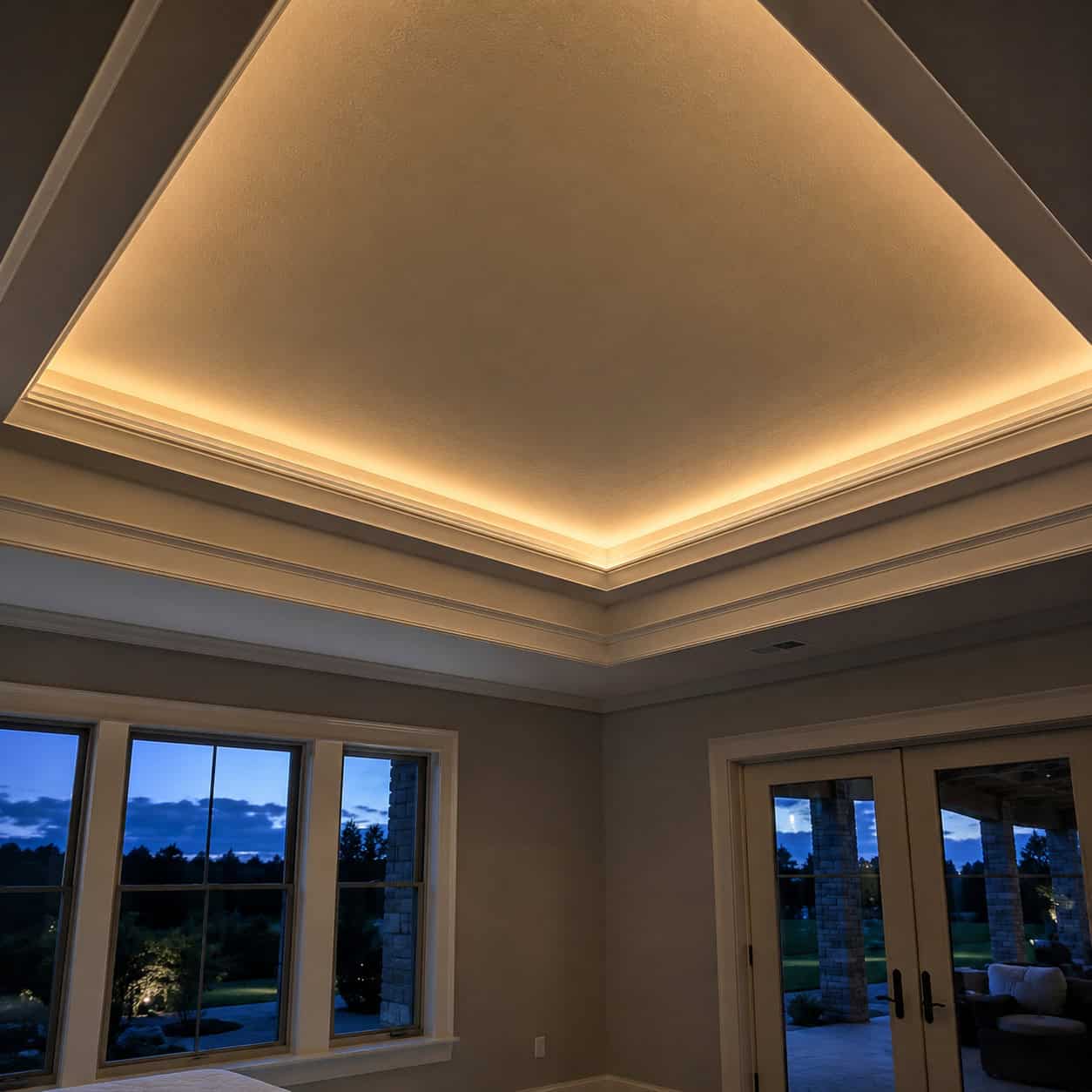
Most people can’t name it, but they feel it. A tray ceiling has a recessed center panel that lifts the eye and makes the room feel taller.
It steps up in levels — usually two or three — each dropping somewhere between 5 and 11 inches. The stepped edge catches light and casts a soft shadow.
It’s the fifth wall nobody thinks to work. And it turns a flat overhead into a design feature.
Add a hidden LED strip in the recess and the ceiling glows at night.
14. A Ceiling Medallion
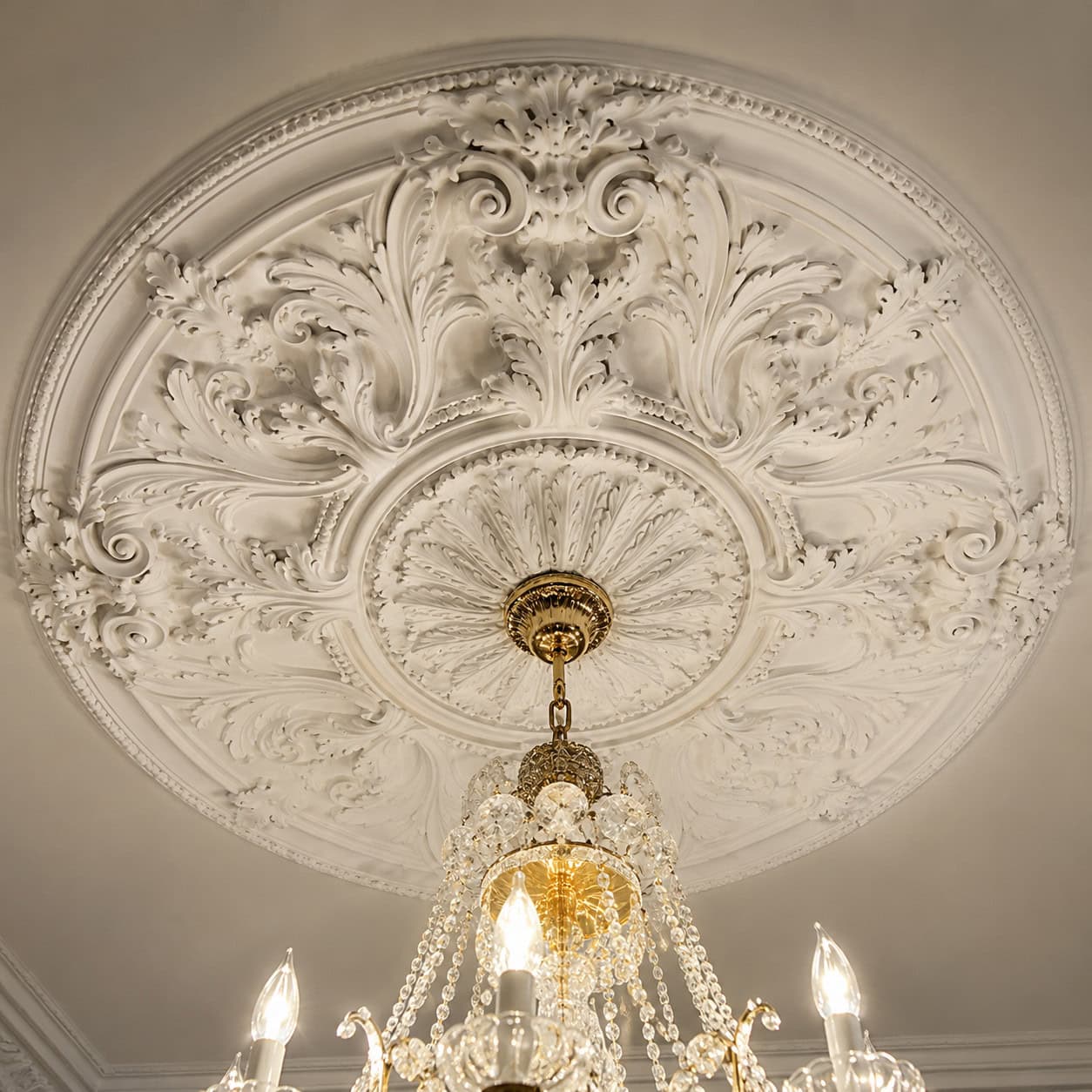
Victorian and Federal builders anchored their light fixtures with medallions. A plaster or wood rosette centered on the ceiling, framing the chandelier.
It’s a small detail no spec builder bothers with. Which is exactly why it registers.
The medallion gives the fixture a reason to be there — a designed connection between light and ceiling instead of a bare junction box.
Pair it with a real chandelier and the two features carry each other.
15. Arched Cased Openings
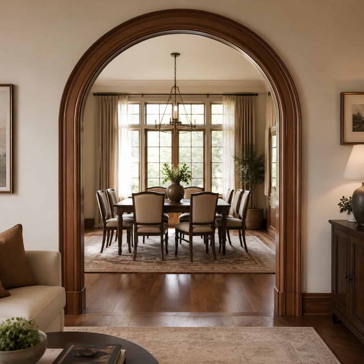
The arch is architecture’s oldest trick, and it never stopped looking expensive. Swap a square-topped doorway for a rounded or elliptical arch and the whole opening changes character.
Square says standard. Curved says permanence and tradition.
It’s a subtle move with a big return. The eye reads the curve as old-world and considered.
Drywall arches are common, but a cased arch with wood trim following the curve is the version that reads truly custom.
16. Interior Columns or a Partial-Wall Colonnade
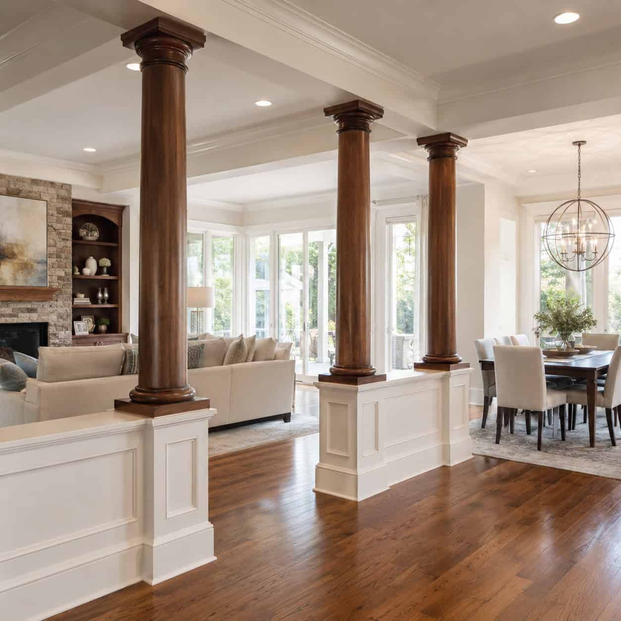
Columns define a space without closing it off. That’s the custom-builder trick — openness that still feels like distinct rooms.
A pair of columns on partial walls can separate living from dining while keeping the whole floor visible. Classical grandeur, open-plan function.
They can be structural or purely decorative. Either way, they add a vertical, architectural moment to a flat span.
Tapered wood columns with proper bases and capitals read most convincing. Skip the plastic ones.
17. Herringbone or Chevron Wood Floors
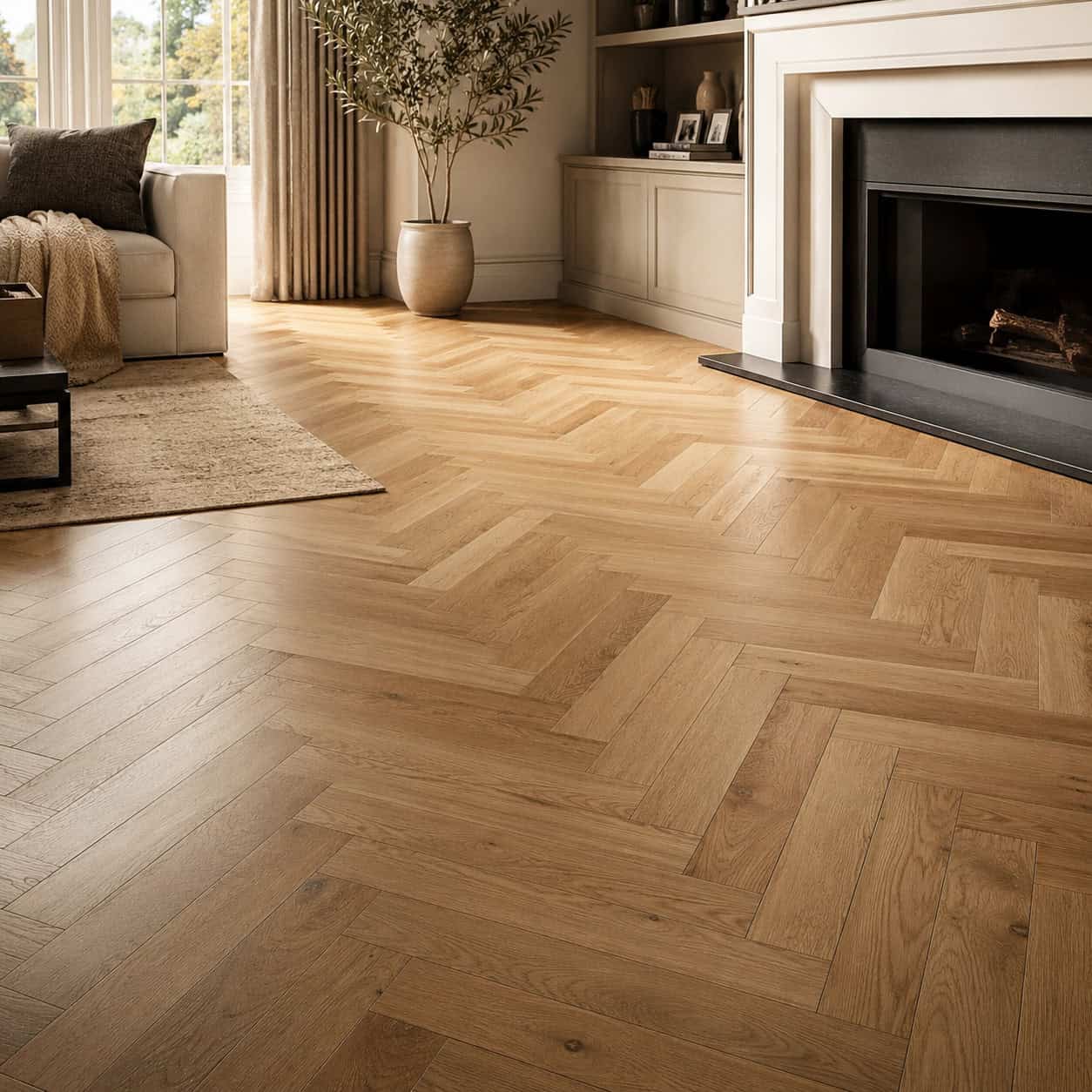
Same wood, laid straight, reads as standard flooring. The same boards in herringbone or chevron read as a thoughtful, rich detail.
Herringbone stacks rectangles in a broken zigzag. Chevron cuts the ends at an angle so the points meet in a clean V.
Both take far more labor than straight runs. That extra work is exactly what the eye picks up as expensive.
You see it in old European homes for a reason. The pattern has read as luxury for centuries.
18. A Window Seat With Hidden Storage
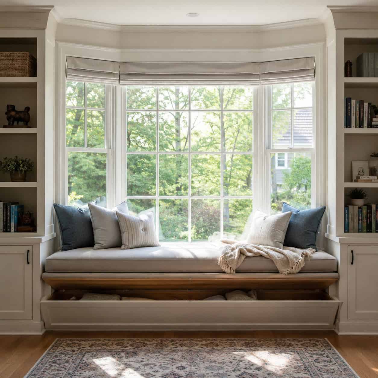
A built-in bench under the window tells everyone the home was designed around this spot. Bungalows and cottages have loved the feature for a hundred years.
Bay-window versions can run 30 inches deep — enough to actually stretch out with a book. A hinged top turns the base into concealed storage for blankets or games.
It’s the kind of feature that makes a corner feel like a destination. And it’s genuinely buildable in a weekend or two.
Frame it into a nook, cushion the top, and flank it with shelves. Now it looks like it was always there.
19. A Hidden Bookcase Door
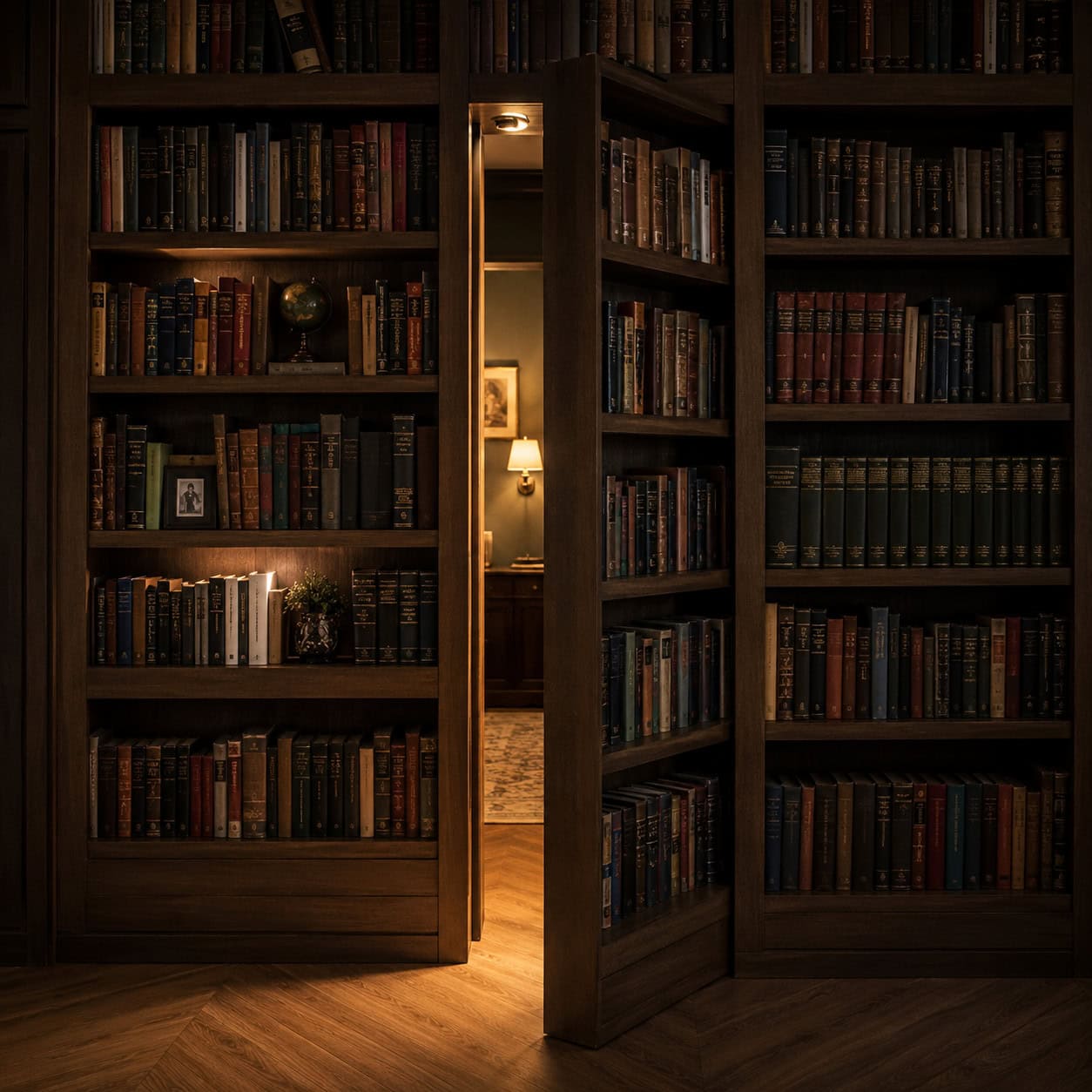
This is the delight feature. A wall of shelves that swings open on a touch-latch or a tipped book.
Behind it — an office, a pantry, a hidden room, or just a closet nobody expects. It doesn’t matter what’s back there. The reveal is the point.
Nothing says “made for us” like a secret passage in your own living room. It’s pure share-bait, and it never gets old.
The engineering is real — a concealed hinge system carrying the full weight of loaded shelves. But the payoff is unmatched. Victorian homes were full of hidden features like this, and they still stop people cold.
20. A Built-In Wet Bar or Bar Cabinet
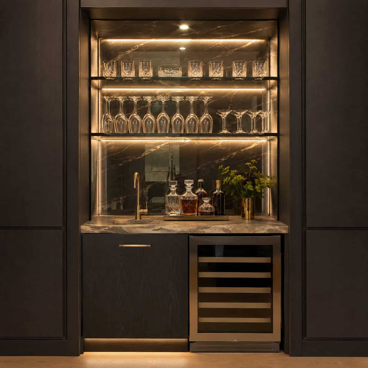
Fitted bar cabinetry turns a dead corner into a jewel box. A small sink, glass storage, a little integrated lighting, all set into paneling.
No off-the-shelf furniture replicates it. The whole appeal is that it’s built into the wall, not parked against it.
Backlit glass shelving is the detail that makes it glow. Add a stone counter and it reads like it belongs in a much more expensive house.
Even a compact version — one cabinet, a shelf of glasses, a light — changes how a room entertains. A wine and whiskey cabinet with LED display is the same idea scaled to fit.
21. A Custom Media Wall With Concealed Wiring
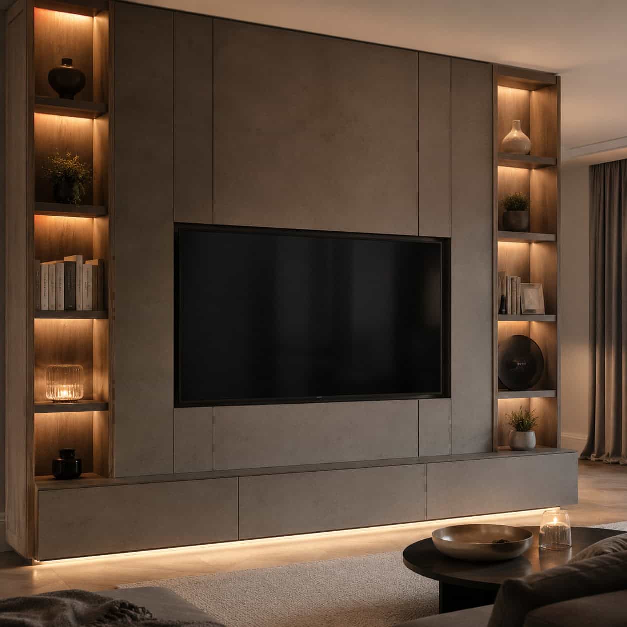
Done right, a media wall reads as architecture, not electronics. The TV sits recessed, flush or nearly so, with every wire buried inside the wall.
The cheap version is a screen bolted to drywall with a cord snaking down to an outlet. The custom version hides all of that.
Recess the screen into a paneled surround. Run the cabling through the wall to a hidden equipment cabinet. Suddenly the technology disappears into the design.
Frame it with shelving or millwork and the TV becomes part of the composition instead of the whole event.
22. Cove Lighting in the Crown Molding
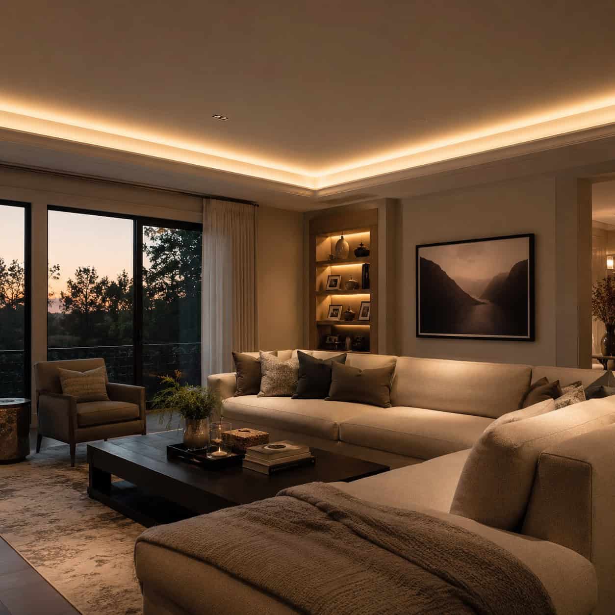
This is hidden luxury. A strip of light tucked into the top of the crown, aimed at the ceiling.
You never see the source. You just see a soft wash of glow along the ceiling line at night.
It’s the kind of detail that quietly signals the home was designed with care. Nobody notices the fixture — they notice the room feels warm.
Build a lip into the crown profile, tuck an LED strip behind it, and put it on a dimmer. That’s the whole trick.
23. Wall Sconces and Picture Lights on Dimmers
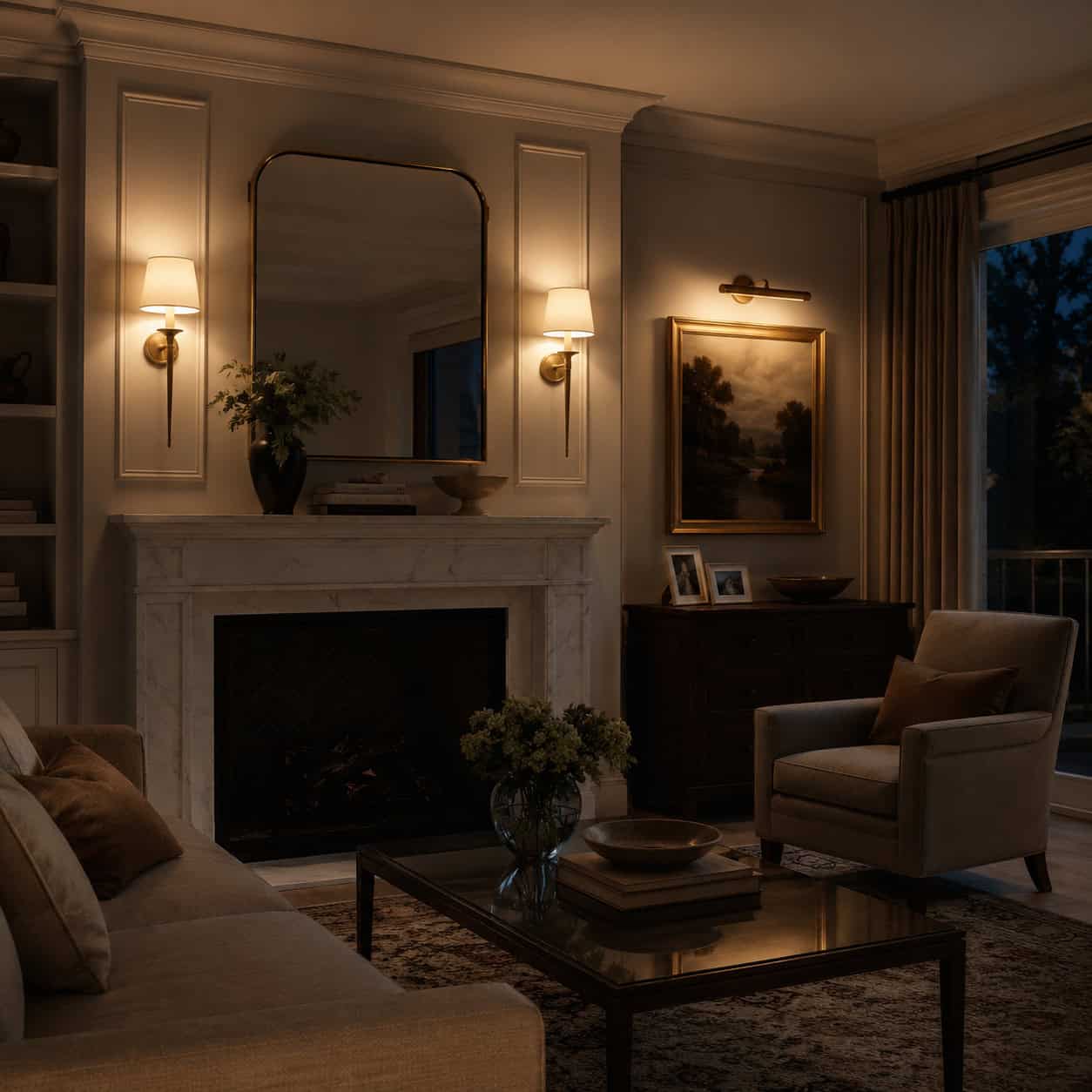
Builder rooms rely on a grid of recessed cans. High-end rooms layer their light instead.
Ambient, task, and accent — three layers instead of one flat ceiling glare. Sconces flanking the fireplace. A picture light over the art. A lamp in the reading corner.
And dimmers on everything. A room that can drop to a warm evening glow feels custom in a way bright overhead cans never will.
Even swapping a few cans for wall sconces changes the whole mood. Marymount University breaks down how the layering actually works.
- Ambient light fills the room evenly.
- Task light aims where you read or work.
- Accent light picks out art, texture, or architecture.
24. A Sculptural Statement Chandelier

Every luxury room has one bold moment. Often it hangs from the ceiling.
A custom or vintage fixture over the seating area draws the eye up and gives the room a signature. It doesn’t have to be crystal — it has to have presence.
Oversized, sculptural, unexpected. The fixture becomes the room’s exclamation point.
One striking light does more than a dozen careful ones. Pick the moment and commit to it.
25. Made-to-Measure Floor-Length Drapery
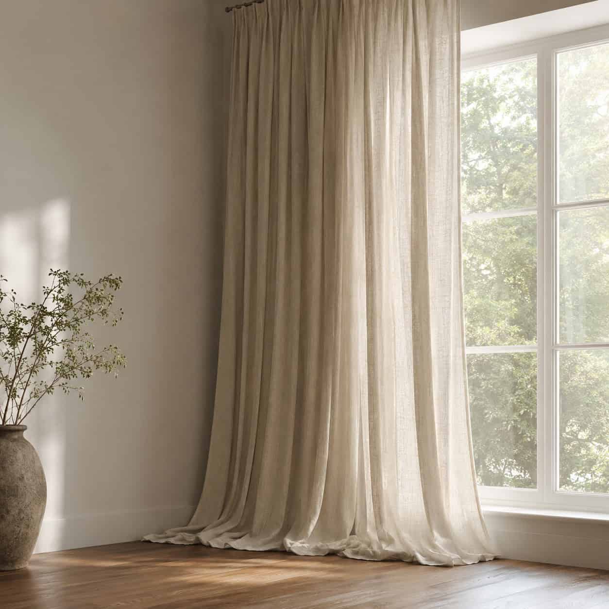
Length is everything with curtains. Panels that reach the floor — or lightly pool on it — read as bespoke.
Short off-the-rack panels floating above the floor cheapen a room instantly. It’s the fastest visual tell there is.
Hang the rod high, near the ceiling, and let the fabric fall all the way down. The window looks taller and the room looks taller with it.
This one’s cheap to correct and impossible to un-see once you know it. Fix the length first.
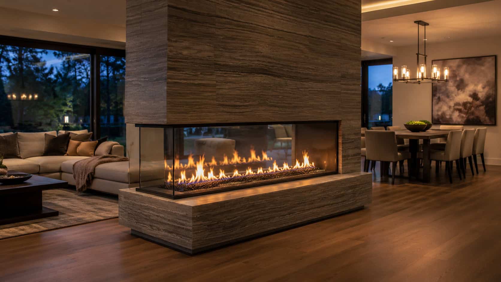
26. A Double-Sided See-Through Fireplace
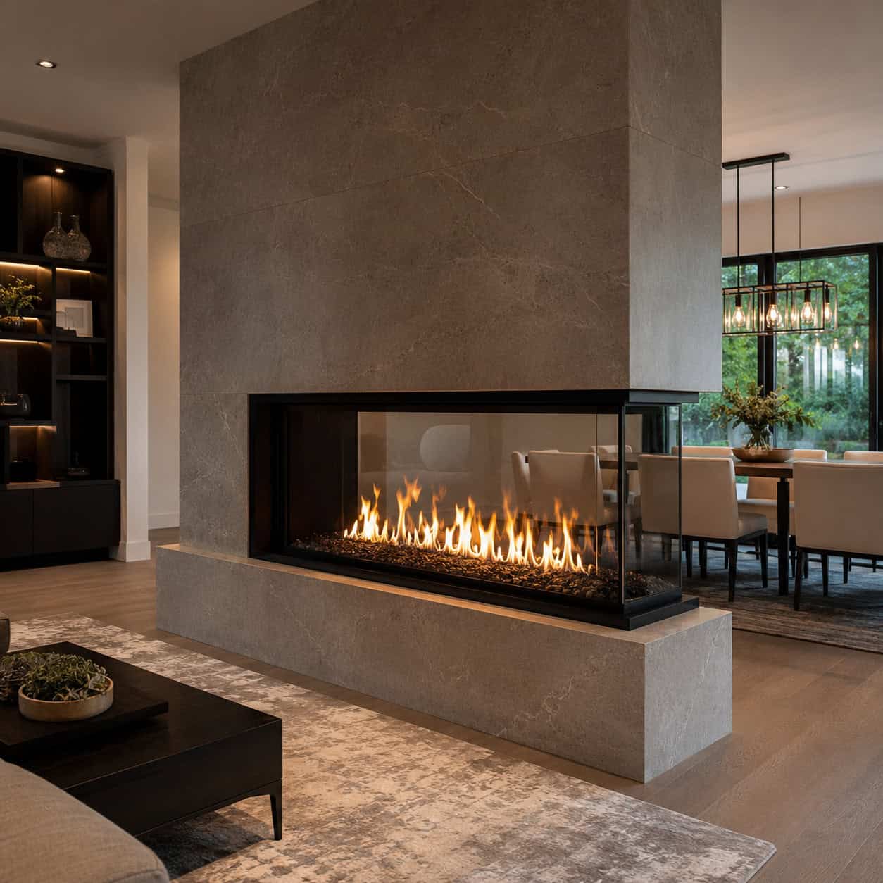
A fireplace open on two sides is a centerpiece that only shows up in intentional builds. You never get one by accident.
It can anchor a long room from the middle, throwing warmth and light in both directions. Or it can divide living from dining while keeping the sightline open between them.
That’s the real trick — separation without a wall. You get two defined spaces that still read as one connected floor plan.
Placement takes planning. The unit has to sit where both sides earn a view, and the flue or venting runs straight up through the roofline, so it usually has to be designed in from the start rather than added later.
Function matters as much as looks. Modern see-through gas units are rated by BTU output, and a two-sided firebox loses some radiant efficiency compared to a solid-back model — you’re heating in two directions and glazing both faces. Size the unit to the room, not the other way around.
Gas versions keep both glass panes clean and the flame consistent, which matters when the fire is on display from two rooms at once. Wood-burning see-through units exist too, but they demand more clearance and more maintenance.
Whichever you choose, this is the feature guests remember. A wall of fire you can see straight through reorganizes how a whole floor feels.
27. Floor-to-Ceiling Windows With Custom Mullions
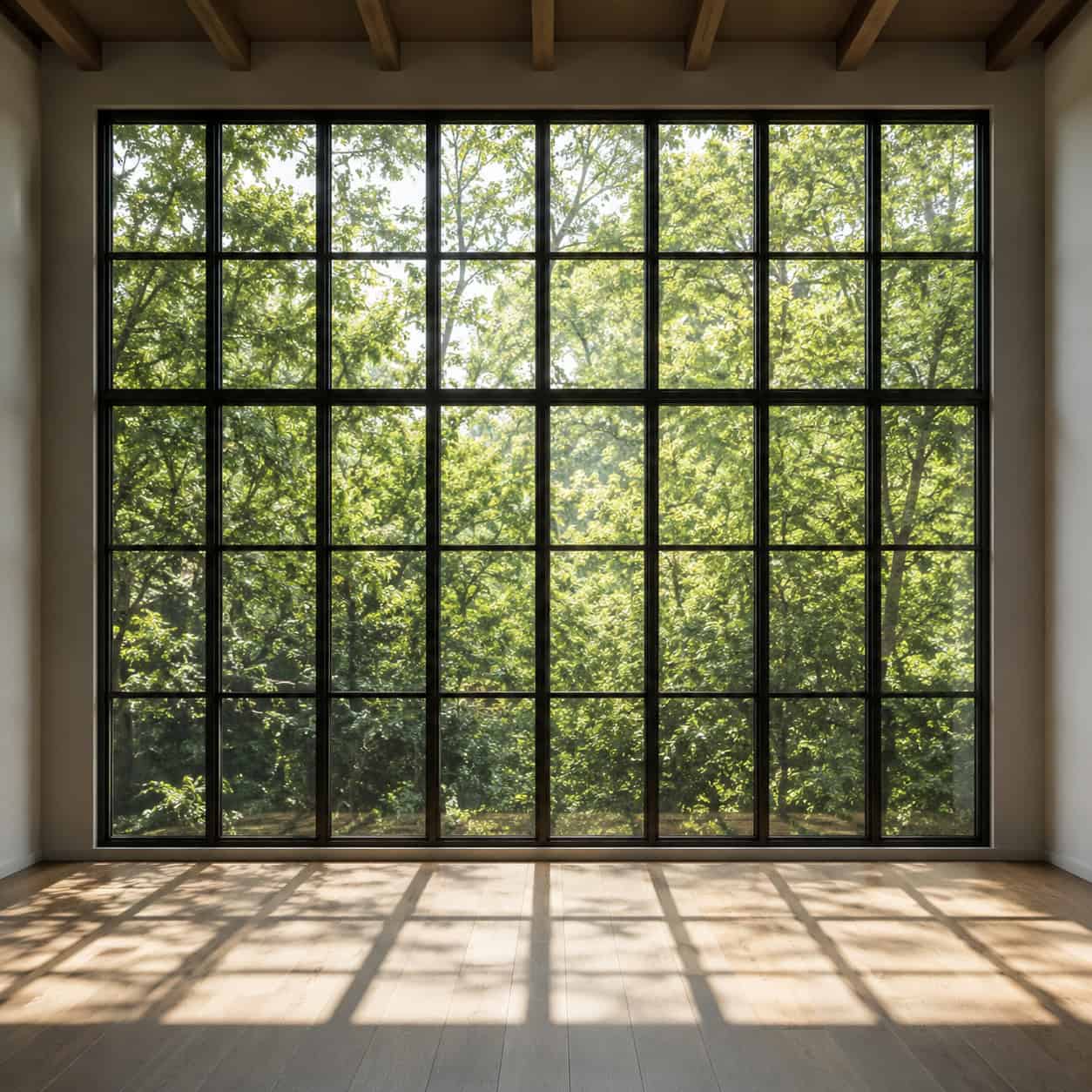
In prestige homes, glass is treated as architecture. Oversized windows, and a considered pattern of mullions dividing them.
The mullion layout is where the design lives. Symmetry and rhythm in the grid read as timeless — random or stock patterns read as builder default.
Light becomes the material. A wall of glass with the right divisions turns the view into framed art.
Even on a standard window, upgrading to a considered grille pattern lifts the whole wall.
28. A Reclaimed-Wood Accent or Barn-Beam Detail
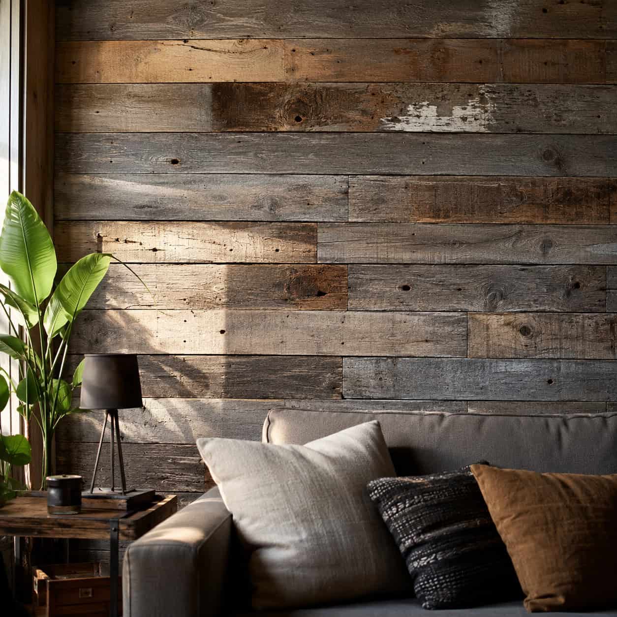
Salvaged wood carries story and patina you can’t manufacture. Nail holes, saw marks, decades of oxidation — all of it reads as real.
A single reclaimed mantel, a barn-beam shelf, or a wall of weathered planks brings age into a new build. It’s warmth with a history attached.
The character is in the flaws. A perfectly milled board can’t fake a hundred years of hard use.
Source it from a real reclaimer, mind the nails and the bugs, and let the wood do the talking. One piece is often plenty.
29. Picture Rail Molding
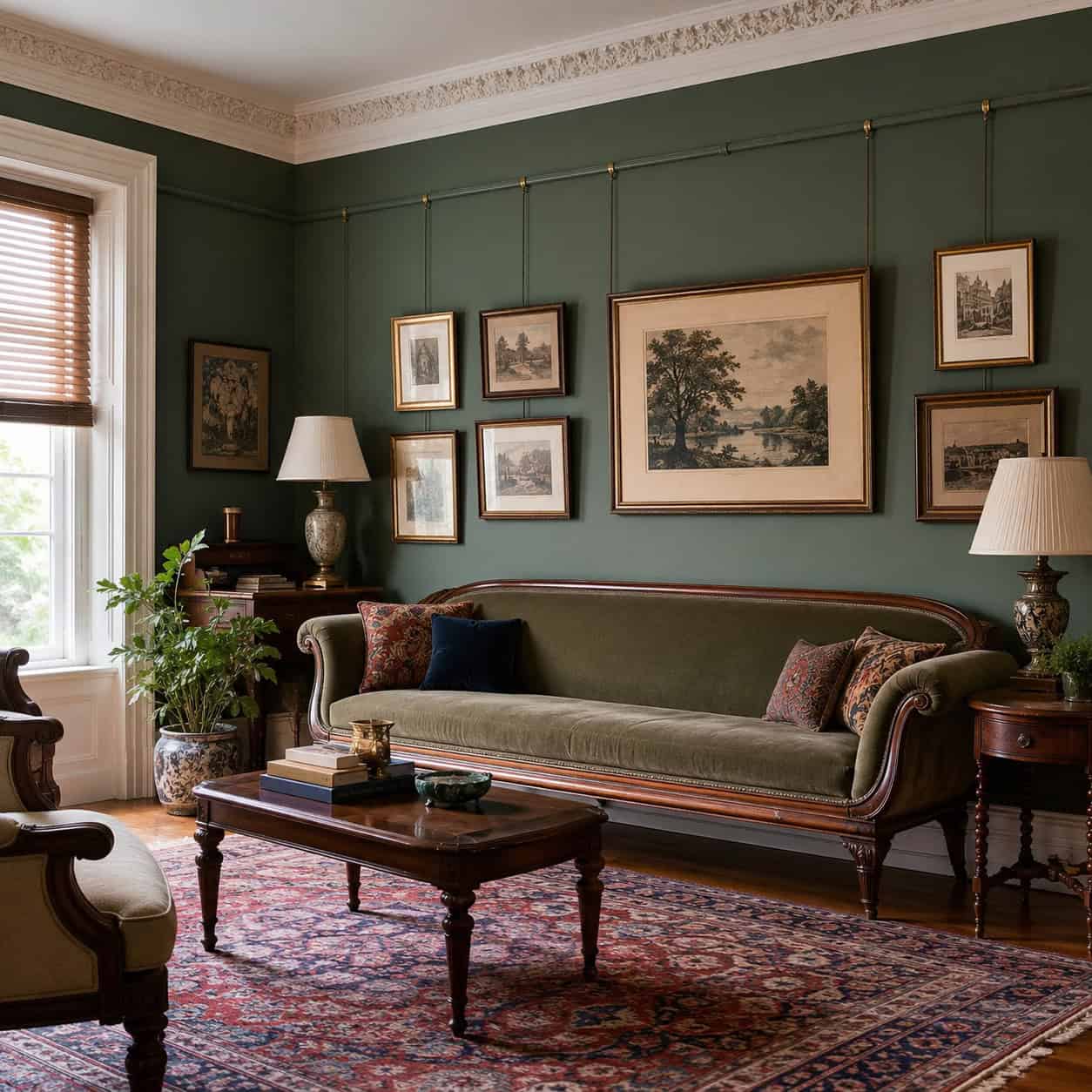
Victorian and Edwardian homes ran a horizontal rail near the ceiling for hanging art. Hooks slid along it, and pictures hung from wires — no holes punched in the plaster.
It’s a charming period detail that also solves a real problem. You can rearrange a whole gallery wall without patching a single hole.
The rail draws a clean line around the room and lowers the visual ceiling just enough to feel intimate. Paint it with the trim or contrast it against the wall.
Narrow appeal, but the people who know it, love it.
30. Pocket Doors
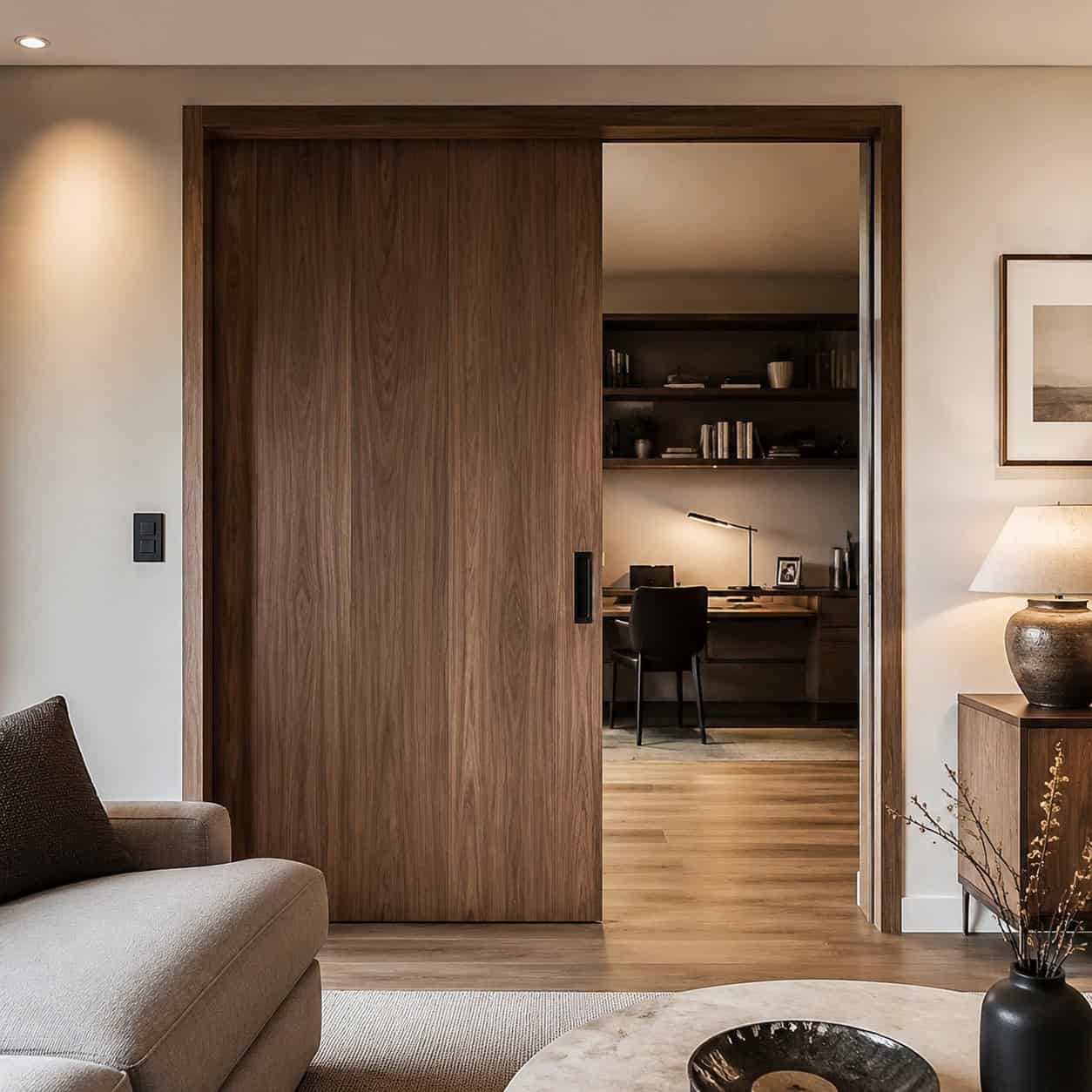
Pocket doors slide clean into the wall and vanish. Late-1800s builders used them to save space, and today they read as a quiet splurge.
A door that disappears feels thoughtful in a way a swinging slab never does. No arc of dead floor space, no door standing open in the way.
Between a living room and a study or dining room, it lets you close off or open up without committing the floor to a swing.
The hardware and framing cost more than a standard door. But the effect — a wall that opens and seals on demand — is pure old-house custom.
The Thread Running Through All of It
Notice what these features have in common. Almost none of them are about expensive materials.
They’re about proportion, layering, and someone caring enough to not take the fast route. Stacked molding instead of one strip. Curtains that reach the floor. A doorway that curves.
You don’t need all 30. Pick two or three that fit your room and do them right.
A house gets its soul from the details a builder skipped — and the ones you decided were worth doing anyway.