

Walk into a house built in 1912 and, if the owners left it alone, something about it still feels right. The oak floors have a glow. The molding catches the light. Nobody has to explain why it works.
Trends move fast. Sage-green cabinets, then gray everything, then white everything, then back to color. Chase it and you’ll be re-renovating every seven years.
Some choices don’t play that game. They looked right a hundred years ago and they’ll look right a hundred years from now.
They tend to share three things: honest materials, a job they were built to do, and no ornament that ties them to a single decade.
Here are 25 upgrades that have outlasted every trend that tried to replace them.
1. Solid Oak Hardwood Floors
This is the safe bet. The one that never dates.
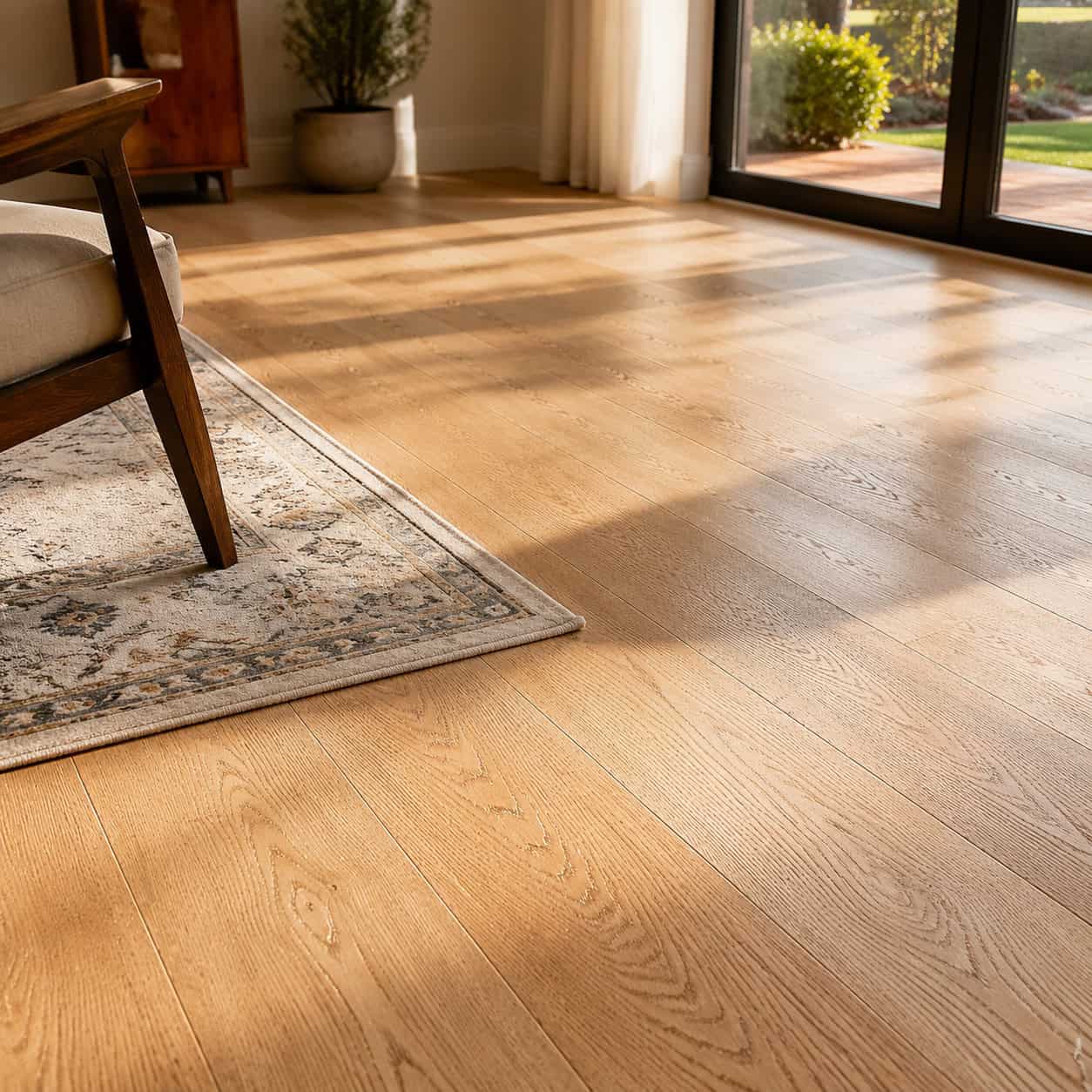
Oak has been the dominant American flooring wood since the 1800s, and it reads warm in a 1900 farmhouse and a 2026 new build alike. Red oak, white oak, quartersawn — all of it ages into something better than the day it was installed.
Here’s the part that matters for your wallet. Solid oak can be sanded and refinished five to ten times over its life. The same boards outlive every flooring fad that tries to replace them — laminate, luxury vinyl, engineered click-lock, all of it.
A worn, tired oak floor isn’t a replacement job. It’s a screening and three coats of finish, and it looks new again for another twenty years.
When you buy, pay attention to a few things:
- Solid ¾-inch boards give you the most refinishing life
- White oak resists moisture and rot better than red oak
- Site-finished floors seal the seams against spills; prefinished don’t
Skip the ultra-thin engineered products if you plan to stay. A 2mm wear layer sands once, maybe twice, then it’s done.
Finish matters too. Oil-based poly ambers over time and deepens the grain. Water-based dries clear and fast. A hard-wax oil shows wear but spot-repairs without a full recoat.
Real wood does something advertisers can’t fake. It gains character. Industry voices like Carlisle Wide Plank Floors point out that a genuine wood floor is one of the few finishes that adds value as it ages instead of shedding it. That’s the whole argument for timeless in one board.
2. White Subway Tile
It has a birthday. 1904, the New York City subway.
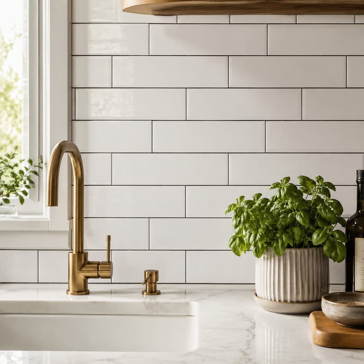
The 3×6 glazed white rectangle was picked because it was bright, easy to clean, and cheap to make. Riders could see in it. Grime wiped off it.
Within a decade it jumped straight out of the tunnels and into prewar kitchens and bathrooms. It never left.
You can lay it in a running bond, stack it vertical, or run it herringbone for a little more interest. Change the grout color and the same tile reads farmhouse, industrial, or clean-modern.
According to This Old House, the format has survived a full century precisely because it was designed for function first. Beauty came free.
3. Shaker Cabinets
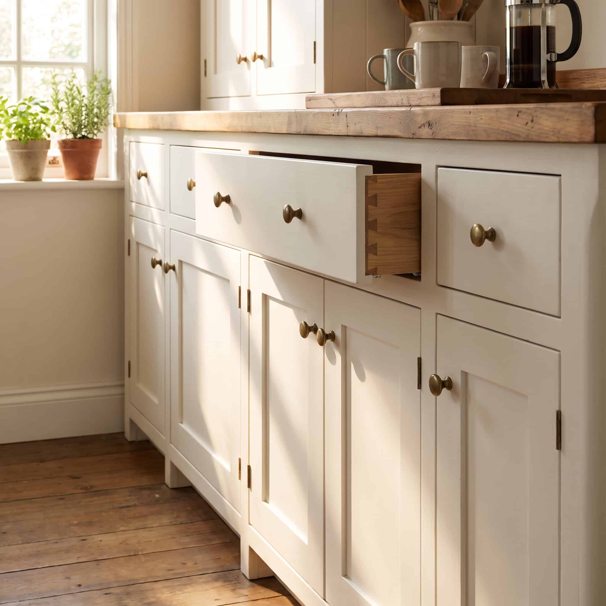
A frame, a flat recessed panel, no carving. That’s it.
The five-piece Shaker door came out of 18th- and 19th-century Shaker communities, where ornament was considered a kind of vanity. What’s left is pure function — and function doesn’t date.
An NKBA report found roughly 61% of U.S. homeowners choose Shaker-style cabinets in a remodel, which makes it the default timeless pick in American kitchens.
Paint it white, stain it walnut, or leave the wood raw. The door doesn’t care. It works either way.
If you’re building your own, the five-piece Shaker door is one of the most forgiving joinery projects there is.
4. Natural Stone Countertops (Marble & Soapstone)
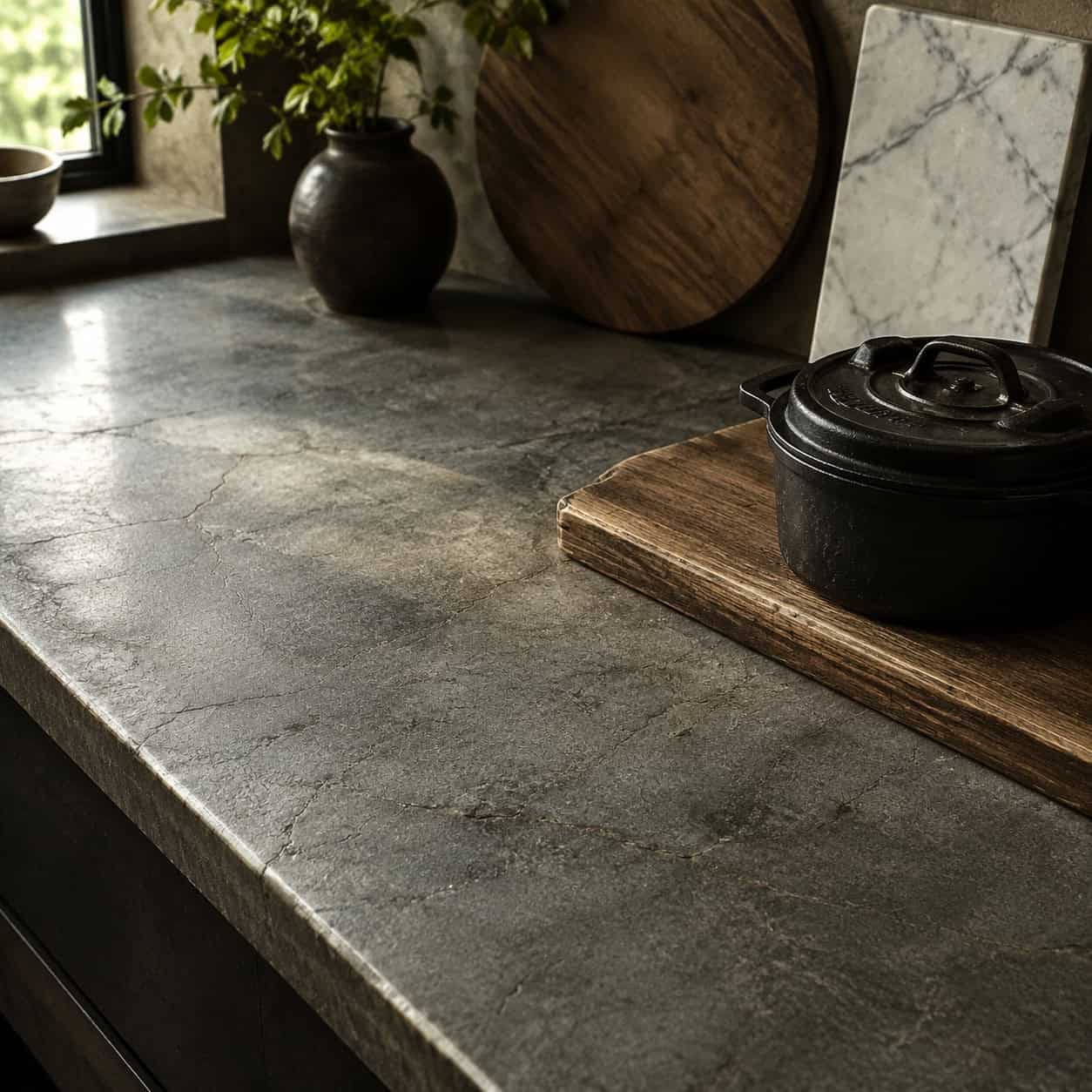
Real stone doesn’t go out of style because it was never in style. It just is.
Marble has been used since antiquity. Soapstone has been in American kitchens since the 1800s — sinks, counters, laboratory tops — and plenty of those original slabs are still in service.
That’s the opposite of a trend. A trend wears out. Soapstone gets a deeper patina and keeps going.
Marble etches where acid touches it, and some people hate that. Others love the way it records a life of cooking. Soapstone shrugs off acid entirely and just darkens over the years, especially when you rub it with mineral oil.
The suppliers at M Teixeira Soapstone note that century-old soapstone counters are still perfectly usable — which is more than any engineered quartz can claim yet.
5. Farmhouse Apron-Front Sink
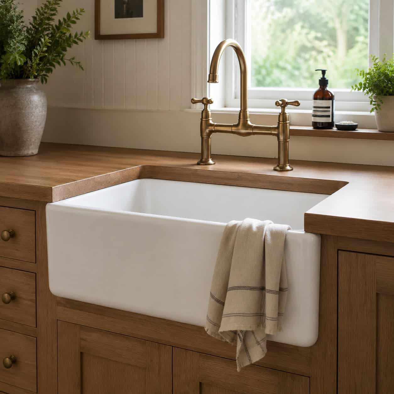
The deep, exposed-front basin showed up in the 17th century for one reason: hard daily work.
Farmhouse kitchens needed a sink big enough to fill a stockpot and wash a butchered bird, with a front you could lean your whole body against. The apron front let you stand close without a cabinet edge digging into your gut.
It survived from the 1600s in cast iron, fireclay, copper, and carved stone. Every one of those materials still shows up today.
The version at The Sink Boutique and elsewhere is the same shape it was four centuries ago. Instagram just discovered it late.
6. Butcher-Block Countertop
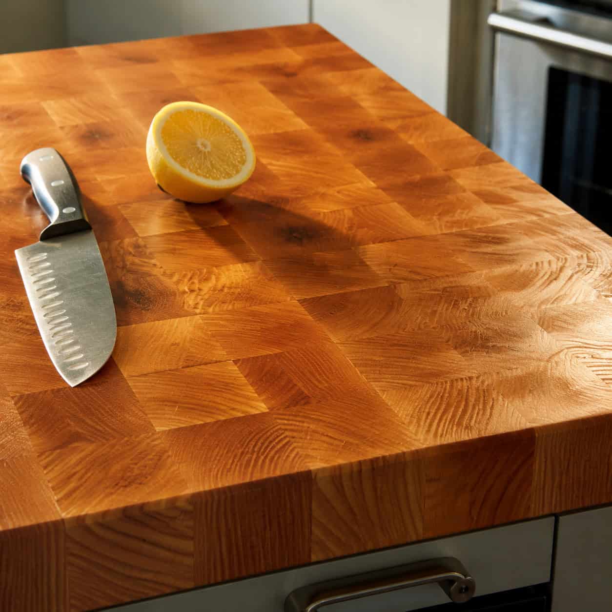
Warm wood on a work surface. It goes with everything.
Old butcher shops and farmhouse kitchens ran on maple and beech end-grain blocks because they took a knife well and could be scrubbed clean. That practical DNA is still there.
Butcher block is the counter you can fix. Scorch it, scratch it, stain it — sand it down, re-oil it, and it looks new again. Try that with a laminate top.
It also proves timeless isn’t a single look. Stone reads cool and permanent. Wood reads warm and alive. A kitchen with both feels layered instead of styled.
Keep it oiled with food-safe mineral oil and it’ll outlast the cabinets it sits on.
7. Crown Molding
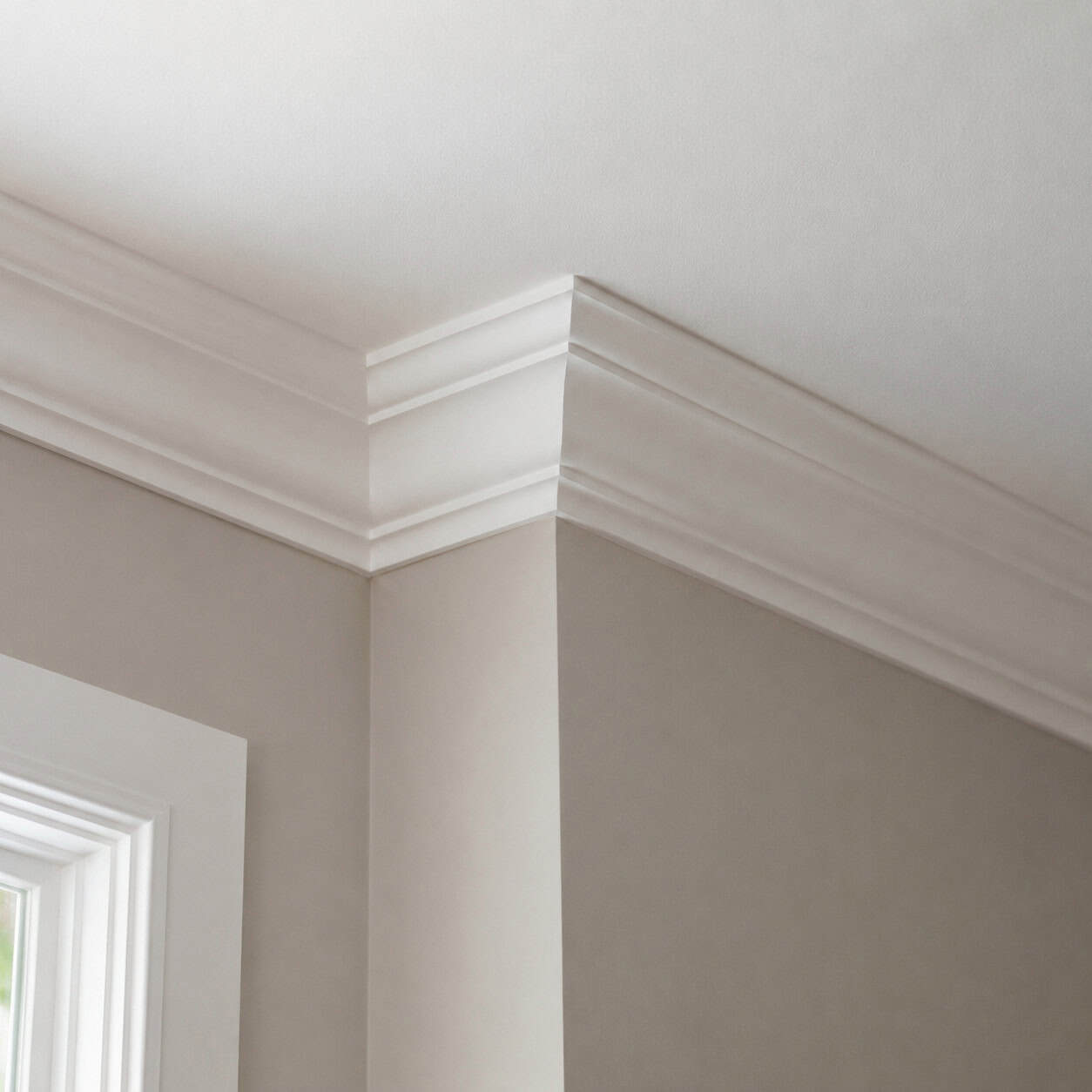
People walk into a room with crown molding and say it feels finished. They usually can’t say why.
The detail traces back to ancient Egypt and Rome, got revived hard in the late Renaissance, and has meant “elegant” ever since. It softens the hard line where wall meets ceiling and gives the eye somewhere to land.
You don’t need a contractor for a modest profile. House Beautiful has covered how even a simple crown transforms a plain box of a room — and it’s an approachable weekend job with a miter saw and a coping saw.
Bigger rooms carry taller molding. A low ceiling wants something restrained. Get the proportion right and it disappears into the architecture, which is exactly the point.
8. Raised-Panel Wainscoting
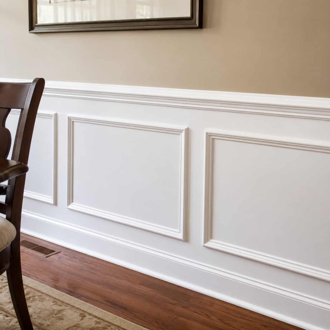
It started as protection, not decoration.
Wood paneling on the lower wall took the abuse of chair backs, boots, and passing traffic in Victorian and Colonial dining rooms. It also added a layer of insulation against cold, heat, and noise in drafty old houses.
That functional origin is why it still feels grounded instead of fussy. It’s doing a job.
It’s also quietly edging out the painted accent wall — the trend that everybody did in 2019 and half of them have already repainted. Wainscoting doesn’t go stale, because it was never a color-of-the-year gamble. It’s one of the features that make a home feel custom rather than builder-grade.
Havenly and other design outlets keep putting wall molding back on their “timeless” lists for the same reason.
9. Board-and-Batten Paneling
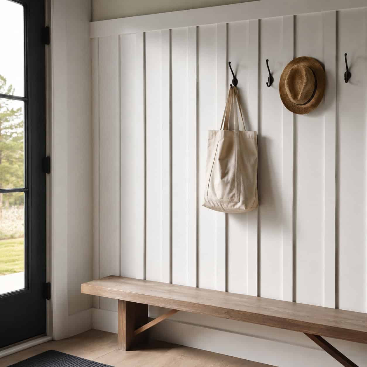
Vertical planks with narrow strips covering the seams. Simple, sturdy, honest.
It came off 19th-century barns and rural farmhouses, where the battens sealed the gaps between boards against wind and rain. It read as practical then and reads as character now.
Don’t confuse it with wainscoting or shiplap. Wainscoting is horizontal frames-and-panels. Shiplap runs sideways. Board-and-batten stands up straight, and that verticality makes a wall feel taller.
Run it full height in an entry. Cap it at chair-rail height in a mudroom. It holds up either way.
10. Coffered Ceiling
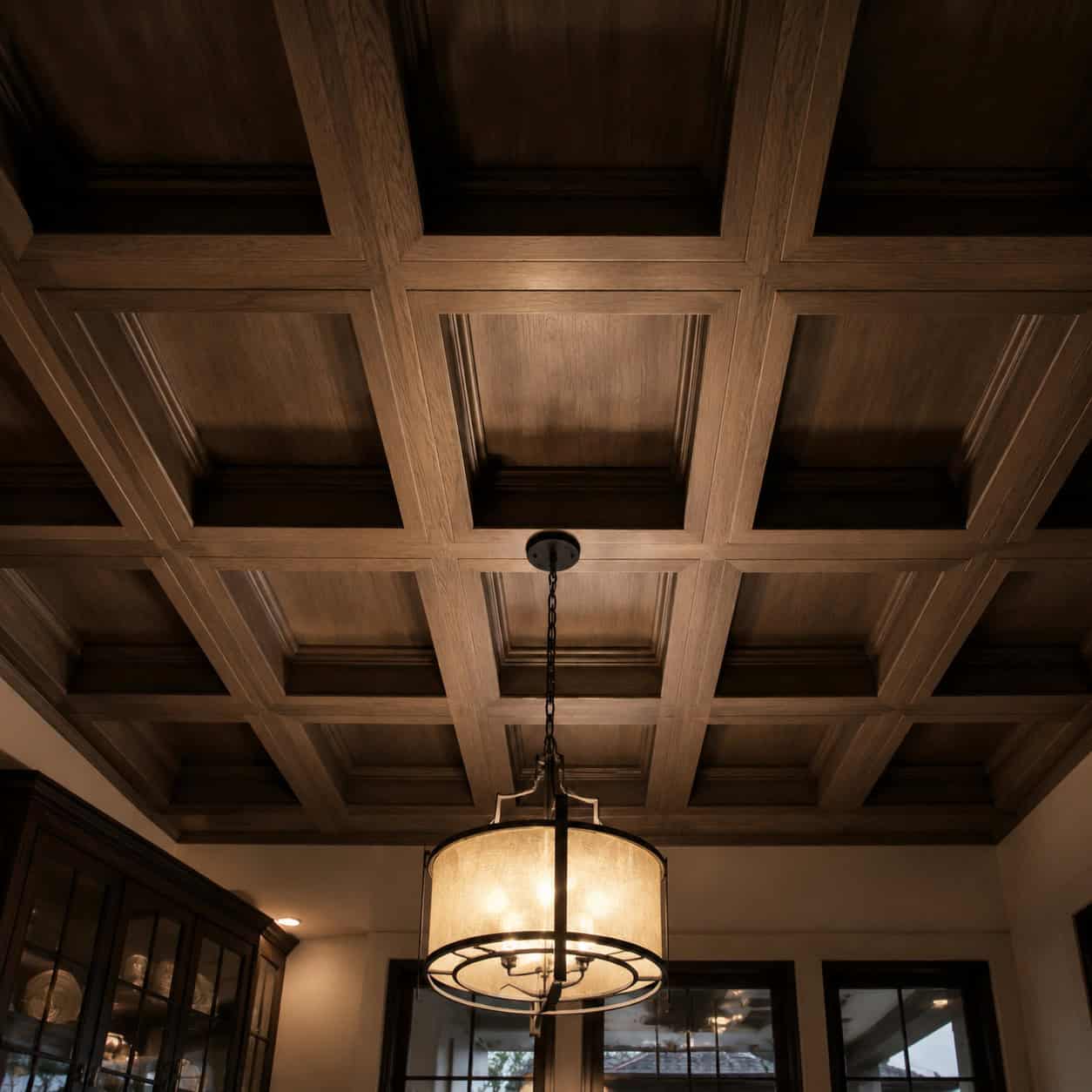
Look up. Most ceilings are a blank white nothing.
A coffered ceiling breaks that plane into a grid of recessed panels, a trick the Romans used in their grandest buildings and American builders revived in the big rooms of the 1890s through the 1920s.
The grid adds depth and shadow overhead and signals craftsmanship the second you notice it. It’s the kind of detail that makes a room feel considered.
You need the ceiling height to pull it off — under eight feet it starts to feel low. But over a dining table or in a study, it turns the fifth wall into the best one.
11. Built-In Bookshelves
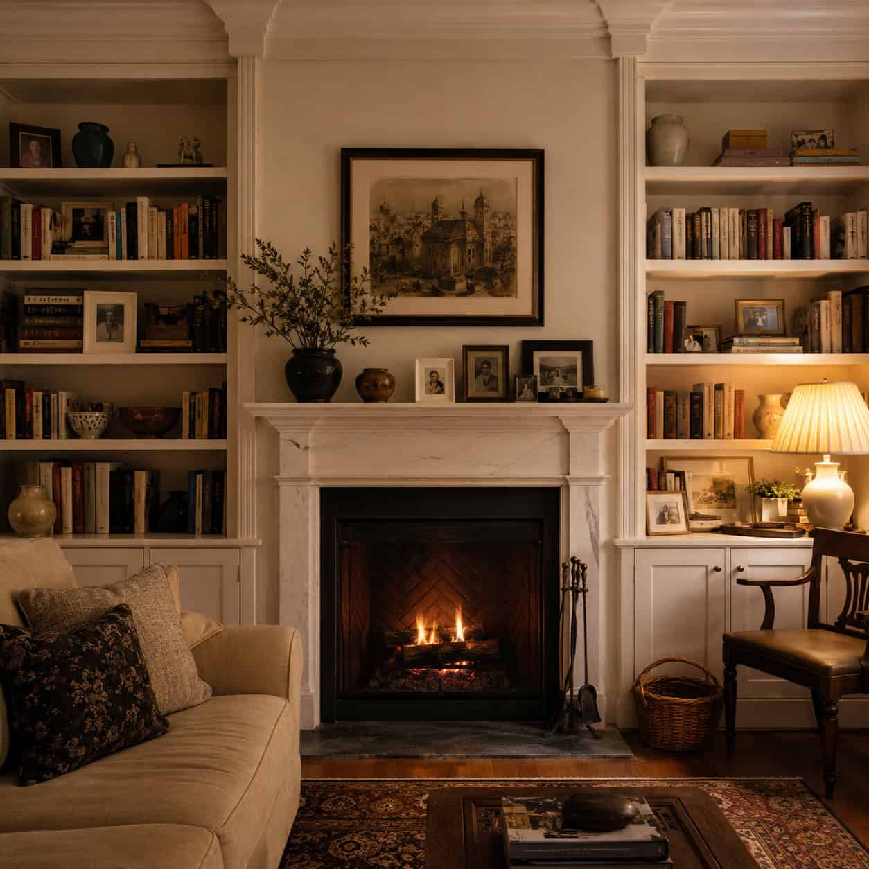
Designers call them a blank canvas that grows with the owner.
Built-ins flanked the fireplaces of grand home libraries from the 1800s on, and they’ve never looked stuck in a decade because you restyle them every time you rearrange the books. Objects change. The frame stays.
A shelf full of books, photos, and odd little finds is a diary of a life. That’s a level of personal you can’t buy in a furniture store.
They also solve the floating-shelf problem. Built-ins look intentional and permanent instead of tacked on. House Beautiful lists them among the design choices that never date, and it’s hard to argue.
Building your own opens up plenty of custom shelf ideas without custom-shop prices.
12. Window Seat
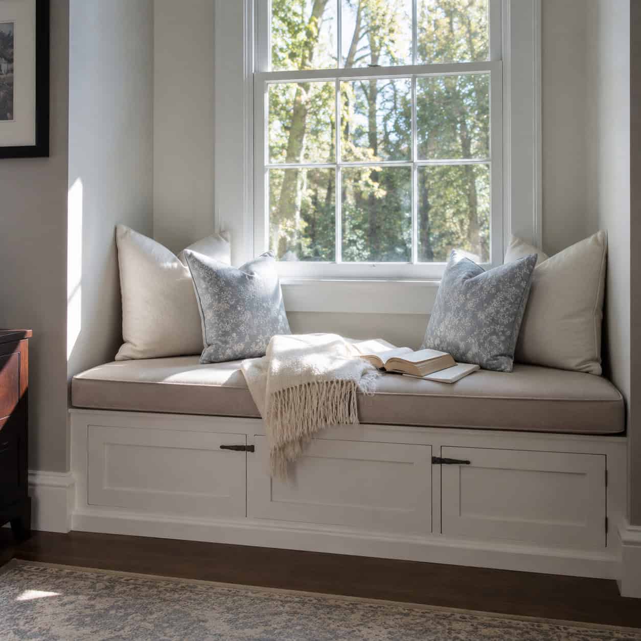
Tuck a bench into a window alcove and you’ve built the coziest spot in the house.
The window seat runs back to medieval and Victorian bay-window tradition, when people arranged the good daylight into a place to actually sit. New builds skip it because it’s custom work, which is exactly why it never feels dated.
Put a hinged lid on it and the base becomes storage. Cushion the top and it becomes a reading nook, a nap spot, a place for the cat to run the household.
It’s one of those DIY projects that pays back every day you live with it.
13. Bay Window
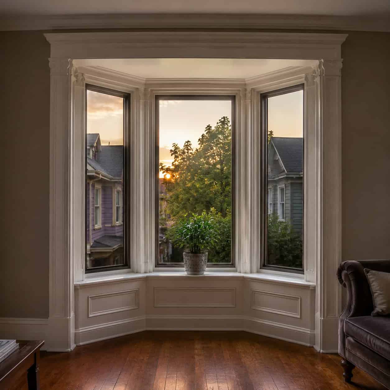
A bay window does three things at once. More light, a wider view, and a bump of extra floor.
It’s a Victorian signature, and it’s been read as “quality architecture” in every era since. The projection catches morning and evening light a flat wall never could.
Pair it with the window seat above and you’ve got the single most-loved corner in most old houses.
Modern builders leave it out to save money on framing and flashing. That’s the whole reason it still feels special.
14. Brick Fireplace with a Wood Mantel
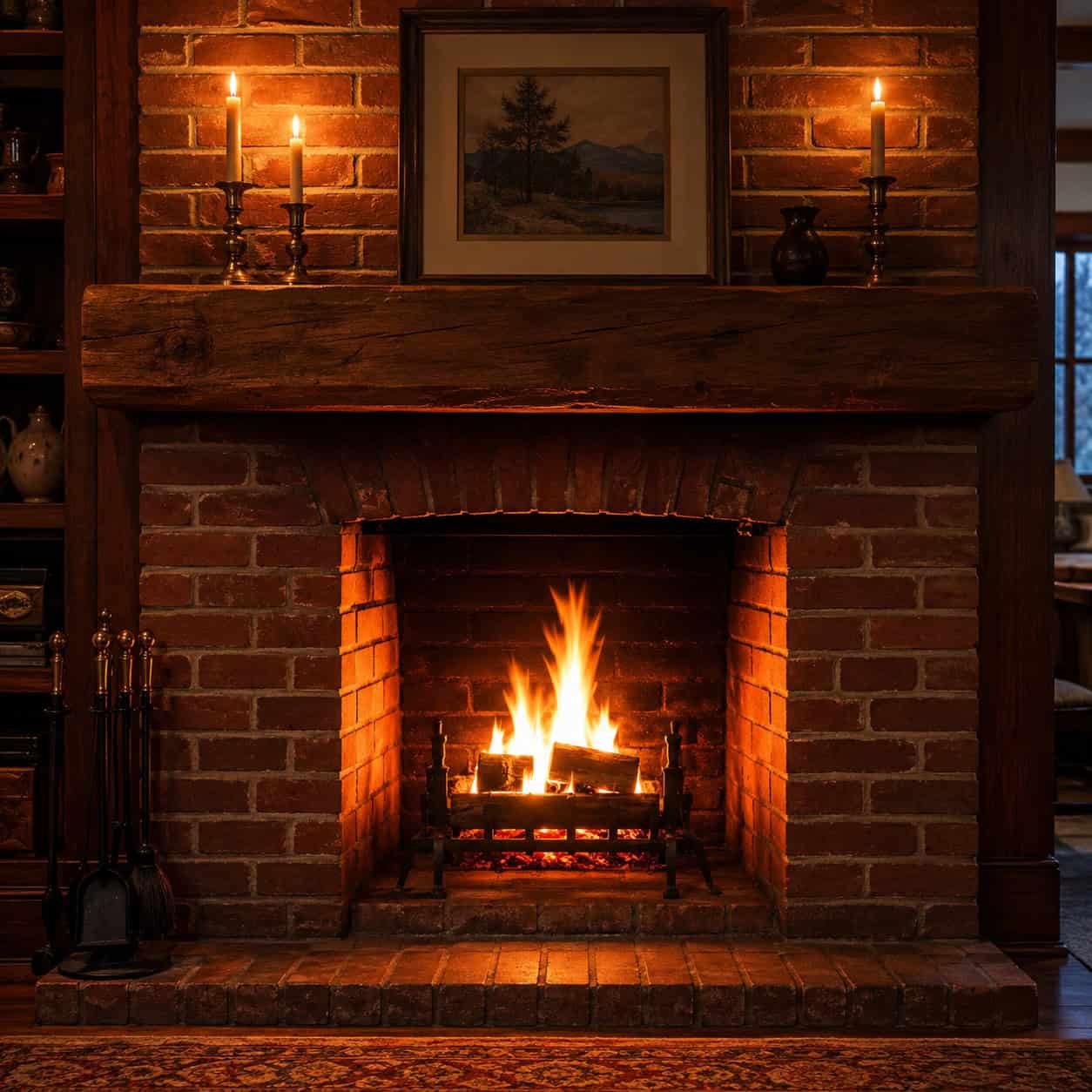
Somebody once called the fireplace the first piece of furniture in a house. The room gets arranged around it before anything else moves in.
For centuries the hearth was the literal center — heat, cooking, light, the place everyone drifted toward. Even when it stopped being the furnace, it stayed the emotional core.
Brick and a solid wood mantel move from cottage to modern to farmhouse without a hitch. That flexibility is the entire timeless argument in one feature.
If you don’t have one, a convincing DIY fireplace that looks completely real can anchor a room almost as well. And the mantel itself is a satisfying weekend build. What a fireplace’s design reveals about your home is more than most people realize.
15. Unlacquered Brass Hardware & Fixtures
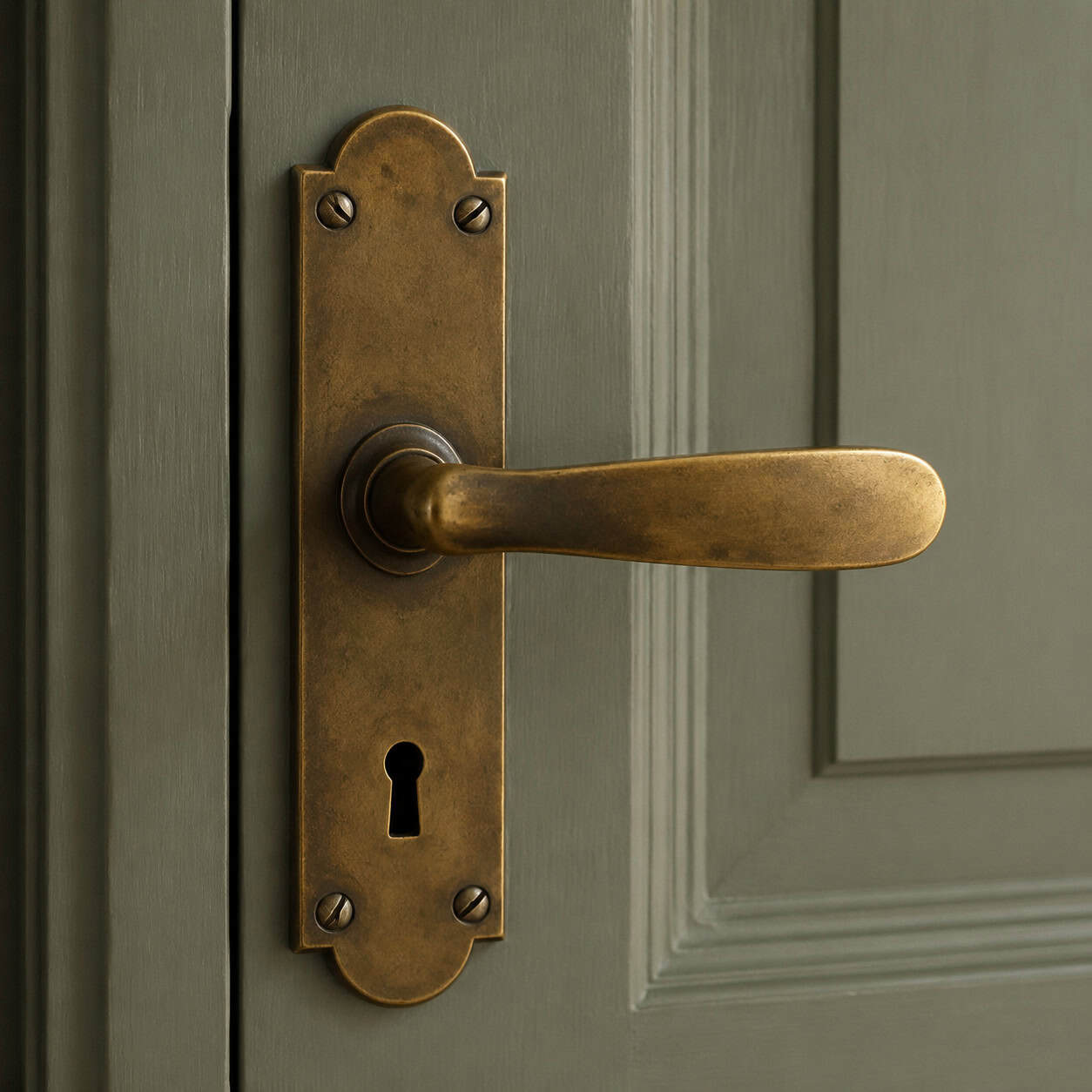
Trend finishes look dated the moment they fall out of fashion. Oil-rubbed bronze in 2008. Brushed nickel forever. Matte black right now.
Unlacquered brass plays a different game. It’s raw metal with no protective coating, so it keeps aging — darkening, developing wear at the touch points, picking up a living patina.
It’s designed to look better with time, not worse. That’s the opposite of a finish that peels or dulls into looking cheap.
Turn-of-the-century homes were full of it: door knobs, latches, faucet handles worn shiny where hands landed for a hundred years.
If you want shiny and even forever, this isn’t it. If you want a fixture that earns its look, it’s the only real choice.
16. Neutral Paint Palette
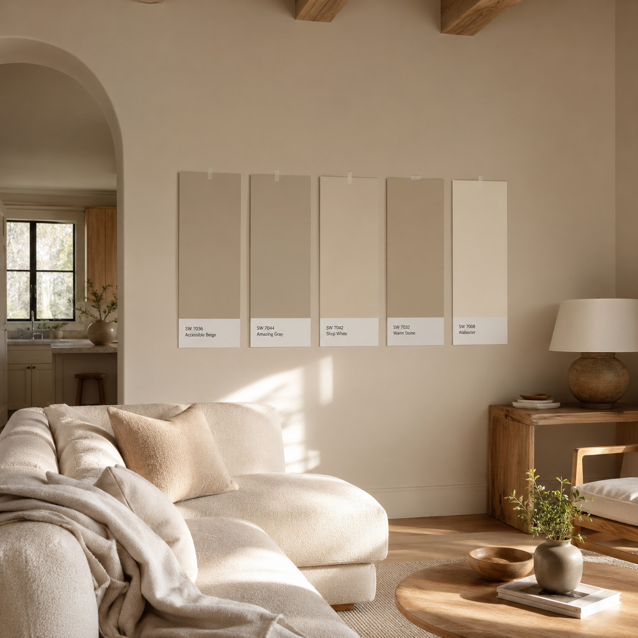
This is the connective tissue for everything else on the list.
Whites, creams, greiges, soft earth tones — they don’t shout, so they let the oak, the brass, and the stone do the talking. And they let a room evolve without a repaint every time you change the couch.
The National Association of Realtors has noted that homes with classic, neutral upgrades sell faster and pull stronger offers than trend-forward ones. Buyers can picture their own life in a neutral room. They can’t in a lime-green one.
Warm neutrals age better than cool grays, which already look a little 2015. Test big swatches on the actual wall and watch them at morning and night before you commit.
Outlets like Refine Place keep coming back to neutral as the safest twenty-year bet in a whole-house renovation.
17. Freestanding / Clawfoot Tub
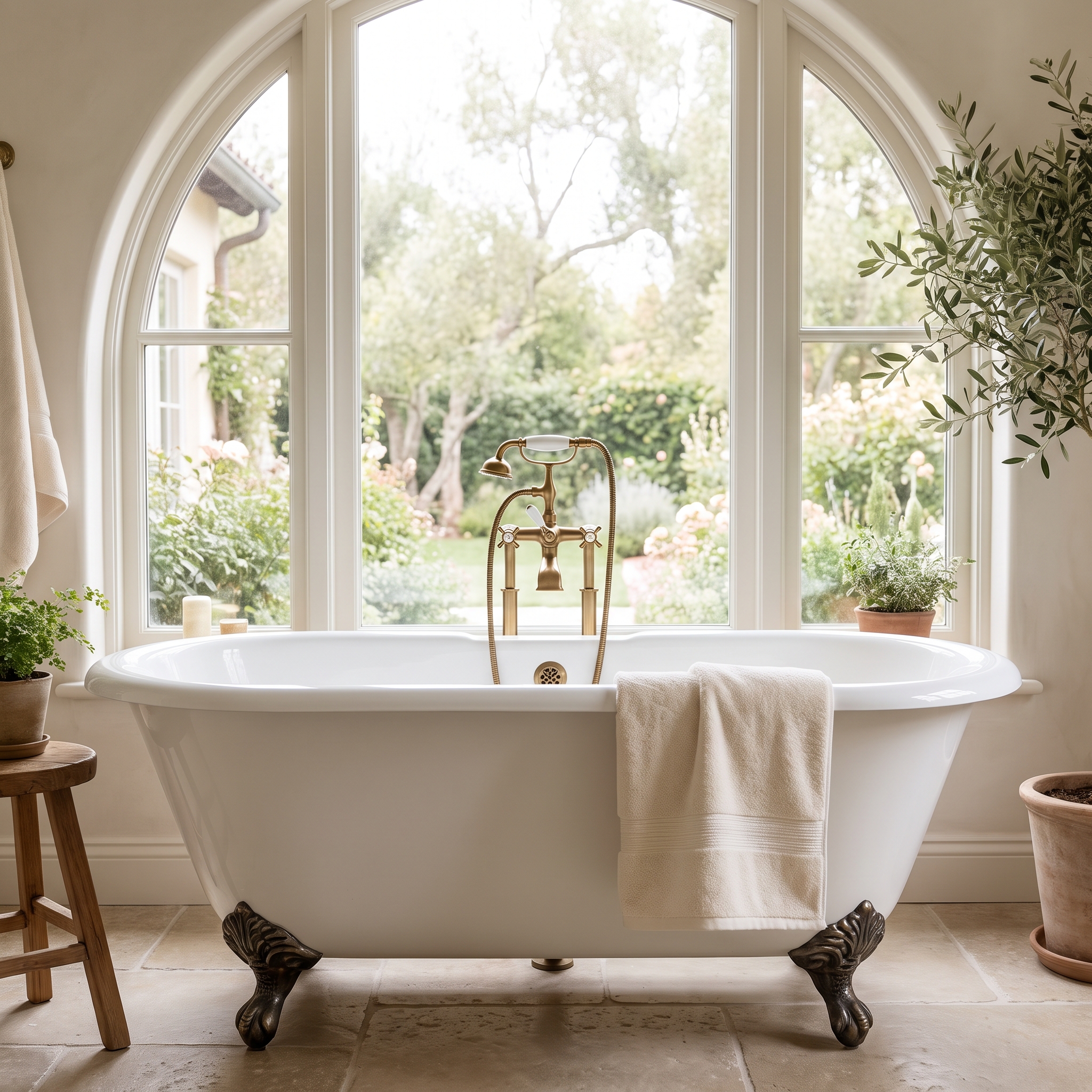
The original luxury bath fixture. And still the one buyers gasp at.
The clawfoot tub arrived in Victorian bathrooms in the late 1800s, when a deep cast-iron soaking tub raised up on ornate feet was the height of indoor plumbing. It’s the centerpiece a spa-style bathroom gets built around.
You’ve got real material choices, and they change the experience.
- Cast iron holds heat the longest and feels substantial, but it’s heavy enough to need a reinforced floor
- Acrylic is light and cheap to install but loses heat fast
- Copper and solid-surface stone land in the premium, sculptural middle
The install detail people forget: a freestanding tub needs floor-mounted plumbing, and running supply and drain up through the slab or joists is where the cost hides. Budget for the rough-in, not just the tub.
A true cast-iron clawfoot can also be re-glazed instead of replaced. A salvaged one, stripped and refinished, often beats anything on a showroom floor — and it’s the detail that makes the whole room read as “real bathroom, not builder box.”
Set it under a window with good light and it stops being a fixture and starts being the reason people want the room.
18. True Divided-Light Wood Windows
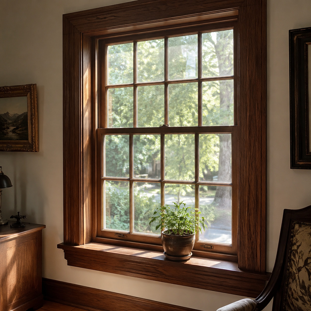
Multi-pane sash windows — real muntins dividing real glass — give a facade proportion that vinyl can’t fake.
Prewar homes had them everywhere. The grid of small panes wasn’t decoration; glass used to come in small sheets, so windows were assembled from many. That constraint produced a look we now read as instantly classic.
The modern debate is restore versus replace, and it’s not as simple as the window salesmen make it sound.
An original wood window, properly restored and paired with a good storm window, can match or beat a cheap vinyl replacement on efficiency — and it’ll last another century, where the vinyl unit fails in twenty and can’t be repaired. The U.S. Department of Energy points out that air sealing and weatherstripping drive most of the real savings, and both are fully doable on old sashes.
Where you do replace, look for wood or wood-clad windows with true or simulated divided lights, not snap-in plastic grilles floating between panes. The difference shows from the curb.
Some efficiency upgrades even qualify for federal help — worth checking the current list at ENERGY STAR before you buy. Cheap windows are one of the shortcuts modern builders take that old builders would never have allowed.
19. Plantation Shutters
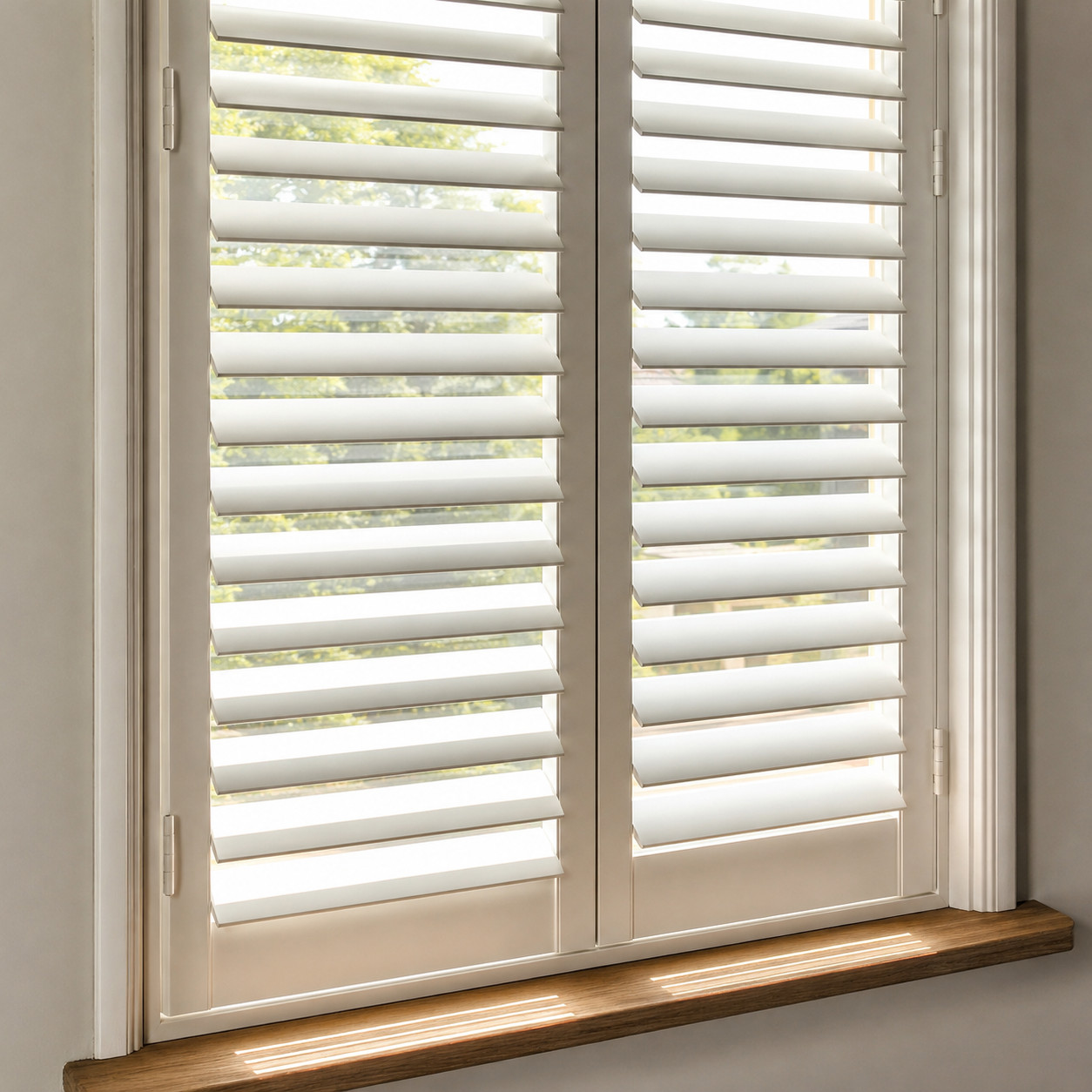
Fabric drapes fade, sag, and go out of fashion. You replace them.
Louvered wood shutters don’t. They’ve been mounted inside windows since the antebellum South, and they’re built into the architecture instead of hung off it.
Tilt the louvers for privacy without killing the light. Fold them open for the full view. They flatter a period home and a modern one equally.
They’re a permanent answer to a temporary problem — the opposite of trend-driven blinds you toss every few years.
20. Front Porch
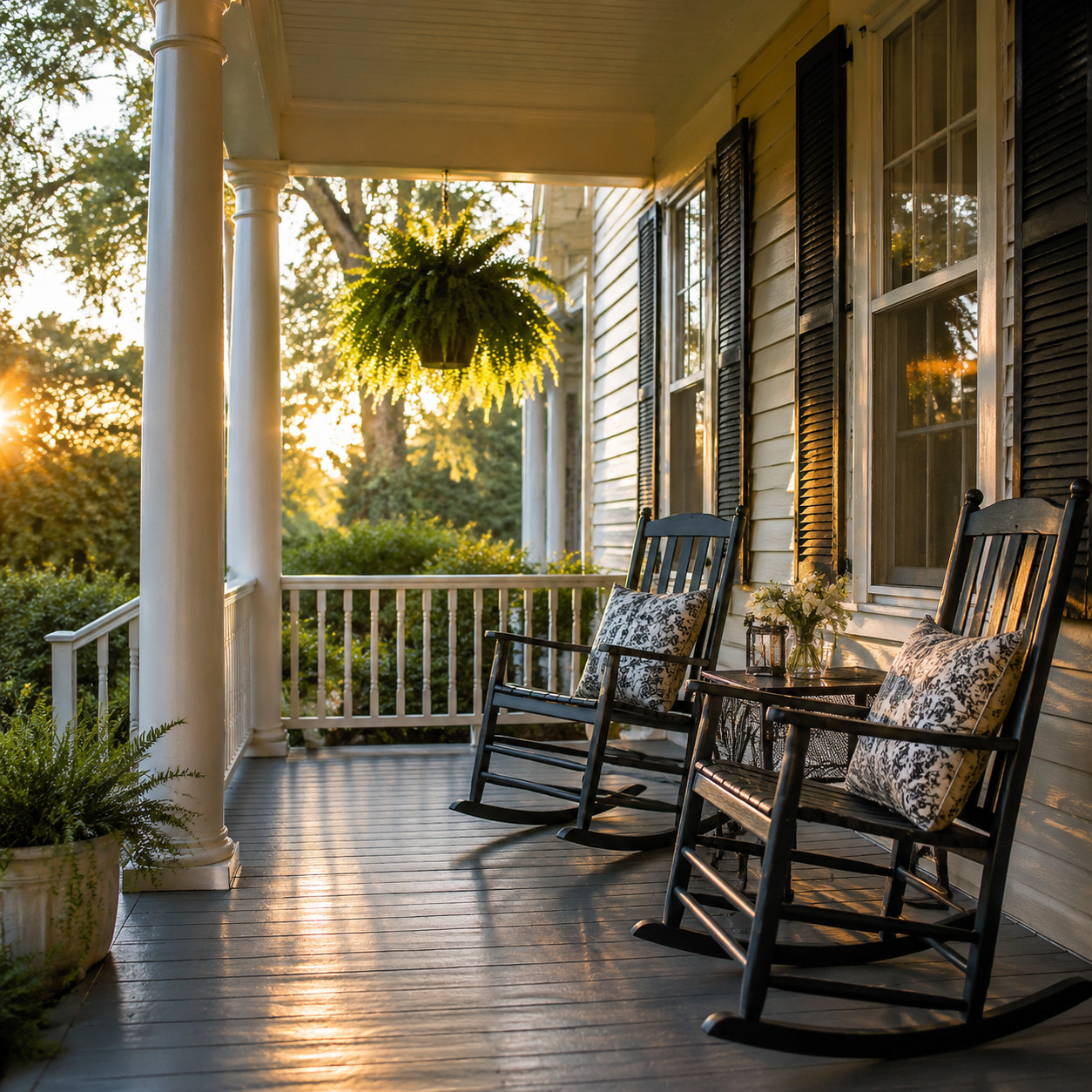
The front porch defined American homes from the Victorian era through the 1940s, and it was never just curb appeal.
It was social architecture. A place to sit in the evening, wave at neighbors, let kids play within earshot. The house met the street there.
Air conditioning and television pulled everyone inside, and builders quietly dropped the porch to save square footage. But a covered porch, or even a proportional entry with sidelights and a transom, reads as timeless every single time.
It’s the feature people describe when they say a house has “good bones,” even if they mean the way it makes them feel. As Refine Place frames it, the enduring choices are the human ones — and nothing is more human than a place to sit out front.
21. Solid Wood Front Door with Sidelights & Transom
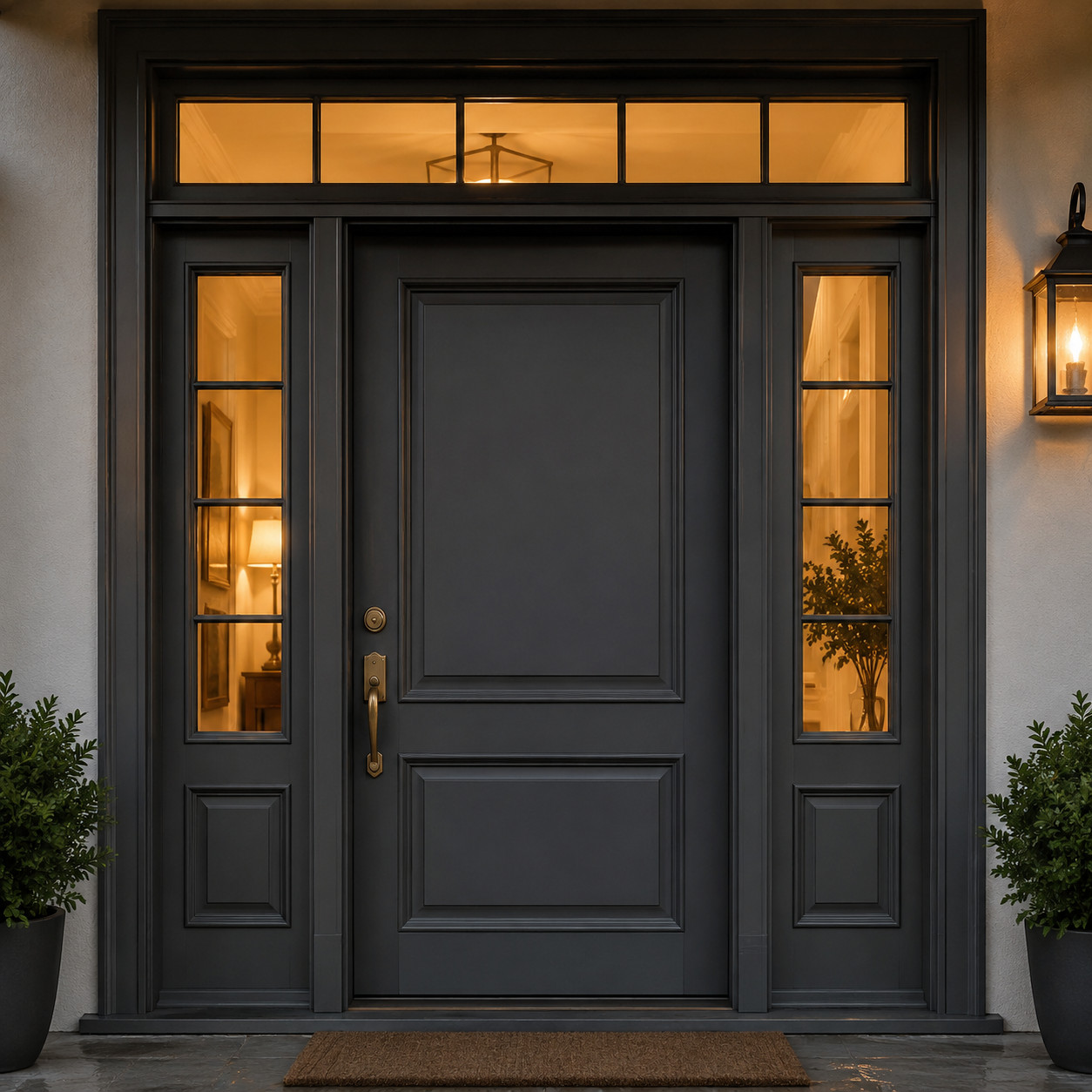
The front door is the highest-impact first impression a house has. Everyone touches it. Everyone judges it.
Federal and Colonial homes got the proportions right: a substantial solid door, flanked by sidelights, capped with a transom to pull daylight into the entry hall. That framing makes even a modest doorway feel important.
It also happens to be one of the best returns in all of remodeling. A steel or solid entry-door replacement recoups well over 200% of its cost at resale, according to remodeling data compiled by Amerisave. Classic done right literally pays you back.
The mistakes to avoid are the trendy ones — a wild color, a bargain fiberglass slab that reads hollow, hardware that doesn’t match the era of the house. Go substantial, go simple, and let the sidelights and transom do the work.
Solid wood over a hollow core also sounds different when it closes. That heavy, quiet thunk is the sound of quality, and buyers register it without knowing they did. The way a front door tells you when a house was built is a whole language of its own.
22. Insulated Garage Door Matched to the Façade
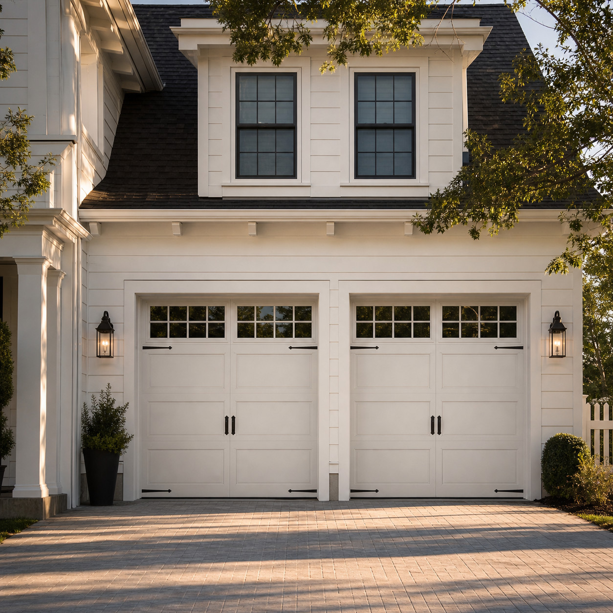
This is the strongest resale closer on the entire list, and almost nobody gets excited about it.
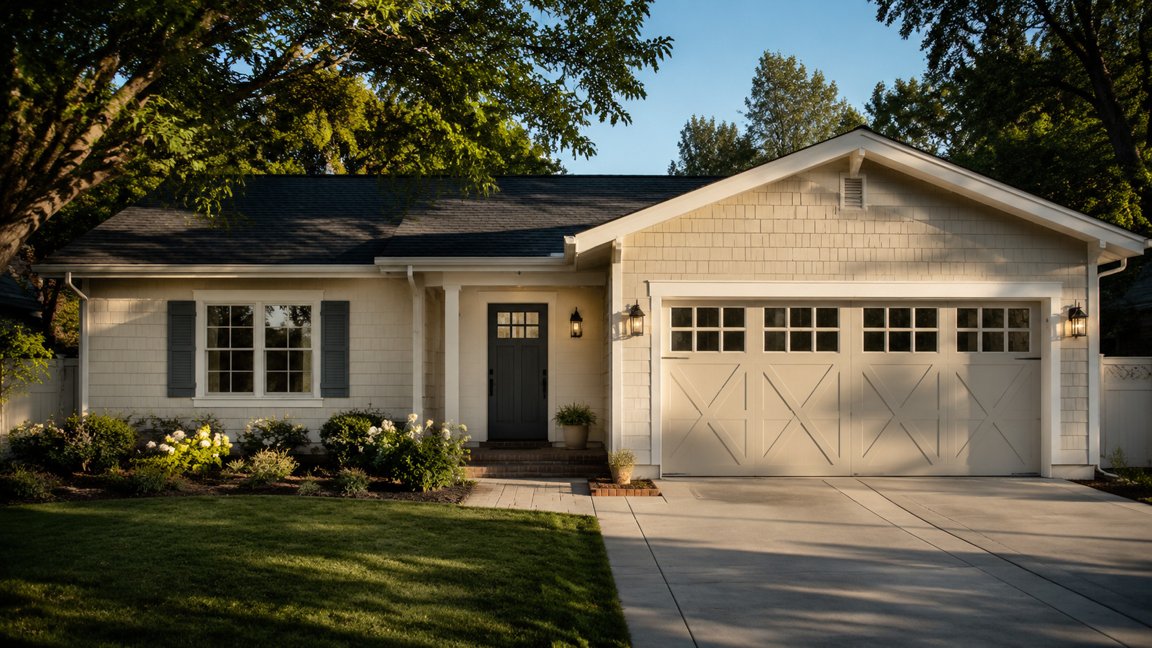
Garage door replacement has repeatedly topped the cost-versus-value rankings, recouping somewhere in the range of 194% to 268% of what you spend, per remodeling figures gathered by Angi. There is no other single upgrade with numbers that reliable.
On many houses the garage door is the biggest single element on the front of the home — sometimes a third of the whole facade. A dated, dented, hollow door drags everything down with it.
The timeless principle is the point. A door that quietly matches the house — carriage-style on a traditional home, clean flush panels on a modern one — always beats a flashy one fighting the architecture.
Insulation earns its keep too. A polyurethane-core door with a decent R-value keeps an attached garage from bleeding heat into or out of the house, and it closes with a solid, muffled sound instead of a tinny rattle.
Match the color to the trim, not the front door, so it recedes instead of shouting. The best garage door is the one nobody consciously notices — they just think the house looks right.
23. Chair Rail & Picture Molding
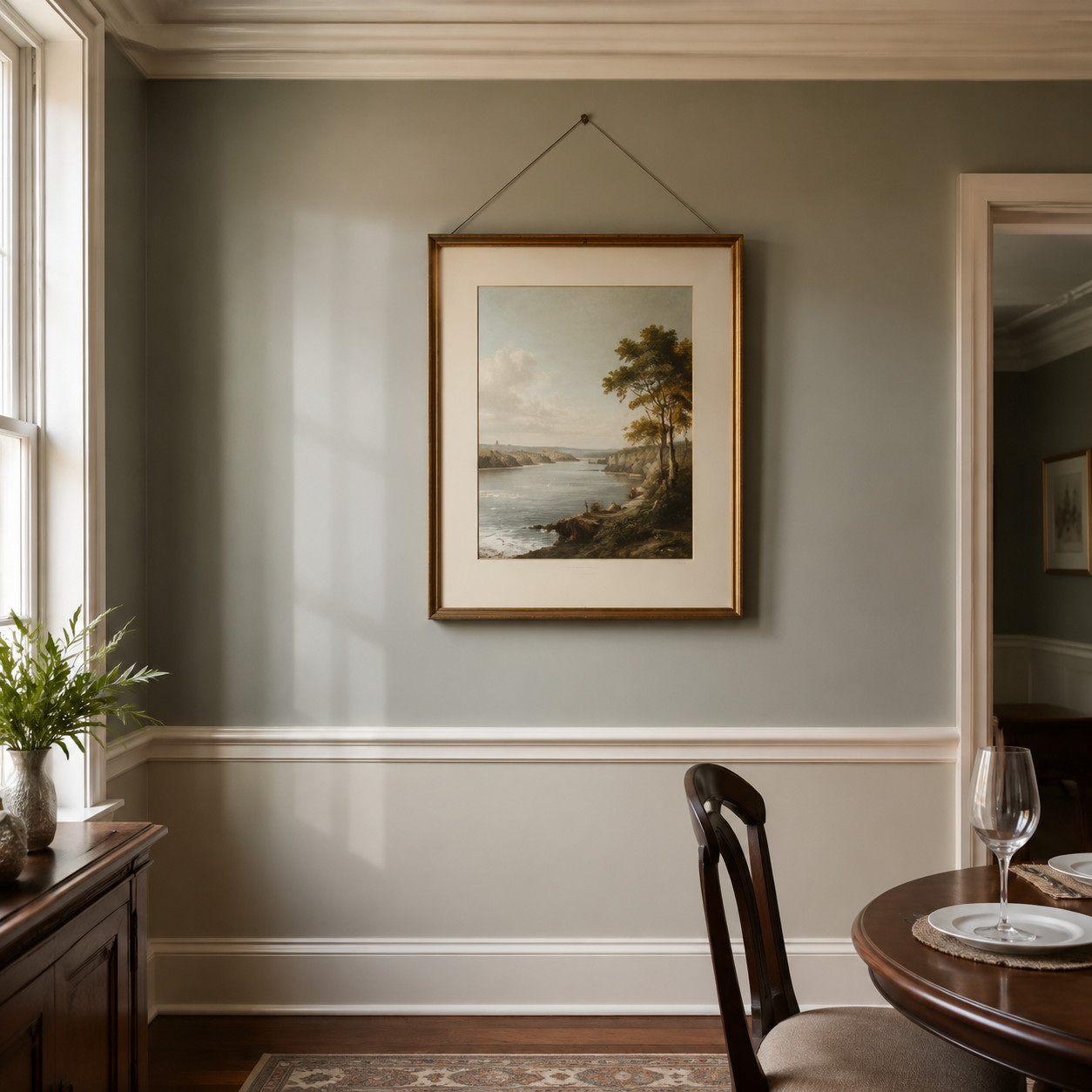
Georgian and Victorian dining rooms ran a horizontal rail around the room at about chair-back height. Practical origin: it kept chairs from gouging the plaster.
Picture molding sat higher, a rail you hung artwork from with hooks and wire so you never punched holes in the wall. Both details quietly organize a wall into pleasing proportions.
They pair naturally with wainscoting below or a painted band between the rails. Restrained, classic, and easy to add with a nail gun and a steady hand.
Get the height right — roughly a third of the way up the wall — and the room instantly looks composed.
24. French Doors
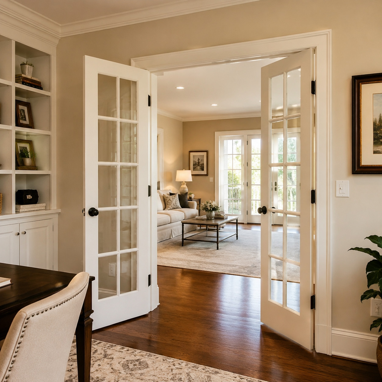
Glass panes in a wood frame, hinged in pairs, throwing light between two rooms. The French have been building them since the 1600s.
They solve a real problem: how to divide space without making either side feel closed off. Shut them for quiet, open them to connect a study to a living room or a kitchen to a patio.
The muntin grid ties them straight to the divided-light windows a few entries up. Same honest logic — real glass, real wood, real function.
Interior or exterior, they’ve never looked dated, because they were never fashionable to begin with. Just good.
25. Pocket Doors
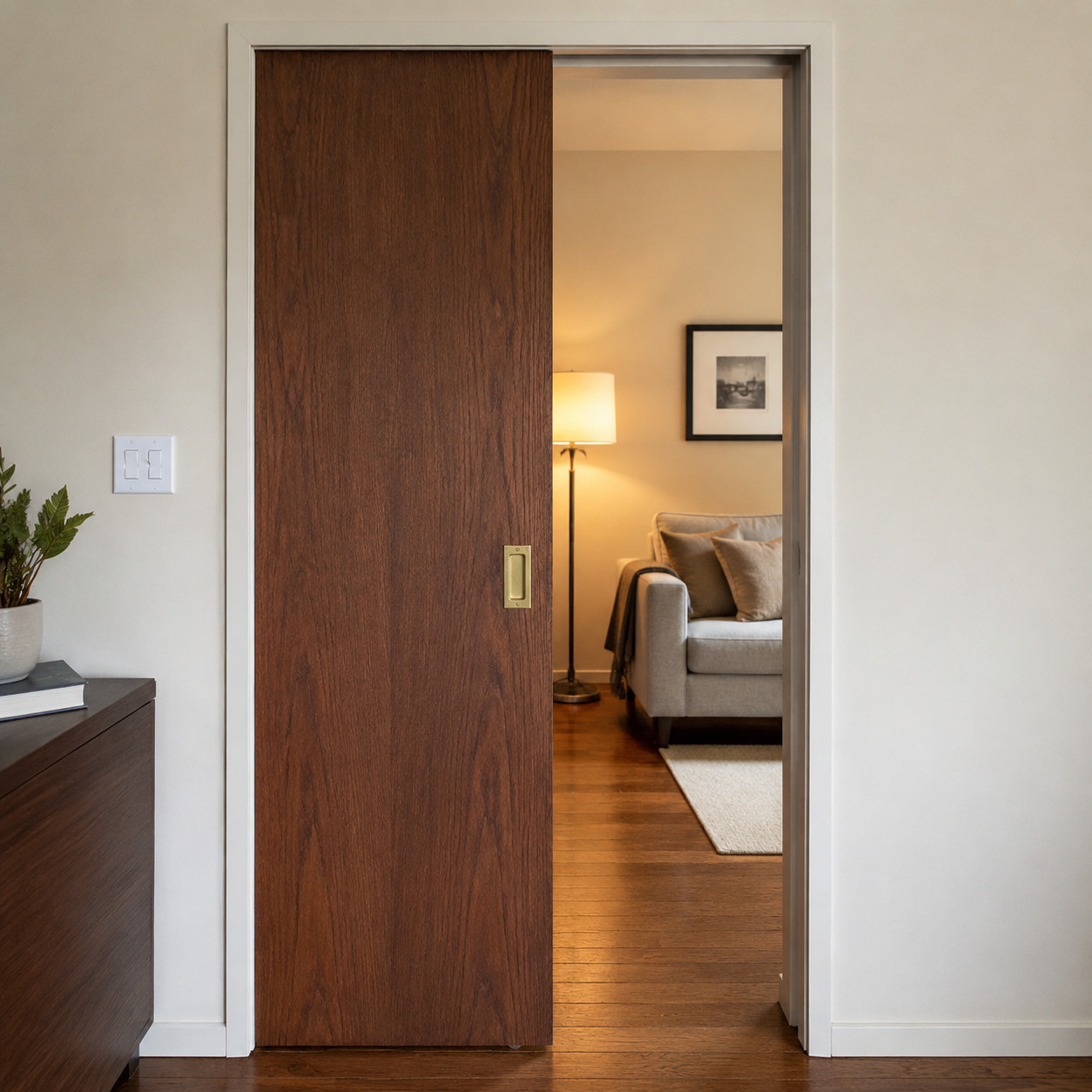
Victorian builders were clever about space. The pocket door slides into a hollow in the wall and vanishes, giving you a doorway with no swing to steal floor.
Grand old houses used them between parlors — big double pockets you could open for a party and close for privacy. They fell out of favor when builders decided the wall framing was too much bother.
They’re having a quiet revival, and for good reason. In a small bathroom or a tight hallway, a pocket door reclaims the entire arc a swinging door would waste.
Modern hardware runs smoother than the old cast rollers ever did. Done well, it’s the kind of detail that makes people wonder why every house doesn’t have one.
The Common Thread
Notice what none of these are. None of them are colors of the year. None of them depend on a specific decade to make sense.
They’re materials that age well, details that do a job, and proportions that have worked since before anyone alive was born. That’s the whole formula.
Chase trends and you’ll renovate forever. Pick the things that were already timeless and you get to stop — and just live in the house.
The oak floor doesn’t know what year it is. That’s exactly why it always looks right.