Walk into a model home and something feels off before you can name it. The square footage is fine. The layout works. But the whole place reads like a rental.
That feeling isn’t an accident. It’s the sum of two dozen tiny decisions a builder made to save eight dollars here and twenty there.
Most of them you’ve stopped seeing. They’re so common your eye treats them as normal — the domed light, the skinny trim, the carpet that came with the house.
None of these are expensive to fix. A few cost nothing but a screwdriver and an afternoon. And almost all of them punch far above their price.
Here are 25 cheap details quietly dragging a house down — and what to do about each one first.
1. The “Boob Light” Flush-Mount Ceiling Fixture
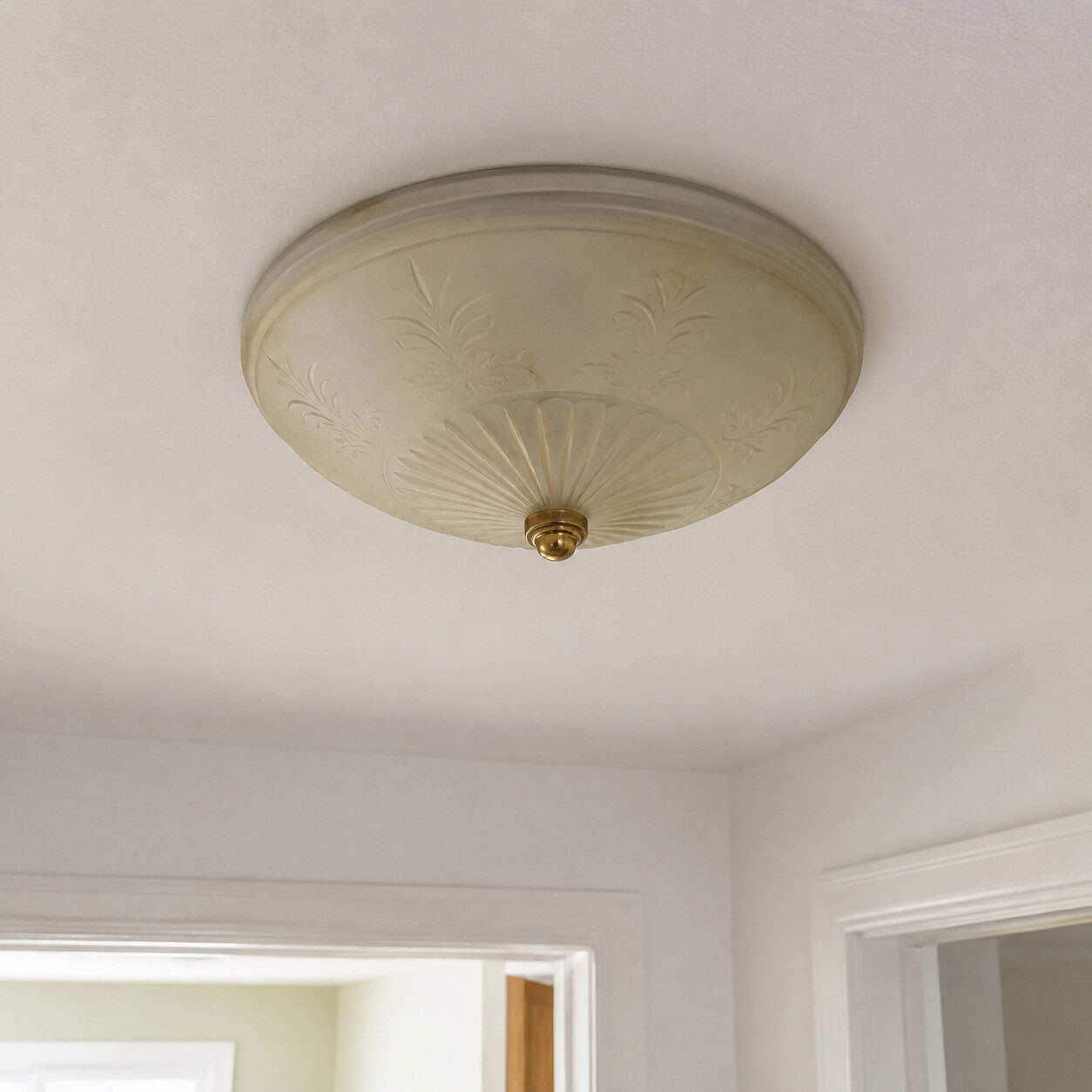
You know the one. A frosted glass dome screwed flat to the ceiling, usually with a little brass nipple in the center.
Designers call it out before anything else in a room. It’s the single most recognizable builder shortcut in American housing.
The fix is almost insultingly easy. A flush or semi-flush fixture with some shape and a real finish runs under $100, and a confident DIYer can swap one in fifteen minutes.
Do every room with one. The change is bigger than the receipt suggests.
2. Recessed Cans Doing 100% of the Lighting
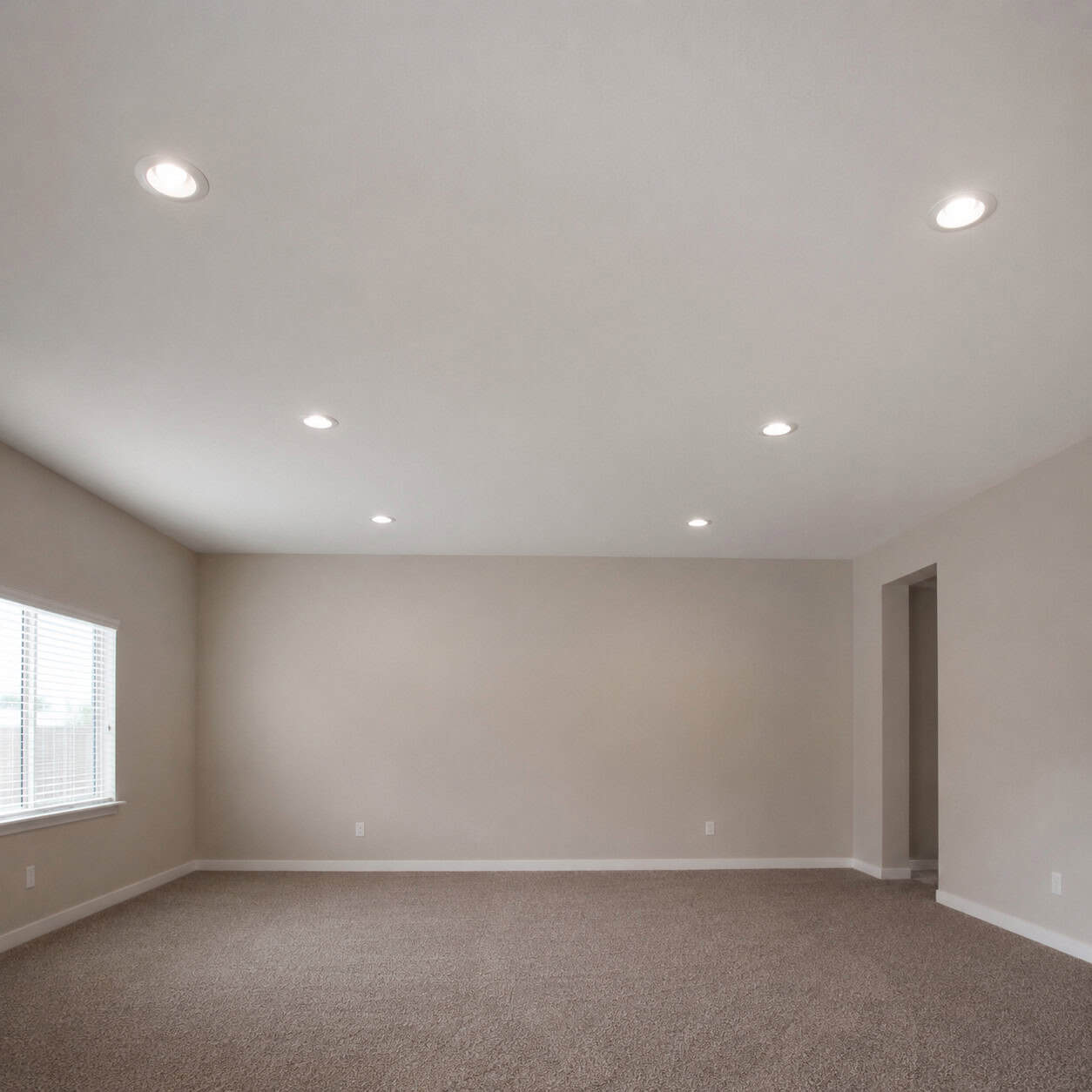
A ceiling full of recessed cans and nothing else is the lighting equivalent of fluorescent tubes. Flat, even, and cold.
Builders love cans because they’re cheap to install and check the “lit” box on the inspection. They don’t love them because they look good. They don’t.
You don’t have to rip anything out. Layer instead — a pendant over the table, sconces by the bed, a lamp in the corner, dimmers on everything.
Light from three heights makes a room feel designed. Light from one makes it feel like a parking garage.
3. Hollow-Core Slab Interior Doors
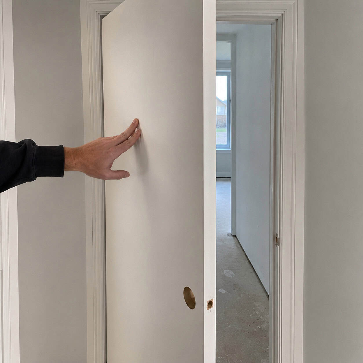
Knock on a builder-grade door. That cardboard thunk tells you everything.
Hollow-core slabs have been the standard since the 1970s because they’re light, cheap, and fast to hang. They also transmit sound through the house and feel like a movie prop in your hand.
Replacing them all gets expensive. So don’t.
Glue thin trim molding onto the flat face in a rectangle pattern and paint it, and a plain slab reads as a paneled door for the cost of a few sticks of pine. The weight gives it away, but at a glance nobody can tell.
4. Tiny Rounded “Clamshell” Baseboards
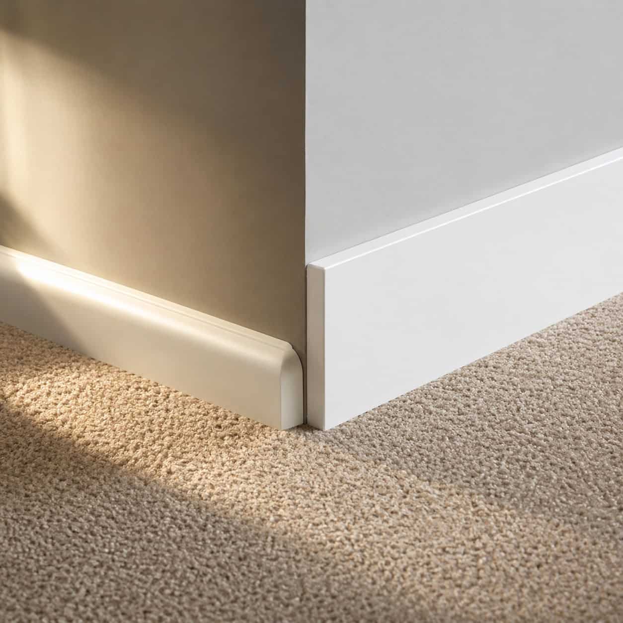
Carpenters will tell you nothing dates a house faster than a 3-inch clamshell base. That little rounded profile hugging the floor is builder shorthand for “we bought the cheapest stock available.”
Tall baseboard does the opposite. It grounds a room and makes the ceiling feel higher.
Swap to 5- to 7-inch flat stock or a length of 1×6 pine with a small cap. Paint it crisp white.
It’s the cheapest way to make a room feel like it was built on purpose.
5. Skinny, Flat Door and Window Casings
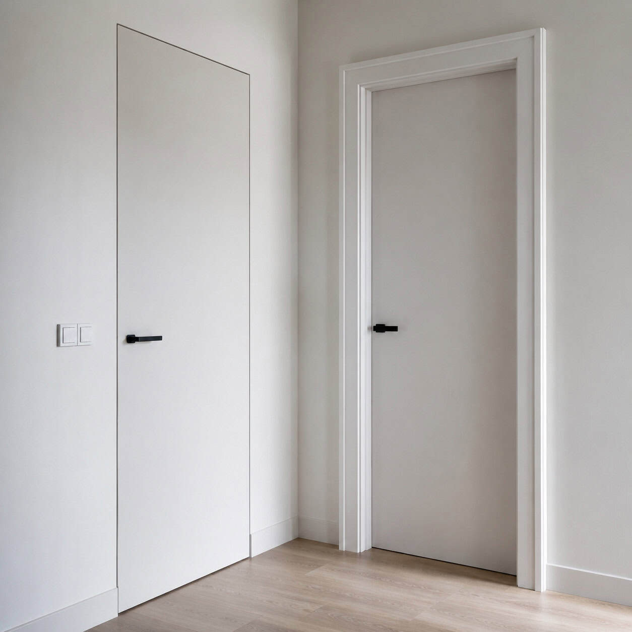
Look at the trim around a door in an old house, then around a door in a 2005 subdivision. One has shadow lines and depth. The other is a flat ribbon of MDF.
Dimensionless casing makes a whole house feel temporary, like the trim was an afterthought. Because it was.
You can build casing up instead of tearing it off. Add a backband to the existing trim, or layer a flat board with a cap to fake a milled profile.
Pound for pound it’s the biggest visual return in the house.
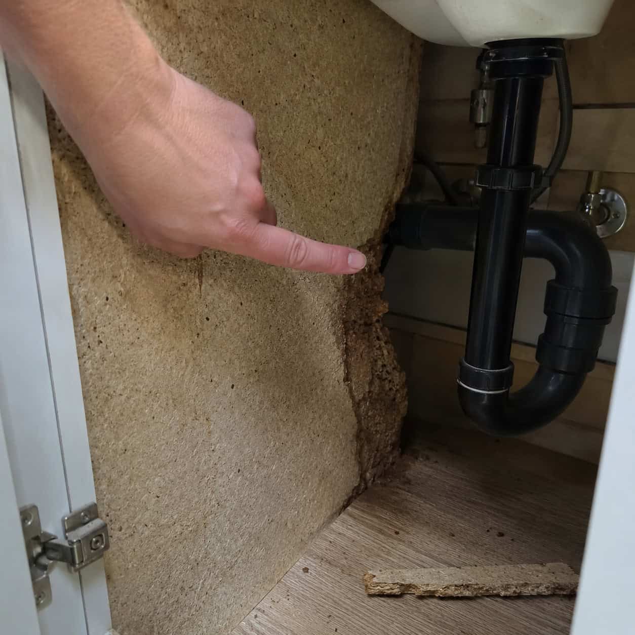
6. Bare Drywall Window Returns
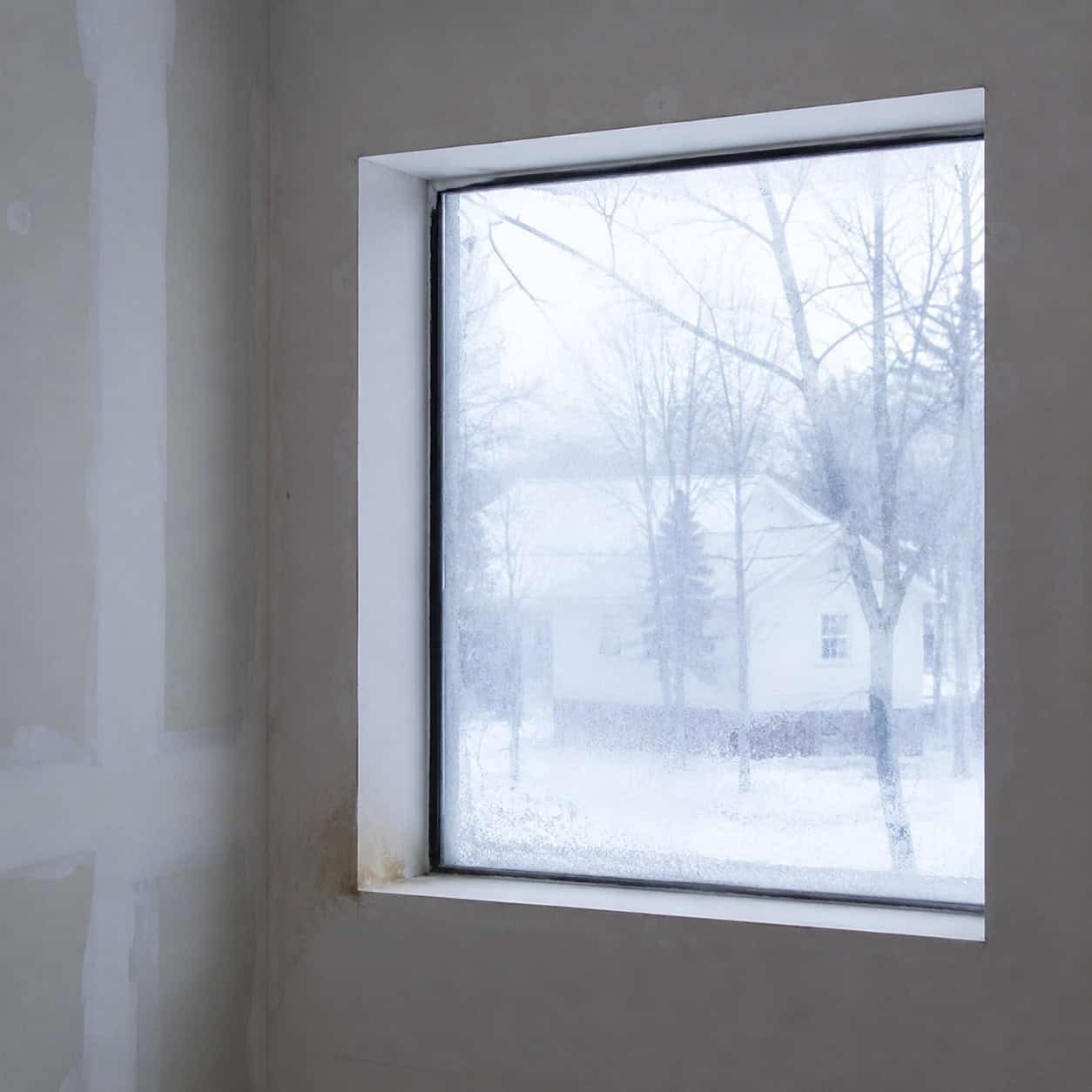
Some builders skip window casing entirely. The drywall just wraps around and dies into the glass, no wood anywhere.
It saves the builder a casing kit and an hour of a finish carpenter’s time. It also leaves the window looking unfinished in a way most people feel but can’t name.
The bigger problem is hiding underneath. A bare drywall return has no real protection where the window meets the wall — and that’s exactly where condensation collects in winter.
Drywall paper wicks moisture. Once water gets into that corner from a leaky seal or months of condensation dripping off cold glass, the paper softens, the mud crumbles, and you get staining, bubbling paint, and eventually mold in the cavity behind it.
A proper wood wrap fixes both at once. A stool (the interior sill you set a plant on), an apron beneath it, and casing around the sides give the window a finished frame and a hard, paintable surface that sheds water instead of soaking it up.
Prime and caulk the wood, and that ledge survives decades of condensation that would have quietly rotted the drywall version. It’s a quiet upgrade almost nobody notices consciously — and one of the few cheap fixes that also protects the structure.
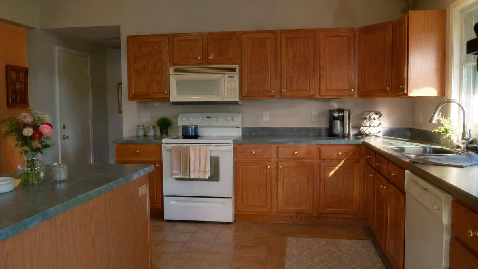
7. Shiny Builder-Brass Knobs and Cabinet Pulls
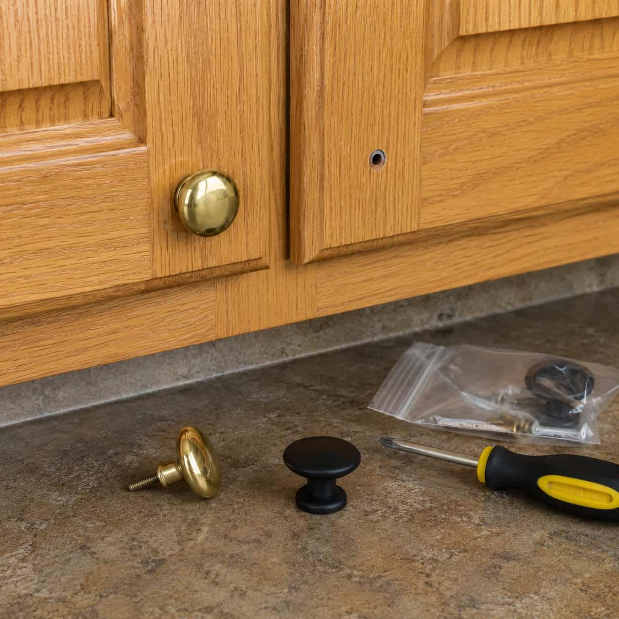
Polished brass knobs from 1989 can make a brand-new kitchen look like a thrift-store clearance rack. The cabinets might be fine. The hardware betrays them.
Hardware is jewelry for a room, and the builder gave you the plastic bin at the checkout counter.
Matte black, brushed gold, or brushed nickel — pick one and commit. A bag of knobs and pulls costs less than a dinner out.
Swap every one. It’s the textbook small change with an outsized payoff.
8. The Frameless Glued-On Bathroom Mirror
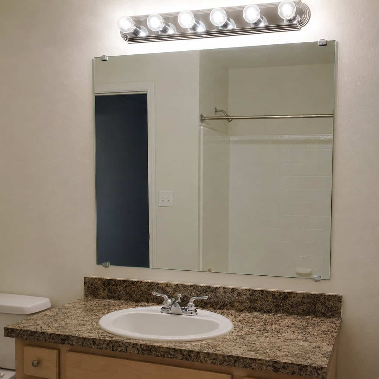
A naked sheet of glass with little metal clips at the corners. That’s the builder bathroom mirror, and it screams it.
Frame it. Build a simple wood surround that sits right over the existing glass, miter the corners, and stain or paint it.
It’s a beginner woodworking project you can finish on a Saturday. Or skip the build and hang an arched mirror in its place.
Either way the vanity stops looking like it came from a contractor’s bulk order.
9. Cabinets That Die a Foot Short of the Ceiling
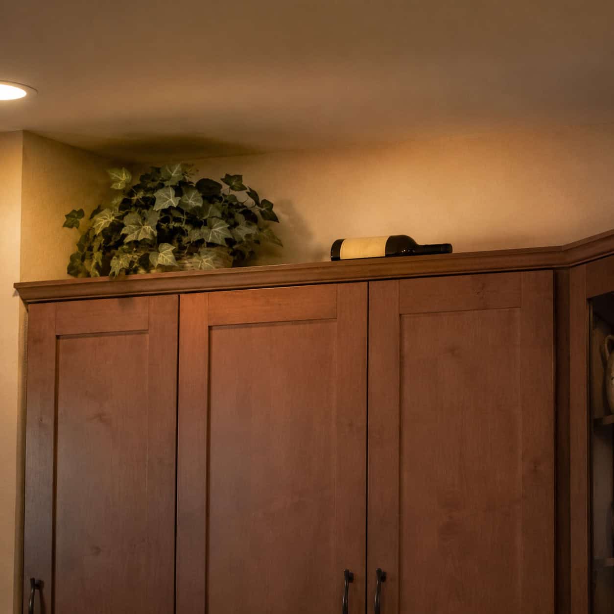
Upper cabinets that stop a foot below the ceiling leave a dead zone up top — the spot that collects dust, fake plants, and a wine bottle nobody will ever open.
That gap brings the eye down and makes a kitchen feel squatty. It also reads as cabinets pulled straight off the big-box sales floor, because that’s what stock heights are.
Close it. Add a stacked row of smaller cabinets, run trim and crown up to the ceiling, or build a soffit panel to fill the void.
Take the cabinetry to the ceiling and the whole room grows.
10. The Exposed Square Laminate Countertop Edge
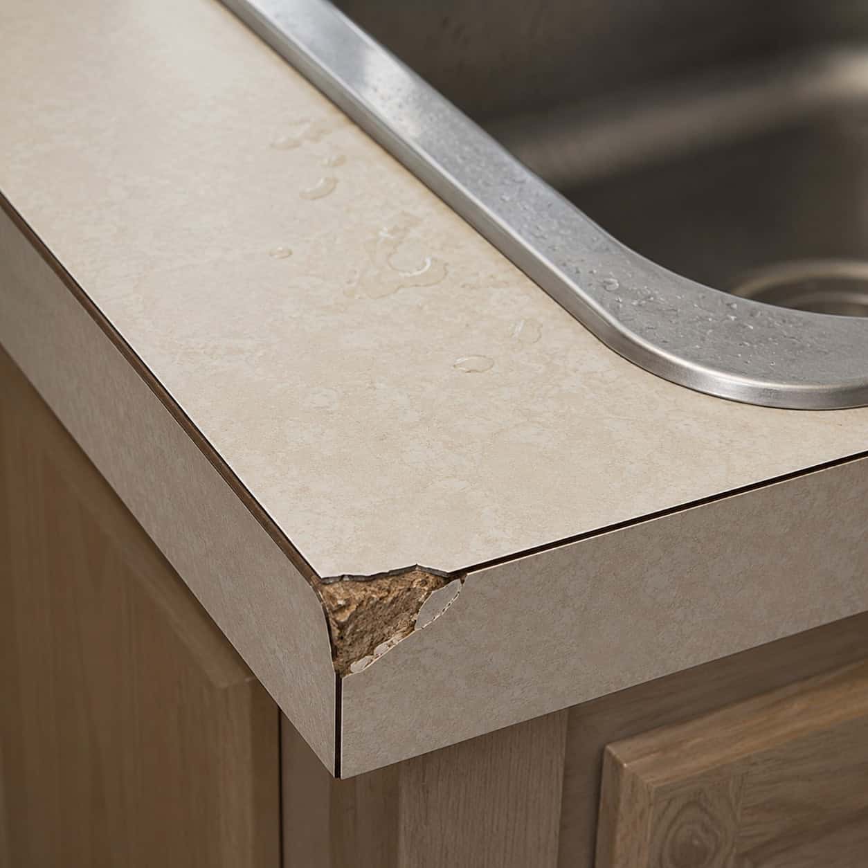
Laminate gets a bad rap it doesn’t fully deserve. At $25 a square foot it can look custom — or it can look cheap. The edge profile decides which.
A square, exposed edge with a brown seam line running along the front is the dead giveaway. It dates a kitchen the instant you walk in.
But the bigger issue is what that exposed edge does over time. Laminate is a thin printed surface glued to a particleboard core, and the front edge is the most vulnerable spot in the whole counter.
Every dropped knife, every chip, every splash at the sink works water toward that seam. Once moisture reaches the particleboard underneath, it swells like a sponge, the laminate lifts at the edge, and there’s no fixing it — the substrate is ruined.
A post-formed counter wraps the laminate over the front edge in one continuous curve, so there’s no seam for water to find. Better still, a hardwood edge band glued and finished over the front gives you a real wood lip that takes abuse and seals out moisture.
It costs little and solves two problems at once — the cheap look and the chip-and-swell failure that ends most laminate counters early.
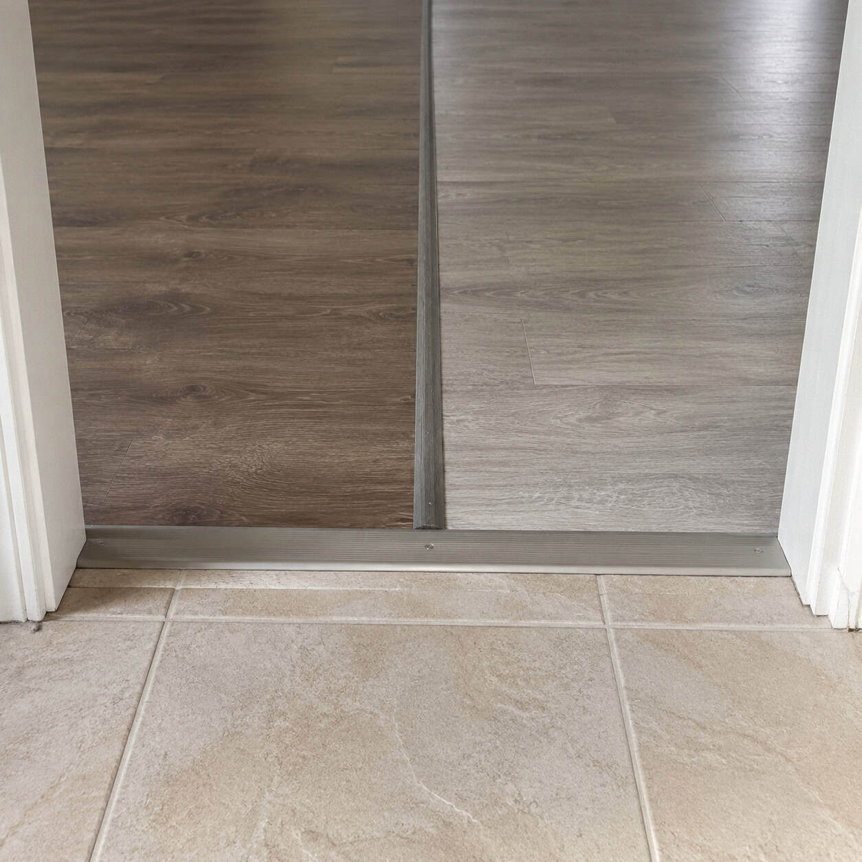
11. Printed “Wood” Vinyl Plank and Laminate Floors
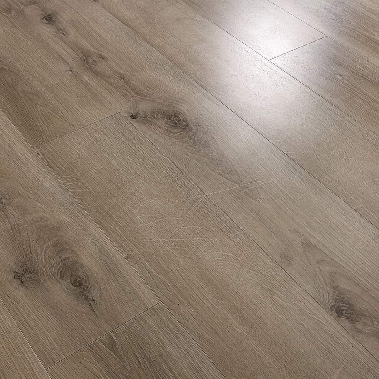
The fastest-growing flooring in America is a photograph. A high-res printed image of oak, sealed under plastic, clicked together over foam.
New, it can fool you. Live on it a while and the seams show.
The pattern repeats every few planks once you start noticing — the same knot, the same streak, over and over. It scratches under chair legs and dog nails. And it has a hollow tap underfoot that no amount of marketing hides.
Real nailed-down hardwood costs more and lasts a century. A printed floor is a photo of the real thing, and your ears know the difference even when your eyes don’t.
12. Different Flooring in Every Room
Laminate in the hall. Tile in the kitchen. A different vinyl in the bedroom. Carpet on the stairs.
This is what a house looks like after years of phased fixes, and it reads as exactly that. Every threshold becomes a hard visual stop that chops the home into disconnected boxes.
One material running throughout makes a small house feel bigger and a big house feel intentional. If replacing everything isn’t in the budget, unify what you have with large rugs that bridge the transitions.
Cohesion is cheap. Chaos is what came with the house.
13. Wall-to-Wall Bargain Carpet
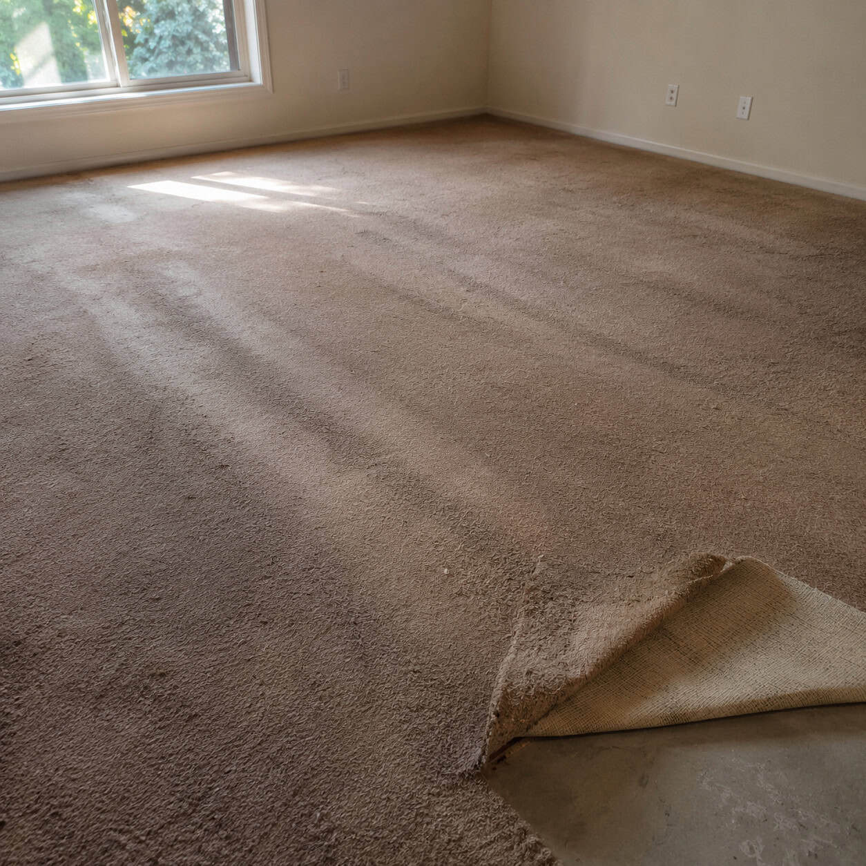
Builders save real money laying cheap carpet, and it’s the first thing pros tear out. Thin pile, a pad like a paper towel, a color chosen to hide dirt rather than look good.
It mats down in the traffic lanes within a year. By year three it’s holding the history of every spill.
Plank or hardwood underneath usually costs less than another full re-carpet over a decade. Pull it.
If you keep carpet anywhere, keep it in bedrooms and put something hard everywhere a chair scrapes.
14. Vertical Blinds on the Windows
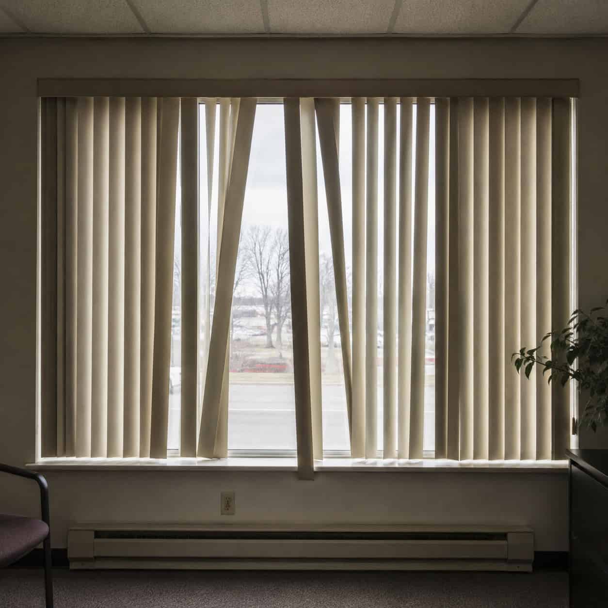
Vertical blinds belong in a dentist’s waiting room. The clatter, the bent slats, the one that always hangs crooked — pure 1980s office.
In a home they feel clinical and dated the moment you spot them.
Trade them for Roman shades, roller shades, or simple drapery. Anything with softness reads as a home instead of a leasing office.
It’s one of the cleanest before-and-afters on this list.
15. Curtains Hung Too Low and Too Short
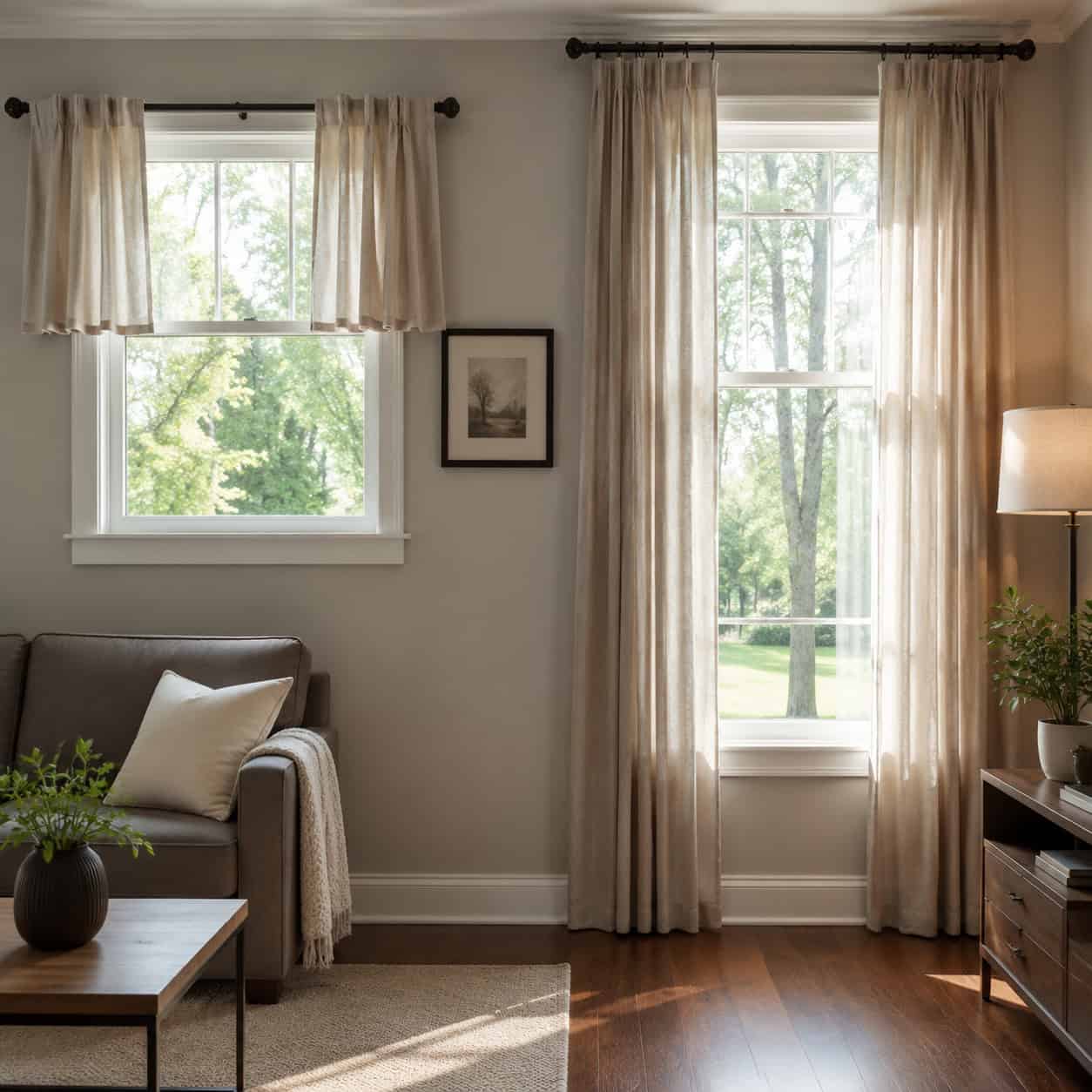
Cheap curtains aren’t usually the problem. Placement is.
Most people mount the rod right at the top of the window frame and buy panels that stop at the sill. That shrinks the window and chops the wall in half.
Hang the rod near the ceiling and wide past the frame, then let panels just kiss the floor. The same fabric suddenly makes the ceiling look taller and the window twice its size.
You didn’t spend a dime more. You just hung it like someone who knew what they were doing.
16. Mismatched White Plastic Switch Plates
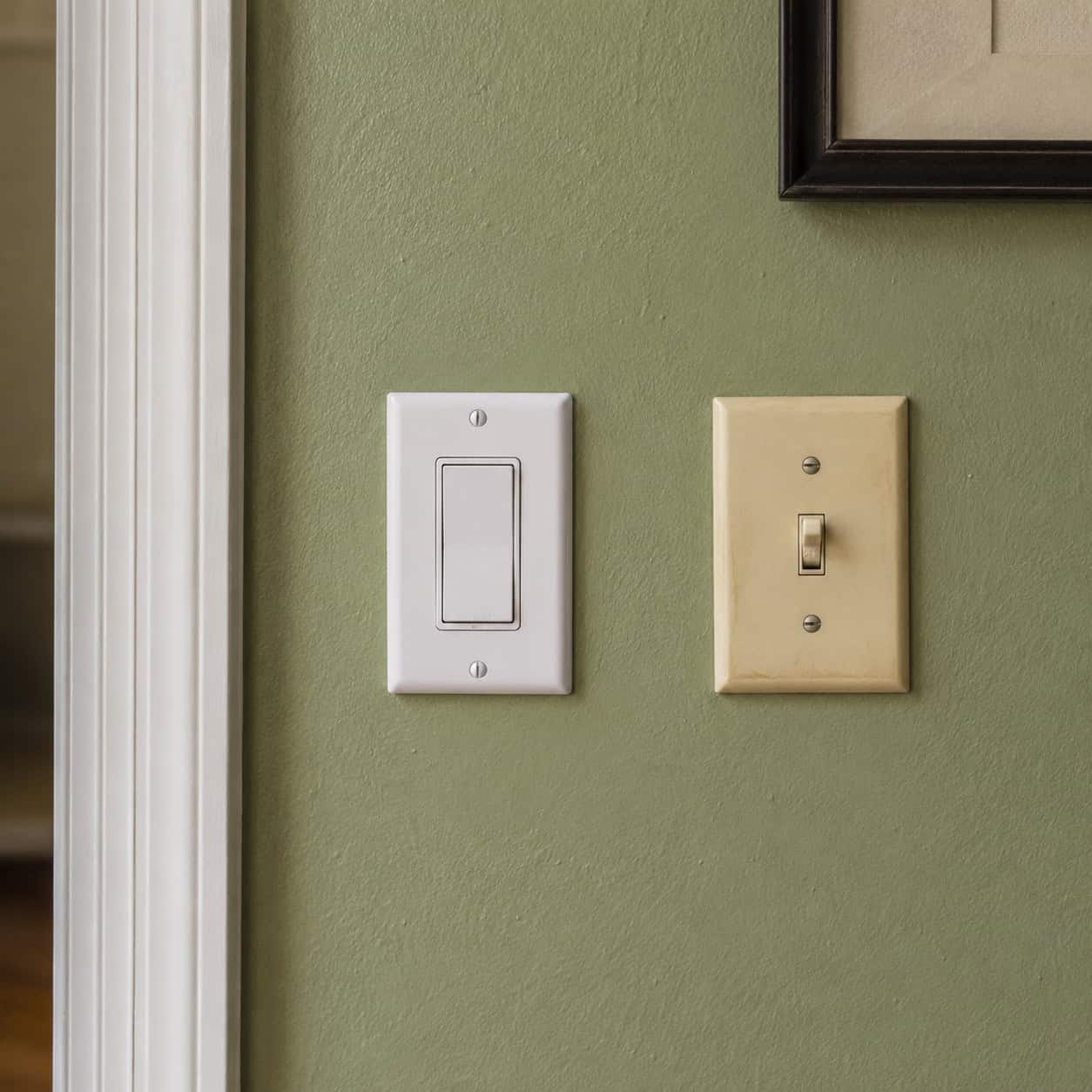
Bright white plastic switch plates hit like little eyesores against any wall with color on it. Add a few yellowed ones and a couple that don’t match, and a room quietly cheapens.
Nobody walks in and says “the cover plates.” But the eye logs them anyway.
Paint them the wall color so they disappear, or swap to a clean metal or matched plastic throughout. The cost is almost nothing.
It’s the kind of detail that reads as polish without anyone knowing why.
17. Sloppy Caulk Lines and Oversized “Goof” Plates
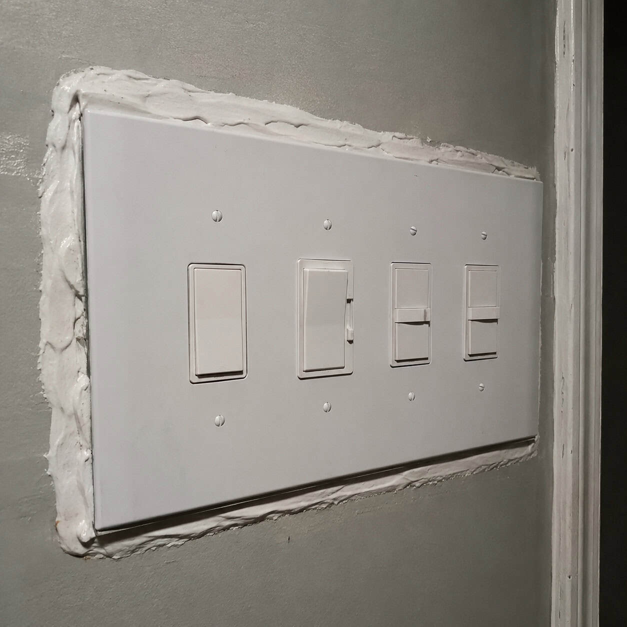
Trades have nicknames for rushed work. Thick fixer caulk smeared over gaps is “boo boo goo.” The jumbo cover plate hiding a crooked electrical box is a “goof plate.”
Once you know the slang, you see the fingerprints everywhere. A wavy bead of white caulk crammed into a corner. A switch plate three sizes too big to hide a sloppy cutout.
These are the tells of a crew working against the clock. Pull the goof plate, fix the box, install a normal one. Scrape the bad caulk and lay a clean thin line with a steady hand.
Tidy caulk and right-sized plates whisper that someone cared.
18. Builder-Beige Flat Paint on Every Wall
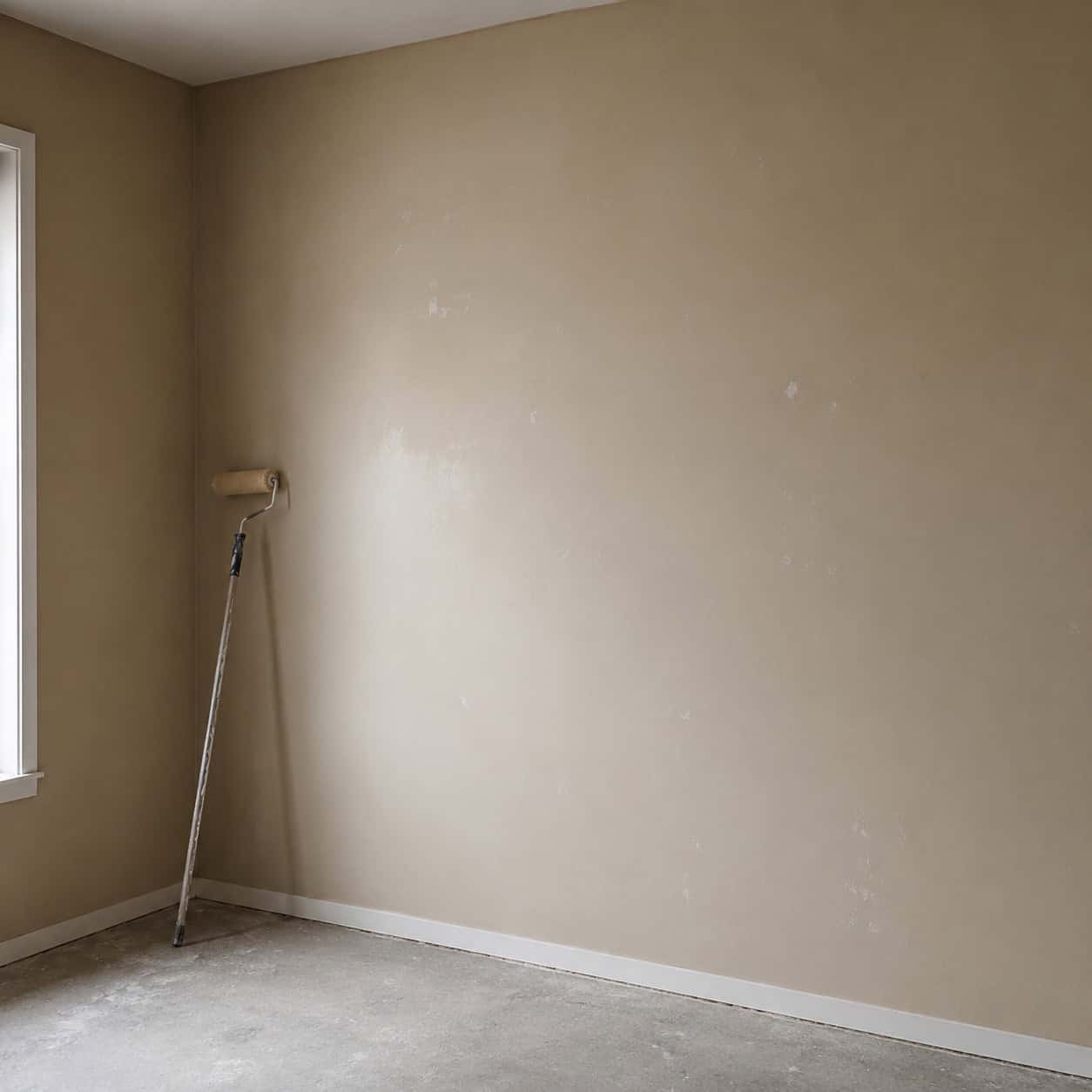
One safe beige, flat sheen, every wall, every room. It’s the default because it offends no one and sells fast.
It also drains the life out of a house. Flat paint shows every scuff and refuses to bounce light, and a single dull tone everywhere flattens a home into a hallway.
Color is the lowest-cost, highest-leverage change you can make. A couple hundred dollars in paint reshapes how every other thing in the room reads.
Pick real colors with some depth. Skip the dead beige.
19. The Pre-Fab Shower’s Angled Tile Soap Dish
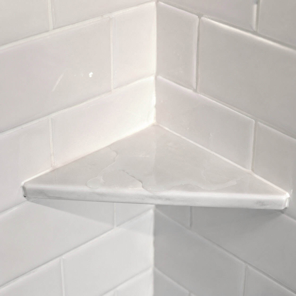
Designers touring model homes keep finding the same thing in the showers — no niche. Just a single tile cut at an angle in the corner, or a ceramic soap dish glued to the wall.
That angled tile is the cheapest possible way to give you somewhere to set the shampoo. It signals a builder who skipped the part that takes real tile skill.
A recessed niche is the detail that says a human being actually tiled this shower. Framing one into the wall, waterproofing it, and tiling the inside takes planning and patience — which is exactly why production crews skip it.
It matters beyond looks. A glued-on dish or a sloppy angled cut creates a ledge where water pools and sits, and standing water on tile finds the grout, then the substrate behind it.
Once water gets behind shower tile, it wicks into the wall and rots whatever it touches — the most expensive water-damage repair in the house. A properly sloped, fully waterproofed niche drains instead of pooling, so it looks custom and protects the wall at the same time.
If you’re renovating a shower, the niche is the line between a real tile job and a builder shortcut waiting to leak.
20. A Backsplash That Stops in the Wrong Place
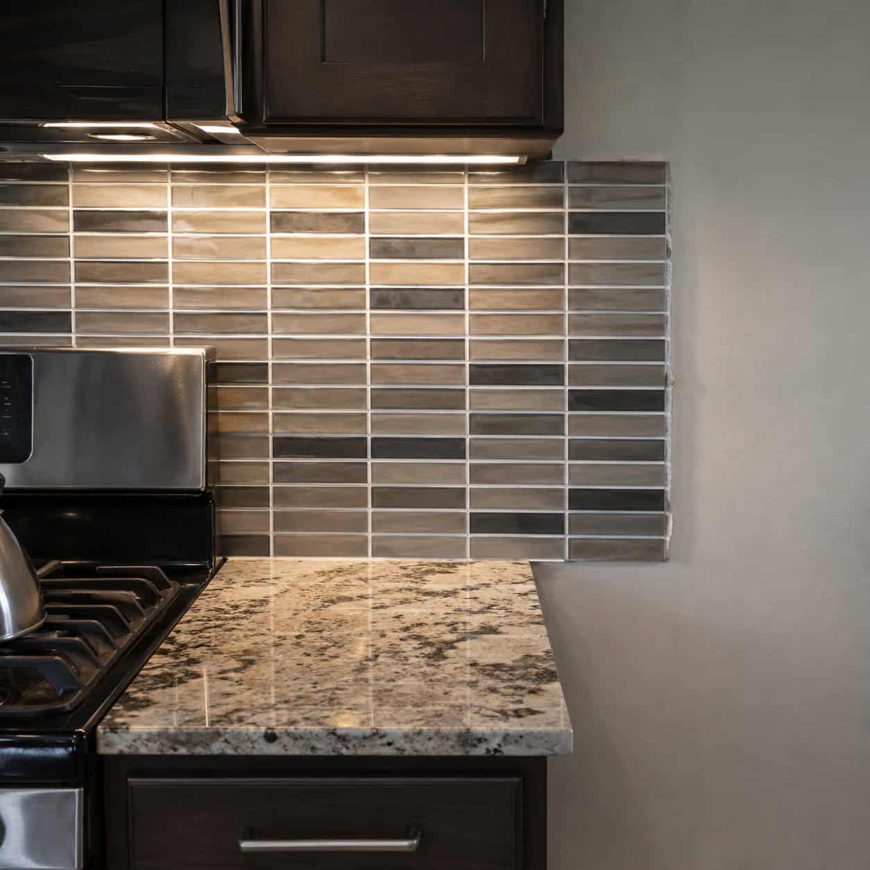
A backsplash that ends in a random spot mid-wall, or runs too far up where it has no business going, exposes a thoughtless install. The eye snags on the place it stops.
White grout on accent tile is its own small crime. It chops the pattern into a grid and kills whatever the tile was supposed to do.
End a backsplash at a logical line — the underside of the upper cabinets, the edge of a window, a full wall corner to corner. Match the grout to the tile so the material reads as one surface.
Small choices, but they’re the difference between “designed” and “winged it.”
21. Undersized Vinyl Shutters With Louvers Facing the Wrong Way
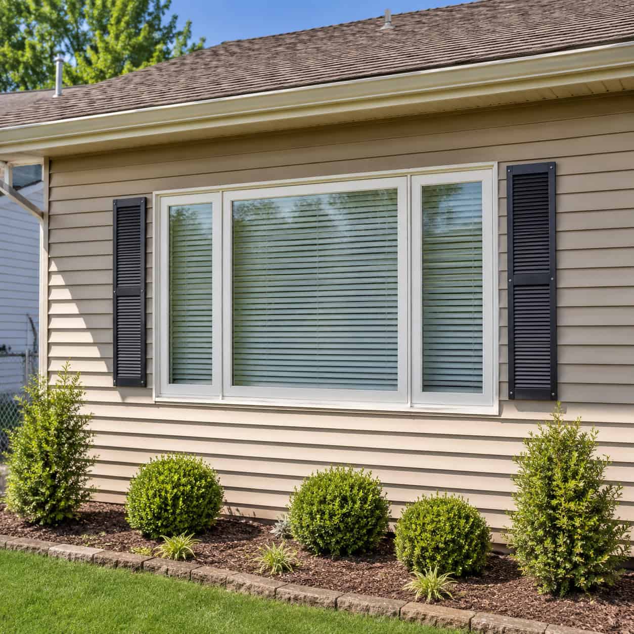
Cheap shutters give cheap curb appeal. The vinyl ones bolted flat to the siding are too narrow to ever cover the window if they closed — which they can’t, because they’re screwed to the wall.
Worse, the louvers usually face up. On a real operable shutter the slats angle down and out, to shed rain. Anyone who knows shutters spots the backward louvers from the street.
If you keep shutters, size them so the pair would actually cover the window, point the louvers the right way, and add hardware that looks like it could swing.
Or take them off entirely. A bare window beats a fake shutter that fools no one.
22. Old Toggle Switches Instead of Flat Rockers
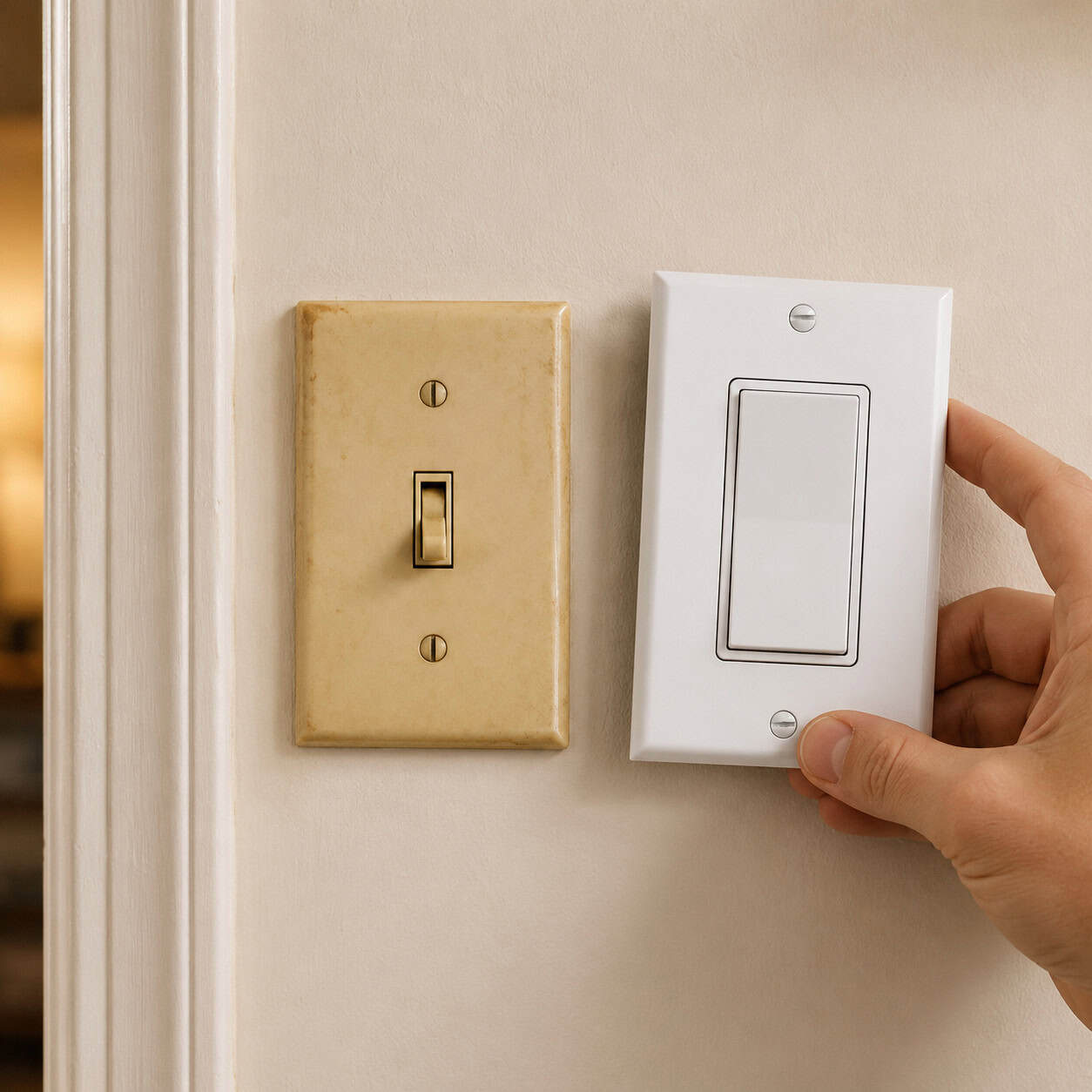
Tiny toggle switches and almond-colored outlets age a wall instantly. They read as untouched-since-1985 even in a freshly painted room.
Flat rocker switches in clean white or a matched color look modern and intentional. Add a dimmer where it counts.
The parts cost a few dollars each in the electrical aisle. Kill the breaker, swap the device, done.
Most people never think to change them, which is exactly why it works.
23. Builder-Grade Chrome Faucets
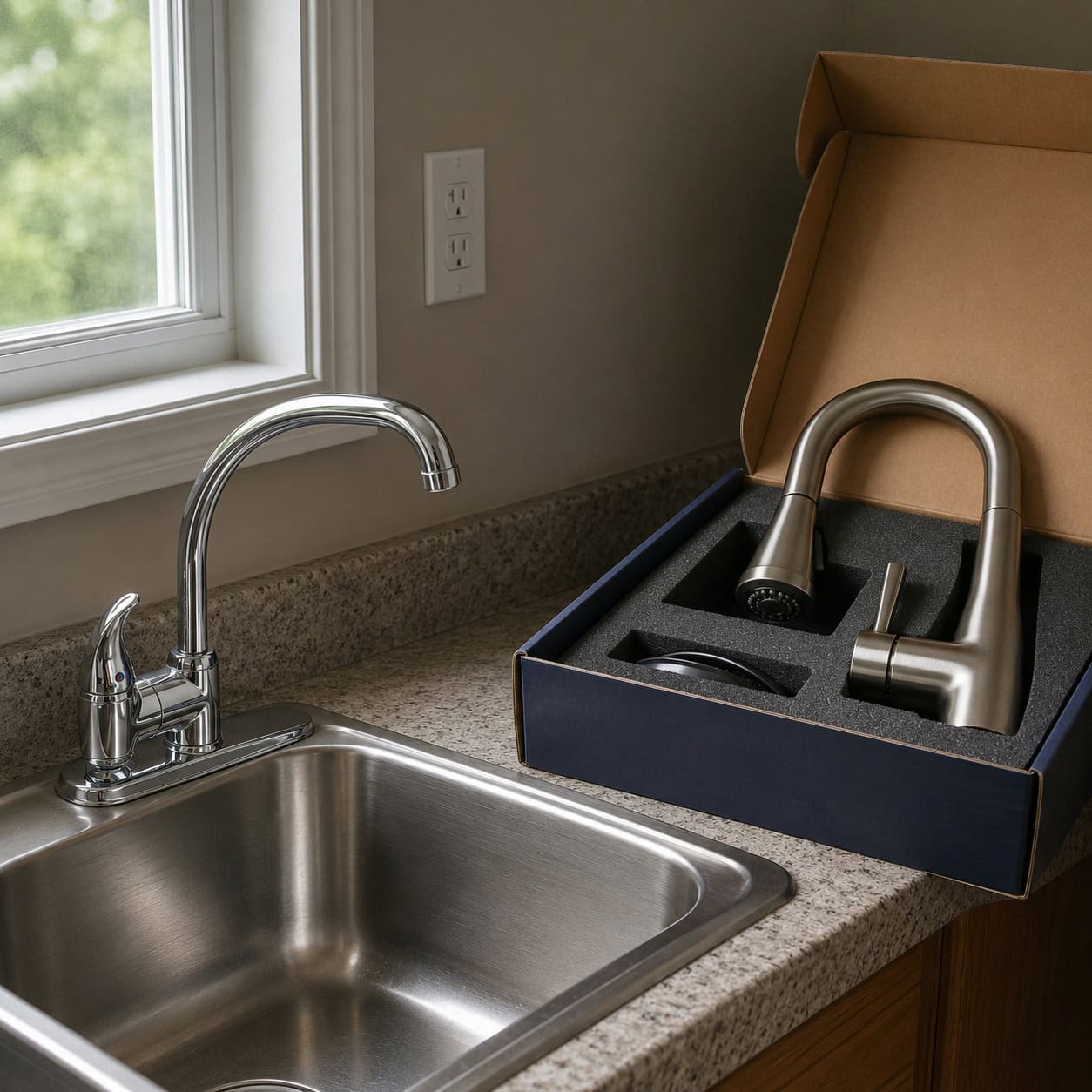
The standard builder faucet is thin, light, and shaped like nothing. It quietly cheapens a kitchen or bath without ever drawing attention to itself.
Pick one up and it feels hollow. Pick up a mid-tier Moen next to it and the difference is in your hand before it’s in your eye.
You don’t need a designer fixture. Even a solid mid-range faucet reads as a custom touch against the builder default.
Stage them over time, one sink at a time, as the budget allows.
24. Particleboard Vanity and Cabinet Boxes
Open a builder vanity and tap the side. That crumbly, dense board is particleboard, the substrate that betrays a budget build.
It chips at the edges, swells the first time the sink drips, and feels flimsy under a load. Plywood boxes cost more, which is exactly why the builder didn’t use them.
Full replacement isn’t the only answer. Paint the boxes, re-front the doors and drawers, or add trim and a solid top to disguise what’s underneath.
Keep water away from the kick and the seams, and a painted particleboard box can pass for years.
25. A Divisive Front Door Color
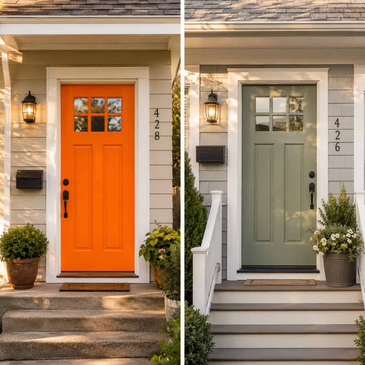
A front door is the one shot to set the tone before anyone steps inside. A loud pink, a school-bus yellow, or a traffic-cone orange undercuts it.
Bold color reads as a personal taste statement, and buyers flinch at statements. It can cheapen the whole facade fast.
A muted sage, a soft black, or a deep muted blue reads more expensive and lets the rest of the house speak.
This one’s more taste than build quality. But the right door color costs the same as the wrong one — so pick the one that flatters the house.
Where to Start
Don’t try to do all 25 in a weekend. Start with the ones that touch the most rooms for the least money — paint, switch plates, hardware, light fixtures.
Then move to the details that protect the house while they improve it: the window returns, the laminate edge, the shower niche. Those earn their keep twice.
None of this requires a contractor or a second mortgage. It requires noticing what your eye stopped seeing.
A cheap house isn’t built from cheap bones. It’s built from a hundred small surrenders — and any one of them is yours to take back this weekend.