

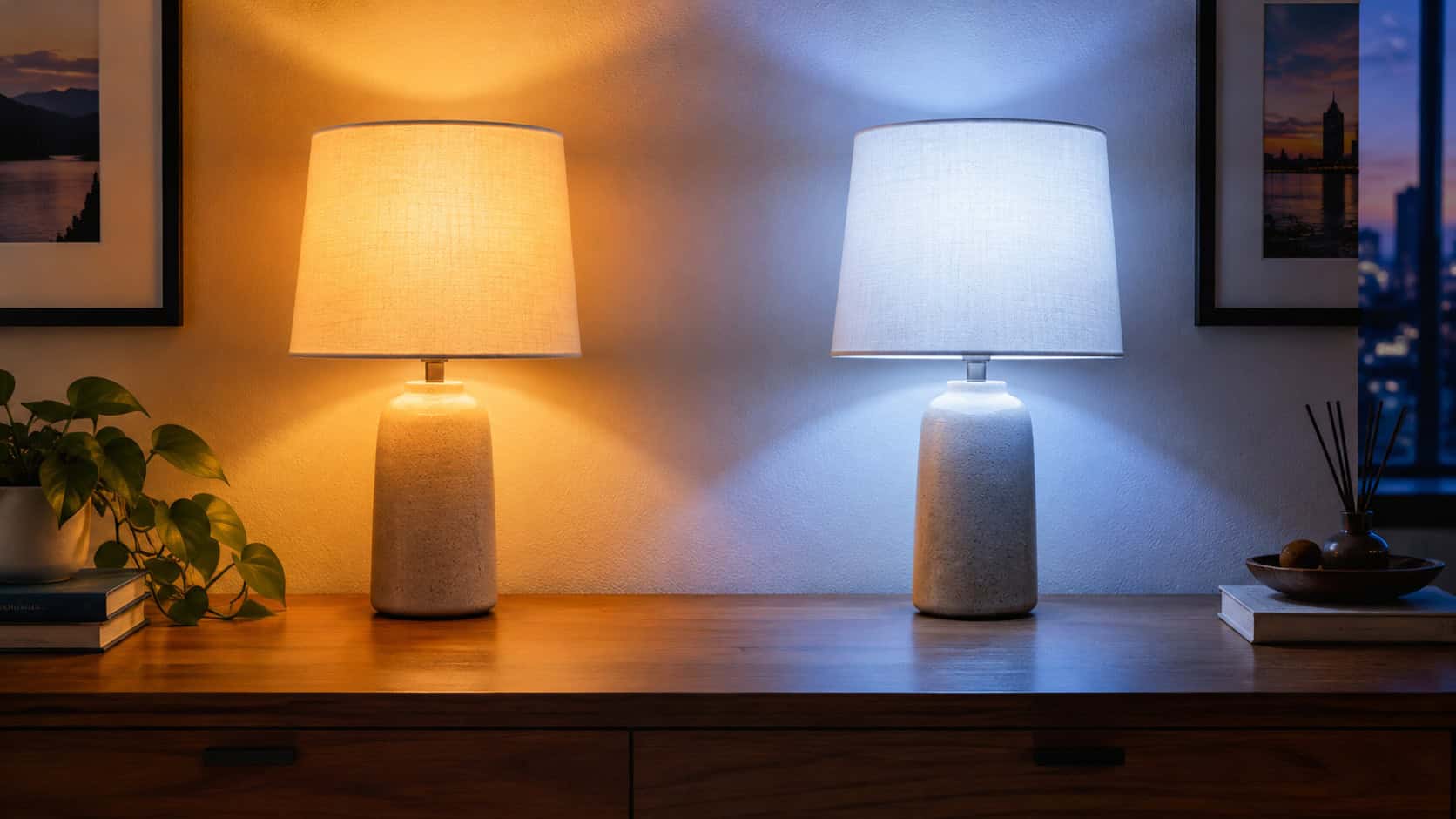
Walk into a room and you’ll judge it in about two seconds. You won’t say “the color temperature is off.” You’ll just feel that something is wrong.
Lighting is the cheapest thing in a house to get wrong and the most expensive thing to live with. Paint can be repainted on a Saturday. A bad ceiling grid of recessed cans is drywall patching, attic work, and a conversation with an electrician.
Most of these mistakes aren’t ugly on day one. They’re fine. They’re what the builder installed, or what the big-box aisle offered, or what looked great in 2016.
Five years later they’re the reason the house reads cheap in photos and tired in person.
Here are 29 lighting choices that curdle fast — and what designers specify in their place.
1. A Ceiling Grid of Recessed Cans
Count the cans in a spec house built after 1999. Twelve in the great room. Eight in the kitchen. Four in a bedroom barely big enough for a queen bed.
The logic seems sound: even spacing, even light. But a downlight does exactly what the name says — it lights the floor. Walls stay dark. Corners go black. Faces get raccoon shadows under the eyes.
The room reads flat. Clinical. Like a conference room with furniture in it.
Designers light the vertical surfaces instead. Walls are what your eye actually reads as “brightness” in a room, so wall washers, sconces, and lamps do more with fewer watts than a grid ever will. The usual spacing guide is ceiling height divided by two — eight-foot ceiling, cans roughly four feet apart — but the better move is fewer cans doing specific jobs, layered with task and accent light.
There’s a second problem nobody mentions at the lighting showroom. Every can in an insulated ceiling is a hole in your air barrier.
Old-style housings leaked conditioned air straight into the attic and had to be kept three inches clear of insulation, which meant a bald spot in your thermal envelope around every fixture. Multiply that by sixteen. In a cold climate, that’s where ice dams start.
If cans are going in, they need to be IC-rated and airtight — look for an IC-AT stamp on the housing, or a canless unit with a sealed gasket at the drywall. Then the insulation can run right over the top.
Dim them, too. A can at full output is a spotlight on your floor; the same can at 30 percent becomes background.
And resist the urge to put one directly over the couch. Nobody wants a reading light aimed at the top of their head.
2. 5000K “Daylight” Bulbs in Living Rooms and Bedrooms
Ask a designer for the single most common lighting mistake in American homes and you’ll hear about Kelvin numbers before the sentence is finished.
The box says “Daylight” and that sounds like a good thing. It isn’t, not indoors. At 5000K the light goes blue-white, skin looks gray, wood goes cold, and the living room starts to feel like a place where someone’s about to clean your teeth.
Anything 4000K and above reads commercial. Warehouses, parking garages, exam rooms.
Go 2700K in living rooms and bedrooms — that’s the color of a traditional incandescent, and it’s what people mean when they call a room cozy. Kitchens and baths can take 3000K if you want crisper light over a cutting board. The Kichler indoor lighting guide breaks the ranges down room by room if you want the full chart.
Buy one bulb before you buy twelve. Kelvin is almost impossible to judge from a package.
3. The Builder-Grade Flush-Mount Dome
Frosted glass. Two screws. A dead moth inside.
Everybody knows this fixture, and almost everybody has a private nickname for it. It’s been standard issue in hallways, bedrooms, and laundry rooms since the 1980s because it costs the builder about eleven dollars.
It’s also the single fastest visible upgrade in the entire house. Shut off the breaker, drop the canopy, swap the fixture — twenty minutes, no new wiring.
A semi-flush lantern adds depth. A shallow fabric drum softens the whole hall. A small schoolhouse globe in white opal glass looks period-correct in anything built before 1960 and costs less than dinner out.
4. Integrated LED Fixtures With No Replaceable Bulb
The incandescent phase-out in 2014 opened the floodgates, and manufacturers discovered something convenient: if the LED is soldered in, the customer buys a whole new fixture when it fails.
The slim profile is the selling point. No socket means the housing can be a half-inch thick.
But LEDs don’t burn out so much as fade, and the driver — the little electronic box that feeds them — usually dies first. When it does, you’re pricing a replacement module that costs more than a comparable new fixture, assuming the model is still made at all.
Designers specify socketed fixtures for anything meant to stay. Let the house outlast the technology. A standard medium base socket has been compatible with every bulb sold since Edison’s patents expired, and whatever comes after LED will screw into it too.
5. Exposed Edison Filament Bulbs
The squirrel-cage filament had a genuinely good run. Around 2010 it was a signal — restaurant, speakeasy, somebody with taste.
By 2018 it was on the ceiling of every chain burger joint in the country.
Design editors have been calling the look retired for a few years now, and the practical complaint matches the aesthetic one: a bare filament at eye level is glare. Your pupils contract, everything around the bulb goes dark, and the room gets harder to see in.
Diffusion is the fix. Opal glass orbs, porcelain, linen shades, anything that turns a point source into a surface. You still get the warm glow. You just stop squinting at it.
6. Every Light in the Room on One Switch
One switch means one brightness. Breakfast, homework, a movie at 10 p.m. — all lit identically, all at full blast.
Dimmers are the highest return per dollar in residential lighting, full stop. Call it $25 a switch and an afternoon.
Split the room into circuits while you’re at it: cans on one, pendants on another, perimeter sconces on a third. Three dimmers turn one room into six rooms.
Check compatibility before you buy. Plenty of cheap LED bulbs flicker or buzz on older dimmers rated for incandescent loads, and the fix is a modern LED-rated dimmer, not a new bulb.
7. Three Tiny Mini-Pendants Over a Nine-Foot Island
Scale is what gives this one away from across the room.
Three five-inch glass shades floating over a nine-foot slab of quartz look like someone forgot to finish. They also light almost nothing — a small shade throws a small pool, and the counter between them stays dim.
Two generous pendants beat three small ones nearly every time. Twelve to sixteen inches in diameter, hung 30 to 36 inches above the countertop, with roughly equal space between them and the island ends.
One long linear fixture works too, especially under a low ceiling. It reads intentional instead of decorative.
8. Mixed Color Temperatures in a Single Room
This one hides in plain sight. Three cans at 3000K, a table lamp at 2700K, and one rogue 5000K bulb from a garage multipack that somebody grabbed when the hall light died.
Nobody can name the problem. Everyone feels it. The room looks subtly diseased, like a photograph with the white balance set wrong.
Pick one Kelvin number per floor and write it on a piece of tape inside the electrical panel door. Then buy in bulk so replacements always match.
Here’s how the common temperatures actually behave once they’re on the wall.
| 2700K | 3000K | 4000K+ | |
|---|---|---|---|
| Reads as | Warm, incandescent | Soft white, crisp | Commercial, clinical |
| Best rooms | Living, bedrooms, dining | Kitchen, bath, laundry | Garage, shop only |
| Effect on wood | Rich, golden | Neutral, true | Gray, flattened |
| Effect on skin | Flattering | Acceptable | Pale and tired |
A shop or garage is the one place 4000K earns its keep. Everywhere people relax, stay under 3000K.
9. Mason Jar and Wire-Cage Farmhouse Fixtures
Between roughly 2013 and 2019, the mason jar chandelier was everywhere. So was the bare wire cage, the galvanized barn shade, and the pipe-fitting sconce.
It’s now the most date-stamped category in the house. A mason jar fixture says 2015 the same way brass-and-smoked-glass says 1987 — instantly, and without affection.
The rustic instinct wasn’t wrong. The execution was literal.
Blackened steel lanterns with clean lines carry the same farmhouse weight. So do plaster shades, unglazed ceramic, and simple turned-wood pendants. They read as old-house rather than old-house-themed.
10. A Single Light Bar Mounted Above the Bathroom Mirror
The Hollywood bar — a strip of exposed bulbs over the mirror — has been builder standard since the 1970s, and its replacement, the three-globe bar, isn’t any better.
Light from directly above does one thing to a face: it drops shadows into the eye sockets, under the nose, and below the chin. It’s the lighting setup used to make actors look menacing.
Try shaving under it. Try putting on makeup and then walking outside.
The professional arrangement is cross-lighting: sconces flanking the mirror, roughly 36 to 40 inches apart, mounted at about 66 inches off the finished floor so the light source lands near eye level. That fills shadows from both sides instead of carving them.
If the mirror is too wide to flank — anything much over 48 inches — a horizontal fixture mounted on the mirror itself, at eye height rather than above it, gets close. Backlit mirrors with a diffused perimeter work too, as long as the output is high enough to actually see by.
Size the mirror a few inches narrower than the vanity top so the sconces have wall to land on. That detail gets missed constantly, and then the sconces end up jammed against a medicine cabinet.
Wiring matters here. Any fixture within three feet horizontally and eight feet vertically of a tub or shower needs to be rated for damp or wet locations depending on exposure, and bathroom receptacles require GFCI protection under current code.
Add a dimmer. Nobody wants full vanity output at 2 a.m.
11. Color-Changing RGB Strip Lights Around the Ceiling
These exploded between 2019 and 2023, and the cheap ones age faster than almost anything else you can attach to a room.
Low-density tape shows individual dots along the ceiling line. The plastic channel sits exposed. The “warm white” setting leans purple because RGB fakes white by mixing three colored diodes rather than using a dedicated white one.
Then the adhesive gives up. Usually around the second summer, usually in one sagging loop above the TV.
Concealed is the whole game. High-CRI white tape, high density so the dots blend, tucked into a plaster cove or a channel routed into trim so you see the glow and never the source.
That’s the same principle behind well-executed built-in work — the floating shelves with integrated LED lighting approach hides the strip in a rabbet so the light looks like it belongs to the shelf.
12. A Matching Lighting Suite From One Collection
Big-box showrooms merchandise by collection: buy the chandelier, and there’s a matching pendant, a matching two-light vanity, a matching flush mount, a matching outdoor lantern.
It’s efficient. It also makes a house look assembled from one page of a catalog.
Real rooms accumulate. The dining fixture doesn’t match the hall fixture in any house people actually admire, and that’s exactly why those houses feel layered.
Mix shapes and eras freely, then tie things together with one repeated element — a finish, a shade material, a shared color temperature. That thread is enough.
13. Bargain Bulbs With a CRI in the Low 80s
Color rendering index measures how accurately a light source shows color against daylight. Most cheap multipacks land at 80 to 82, and the number is rarely printed on the front of the box.
At CRI 80, reds go muddy and wood loses its depth. Walnut reads gray-brown. Cherry stops being cherry.
Brutal in a room where the millwork was the entire point.
Specify CRI 90 or higher throughout, and 95 where wood, art, or food is on display. The GREEN CREATIVE lighting academy covers how CRI and Kelvin interact, which matters because a high-CRI 2700K bulb and a low-CRI 2700K bulb look nothing alike on a stained board.
14. Solar Path Lights Lining the Front Walk
Six for twenty dollars, installed in an afternoon, no wiring. They look tidy the first night.
By the second season, three are tilted, two are dead, and the survivors glow blue-white at about the brightness of a phone screen. Lined up evenly down both sides of the walk, they read like runway markers.
Low-voltage landscape lighting is a weekend job and a different universe of result. A transformer, direct-burial cable, and warm 2700K lamps.
Use fewer fixtures than feels right. Aim light at the house — uplighting a stone chimney or grazing a textured wall — rather than scattering dots along the pavement. The walk gets lit as a byproduct, and the house gets a facade at night.
15. A Dining Chandelier That’s Too Small for the Table
Undersized is the most common scale error in American houses, and designers name it constantly.
A 20-inch fixture over a 72-inch table reads timid forever. No amount of styling fixes it.
The working rule: chandelier diameter should be roughly half to two-thirds the table’s narrow dimension. A 42-inch-wide table wants something in the 21 to 28 inch range.
Hang it 30 to 34 inches above the tabletop. Higher for ceilings above eight feet — add about three inches of drop per extra foot of ceiling.
When in doubt, go one size up. Nobody has ever stood in a dining room and complained the chandelier was too generous.
16. Rope Light in the Soffit Above the Cabinets
Between 1995 and 2008 this was the kitchen upgrade. A coil of orange rope light laid on top of the cabinets, throwing a warm halo onto the soffit.
It dates a kitchen the moment you flip the switch. The color is off, the light is weak, and the whole effect illuminates a dusty shelf nobody has looked at in years.
If you want ambient bounce above the cabinets, use proper linear tape in an aluminum channel aimed at the ceiling — even, white, invisible.
Honestly, though, put the money into task lighting on the counter instead. That’s where the cooking happens.
17. Smart Bulbs Instead of Smart Dimmer Switches
Smart bulbs are an easy sell. Screw one in, open an app, and your lamp has a schedule.
Then a guest walks in and flips the wall switch off. Now the bulb has no power, the app can’t reach it, and the voice assistant reports that the device is unavailable. The “smart” part of your house just became a trivia question.
Some households solve this by taping over switches. That’s not a solution, that’s a surrender.
The deeper problem is time. A smart bulb is a tiny computer with a radio in it, sitting in a hot enclosure, tied to a manufacturer’s cloud service. When that company sunsets the app — and several already have — you own a very expensive dumb bulb that still can’t be dimmed from the wall.
Wired smart dimmers invert all of it. The switch stays a switch, so anyone can walk in and use the room normally. The intelligence lives in the wall box where it’s cooler, hardwired, and controlling the whole circuit rather than one bulb at a time.
You also get to use any bulb you want. High-CRI 2700K, replaceable, four dollars.
| Smart Bulbs | Smart Dimmers | |
|---|---|---|
| Guest flips switch | Device goes offline | Works normally |
| Cost per room | Multiplies per bulb | One per circuit |
| Bulb choice | Locked to brand | Any bulb you like |
| If app dies | Bulbs are bricks | Still a dimmer |
| Install | Screw in | Wiring, neutral needed |
The one catch: most smart dimmers need a neutral wire in the switch box, which older houses often don’t have. No-neutral models exist, but check before you buy five of them.
Smart bulbs still make sense in a lamp with no switched outlet. That’s about it.
18. The Flat LED Panel Ceiling Light
A slim white rectangle, bright as anything, about an inch thick. These took off after 2016 as the easy replacement for fluorescent boxes.
On the ceiling it looks like an iPad left face-up. Usually 4000K out of the box, frequently non-dimmable, and almost always an integrated LED you can’t replace.
It reads as fixture-shaped light, not as a light fixture.
In a hall, laundry, or small bedroom, a modest semi-flush drum costs maybe fifteen dollars more and actually looks like part of the architecture. Same footprint, same brightness, completely different room.
19. Puck Lights Under the Upper Cabinets
Round pucks spaced a foot apart throw a row of scallops down the backsplash — bright circle, dark gap, bright circle. On glossy tile each one reflects back as a hard dot.
The old halogen versions also ran hot enough to soften the shelf above them.
Continuous COB tape solved this. The diodes are packed tight enough that the output reads as one unbroken line of light with no visible source.
Mount it at the front edge of the cabinet bottom, behind a small lip or in a shallow channel, aimed back toward the wall. That puts the light on the counter instead of in your eyes when you’re standing at the sink.
20. A Black Track Bar With Adjustable Heads
Track lighting had a legitimate moment in the 1970s and came back in 2000s big-box form as the quick fix for a room with one ceiling box.
Spec-grade track is visually loud. A black bar and five cylinder heads announce themselves from every angle of the room, and the heads drift out of aim every time someone bumps one with a ladder or a broom.
Real directional light is still worth having — over art, into a bookcase, down a stone wall.
Designers get it from low-profile monopoints, which are single adjustable heads on small canopies, or from recessed adjustable trims that aim within the housing and disappear into the ceiling. The light moves. The hardware doesn’t shout.
21. Every Fixture in the House in One Trendy Finish
Matte black owned 2016 through 2022. Brushed gold took over around 2019 and hasn’t let go.
Both are fine finishes. The problem is commitment — when every fixture, knob, faucet, and hinge in the house wears the same of-the-moment metal, the entire house carries one date stamp and ages in a single move.
Design editors are already flagging brass overload by name.
Mix a warm metal with something quieter: oil-rubbed bronze, aged nickel, painted steel, unlacquered brass that’s allowed to patina. The contrast reads collected rather than purchased, and when one finish falls out of favor you’re only replacing part of the house.
The same logic applies to cabinet choices that age badly — the all-in trend commitment is what dates a room, not the trend itself.
22. A Ceiling Fan Light Kit as the Room’s Only Light
Standard bedroom package since the 1980s: one fan, dead center, with a light kit hanging off the bottom.
Everything wrong with a recessed can, concentrated into one fixture. Light from directly overhead, glare straight down, and a strobe effect through the blades that gives some people a headache within minutes.
Modern ones usually hide an integrated LED you can’t replace, so when it fades you’re pulling the whole fan.
Keep the fan if the climate earns it. Just stop asking it to be the room’s light — add a pair of bedside sconces or table lamps on a switched outlet, and the fan light becomes an emergency option you touch twice a year.
23. A Blue-White Security Floodlight on the Garage
The instinct is understandable. Brighter equals safer, so bolt up the biggest, whitest flood on the shelf and aim it at the driveway.
What actually happens is glare. A 5000K flood at 4,000 lumens pointed outward bleaches everything it hits and throws deep black shadows everywhere it doesn’t — which is precisely where someone could stand unseen.
It also destroys your own night vision. Walk from that driveway into the dark side yard and you’re blind for a solid thirty seconds.
Then there’s the neighbor’s bedroom window, which is now lit all night because a raccoon crossed the lawn.
The effective version is warmer, lower, and shielded. Go 3000K, pick fixtures with a solid top and a cutoff shield so the lamp isn’t visible from the street, and aim them down rather than out. A pair of modest 800 to 1,200 lumen fixtures placed well beats one 4,000 lumen cannon.
Motion activation does more work than brightness. A light that comes on is what draws attention; a light that’s been on since dusk is just scenery.
Set the sensor sensitivity so cars on the street don’t trigger it, and put the dusk-to-dawn pathway lighting on a separate, much dimmer circuit.
Warm, shielded, aimed down, motion-triggered. Better security, and the house stops looking like a used car lot after dark.
24. The Sputnik Starburst Chandelier
Twelve brass arms, twelve bare bulbs, radiating from a center sphere. In 2012 it was a genuine statement — a mid-century reference most people hadn’t seen in decades.
By 2020 it had appeared in enough listing photos to qualify as stock imagery.
Even designers who build whole rooms around mid-century furniture admit the Sputnik has lost its edge through sheer repetition. It isn’t ugly. It’s just no longer saying anything.
Sculptural plaster, alabaster, and opal glass are where that same instinct has moved — forms with weight and shadow, reading modern without broadcasting a specific year.
25. A Chandelier Hung in an Unreachable Two-Story Foyer
Open two-story entries became standard in 1990s construction, and every one of them got a big fixture hung in the middle of the void.
Nobody thinks about year five.
That’s when the fixture is furred with gray dust twenty-two feet up, a bulb has died, and replacing it means renting scaffolding or hiring someone with a ladder that doesn’t fit through your front door.
Two real solutions. Specify an aircraft-cable winch — a hand crank in a nearby closet lowers the whole fixture to standing height for cleaning and relamping, and it adds a few hundred dollars during construction versus a service call every time.
Or choose a fixture built for the reach: simple form, minimal dust-catching detail, lamped with LEDs rated for 25,000 hours so relamping is a once-a-decade event.
26. A Room With No Lamps in It
Walk into a house where every room is lit entirely from the ceiling and you’ll feel it before you see it. Everything’s visible. Nothing’s warm.
Ceiling light is flat by definition — it comes from one direction, from above, and it does nothing for the vertical surfaces your eye reads as atmosphere.
Think about the old houses people romanticize. The quality everyone remembers is pools of lamplight at eye level: a shaded lamp beside a chair, a picture light over a frame, a sconce in a hallway. Light where the people are, not twelve feet above them.
Lamps are also the cheapest beauty in the entire lighting budget. A thrifted base and a decent linen shade will do more for a living room than any ceiling fixture at three times the price.
Plan for them before the drywall goes up. Switched outlets at the corners of a living room — so a floor lamp turns on at the door — and a pair of outlets flanking the bed. Costs almost nothing during rough-in and is a miserable retrofit later.
Two lamps, a dimmer, and 2700K bulbs. That’s most of the warmth people pay designers to find.
27. Canless “Wafer” Recessed Lights
These took the retrofit market in a few short years, and it’s easy to see why. Cut a hole, clip a junction box through the opening, push the wafer up, done — no housing, no attic access, no joist clearance problem.
For an existing ceiling, that’s a real advantage, and the airtight gasketed models solve the insulation issue that plagued old cans.
The trade-off is permanence. The LED is non-replaceable, so every wafer is a disposable fixture, and the trim often sits slightly proud of the drywall instead of flush like a proper trim ring.
Reasonable in a retrofit or a utility space. In new construction, where you can put in a real airtight housing with a socket, the long game favors the can.
28. Minimal Ring and Halo Pendants
A glowing circle on a thin stem. It showed up in spec-build kitchens and entryways around 2018 and has been the default “modern” fixture ever since.
Designers are already naming it as the next thing to date, and the reasoning tracks: it’s a shape, not a fixture. No material, no craft, no shadow — just an illuminated acrylic ring, usually with a non-replaceable LED inside.
Once a form gets that ubiquitous that fast, the clock is running.
If you want modern and minimal, look for something with actual material presence. Blown glass, plaster, turned wood, honed stone — things that still look like objects when the light is off.
29. Toe-Kick and Floating-Vanity Glow Strips
Light spilling from beneath a floating vanity is a genuinely good effect. It makes heavy cabinetry look like it’s hovering, and it doubles as a nightlight.
It also goes wrong in the same ways everything else on this list does. Bad tape, visible diodes, a color temperature that doesn’t match the vanity sconces, and adhesive that releases the first time the bathroom hits ninety percent humidity.
Do it right or skip it. Mount a high-CRI 2700K strip in an aluminum channel with a frosted diffuser, set well back from the front edge so you see glow and never the source, and wire it to the same dimmer as the rest of the room.
And use wet-location-rated tape in a bathroom. The twelve-dollar roll from the big-box endcap is not that tape.
Almost none of these mistakes are about money. A $400 chandelier hung at the wrong height is worse than a $60 one hung right, and a 2700K bulb costs the same as a 5000K bulb.
They’re about defaults — what the builder installs, what the aisle offers, what the box says in big letters on the front.
Fix the Kelvin, add dimmers, get light off the ceiling and down to eye level. That’s three changes and most of the difference between a house that feels like a house and one that feels like a showroom after hours.
You’ll notice it most on the first dark evening of November, when the lamps go on and the room decides to be kind to you.