


Step through the front door of a 1912 bungalow and you feel it before you’ve walked three steps in.
The room seems to outgrow its own square footage. Pull the tax card afterward and discover the whole first floor clocks in at 900 square feet, and you’ll still be skeptical.
None of that happened by chance. Carpenters and pattern-book architects were working without central air, without recessed lighting, without four-figure remodeling budgets — so they mastered the art of making a small room act like a large one. Clear sightlines, borrowed daylight, storage tucked inside the wall cavities, furniture that folded away when it wasn’t needed.
Somewhere along the way we lost the instinct. Furniture got shoved in front of the sightlines, wainscoting got torn out, and artwork migrated down to eye level.
Below are 33 tricks pulled from old houses that made small rooms live large — and a look at which ones you can bring back without hiring anyone.
1. Let Glass Cabinet Fronts Open Up the Butler’s Pantry

The eye keeps traveling when it hits glass, but a solid door stops it cold right at the surface.
That’s the reason a narrow, floor-to-ceiling butler’s pantry can feel more spacious than a modern kitchen lined with flat-front cabinetry.
No demolition required — just cut the panels out of two upper doors and glaze them, and suddenly the whole wall has depth. Adding glass to cabinet doors is a weekend job.
2. Reach for Vertical Stripes on the Wall

This is the original height illusion. Victorian and Edwardian pattern books pushed stripes specifically for cottage rooms with low ceilings.
Repeating vertical lines give the eye something to climb. Even a subtle tone-on-tone stripe, barely visible from across the room, does real work.
Save the bold circus stripe for when you really mean it — two shades of the same color, three inches apart, is the version that still looks good in ten years.
3. Show Floor Around the Edges of an Area Rug
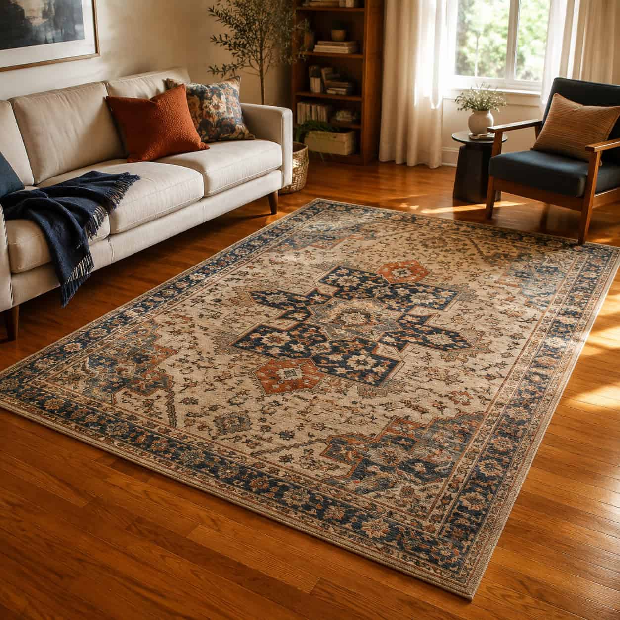
Wall-to-wall carpeting ends right at the baseboard, turning every edge of the room into a hard stop.
Leave 8 to 18 inches of bare finished floor showing on all sides instead, and the floor plane reads continuous — the rug becomes an island floating on something bigger.
You can do this one this afternoon; there’s nothing to build or tear out.
4. Put a Window Where the Stairs Turn

The center of any house is naturally its darkest zone, and old builders countered that by glazing the stair landing.
Daylight pours down the stairwell into the core, so the staircase reads as a lit shaft instead of a tunnel — the brightest vertical space in the house rather than the dimmest.
Victorian examples often used stained or leaded glass, sized generously since the landing wall had no furniture competing for attention. In 1920s Colonials you’ll usually find a tall double-hung centered on the landing, or an arched Palladian window in the more elaborate examples.
Then look at what’s been done to them since: blackout curtains hung out of heat-loss anxiety, a tall bookcase shoved onto the landing, or the whole opening framed over during a bathroom addition — sometimes swapped for glass block in the 1970s.
Two honest fixes exist. Leave the window bare, or use a sheer that stops at the sill; and if the glazing is failing, repair rather than replace — original wood sash paired with an exterior storm performs better than most people assume, and the National Park Service publishes technical guidance on repairing historic sash instead of swapping it out.
Paint the stairwell a shade lighter than the adjoining rooms and the effect compounds.
5. Go Taller Than Standard on Interior Doors

Before 1940, interior doors typically ran 7 feet tall, and better houses often had 7-foot-6 or a full 8-foot door. Compare that to today’s standard 6-foot-8 slab.
With a tall door you get four inches of casing above it instead of eighteen inches of blank wall — and that single unbroken vertical line does most of the visual work people usually credit to ceiling height.
It’s also one of the fastest ways to date a house, right alongside the details that tell you a house was built before 1960.
6. Fold the Bed Away When It’s Not Bedtime

These weren’t novelty items — folding beds were standard catalog fare, and bungalow plans from the 1910s regularly built them into closets, alcoves, and dedicated wall cabinets.
A single room could serve as a parlor by day and a bedroom by night, a hundred years before anyone filmed a small-space-living video about it.
The hardware is where it gets genuinely impressive: counterweights, cast-iron pivots, and spring assemblies balanced precisely so a full mattress could swing up with one hand. There’s a modern version of the idea in this Murphy bed with built-in shelving.
7. Choose Folding Interior Shutters Over Bulky Drapes

Shutters fold flat into the window jamb, so nothing projects into the room and the full window casing stays on display.
A stack of drapery, by contrast, eats up five or six inches of wall on either side, plus a rod that extends beyond the window frame itself.
Run the math on a narrow room with two windows and you’ll find you’ve reclaimed roughly a foot of wall.
8. Face a Mirror Straight at a Window

Those Victorian pier mirrors weren’t hung for checking your collar — they were positioned deliberately to face a window.
A tall mirror opposite a window bounces the whole window back into the room: light, view, and depth included. A narrow parlor with a single window suddenly reads as though it has two.
It’s also the cheapest fix on this entire list — one salvaged mirror, one hook, twenty minutes of your time.
9. Lay Floorboards Along the Long Axis of the Room

Boards running along a room’s longest dimension visually stretch it, while boards crossing that dimension chop the space into segments.
Worth being honest about the history here: board direction was originally determined by joist direction, not by any optical strategy — running perpendicular to the joists was simply the only structural option for a plank floor.
The visual payoff was a happy accident, but you can still borrow it deliberately. Line up your rug’s stripe, your runner, and your furniture along the long axis, and you get the same trick with zero flooring bill.
10. Skip the Door on a Wide Cased Opening

A generously wide opening, fully cased and left without a door, keeps two rooms functionally distinct while letting the eye pass through freely.
Bungalows and Colonial Revivals leaned on this constantly between hall and living room, and between living and dining rooms.
It’s the easiest change on this entire list: lift the door off its hinges, fill the hinge mortises, and leave the casing in place. Do this one first.
11. Let French Doors Do Double Duty Between Rooms

Glazing in the door preserves both the sightline and the daylight, while the door itself still closes off sound, cooking odors, and heat you’d rather not pay to move.
That’s the historic middle ground between a fully open floor plan and a completely shut room — and it still beats either extreme.
Picture fifteen lights spread across two leaves, hung in a 1920s opening. Nobody’s really improved on that design since.
12. Let the Floor Show Under Your Furniture

Federal and Hepplewhite case pieces were built on tapered legs, and so was most of the revival furniture manufactured through the 1930s.
Visible floor beneath a sofa or sideboard keeps the floor plane reading as one continuous surface, which keeps the room’s true boundaries in view.
Skirted, box-bottom furniture undoes all of that — it lands like a shipping crate and slices the floor into disconnected pieces. In a small room, the skirt has to go.
13. Cut a Pass-Through Between Kitchen and Dining Room

Postwar remodelers cut thousands of these openings into 1920s houses, borrowing light and sightline between kitchen and dining room without touching a single load path.
They were typically cased, sometimes shelved, and occasionally fitted with a small sliding shutter — essentially the open-plan concept before open plans existed.
You get most of the benefit of a demolished wall for a fraction of the cost.
14. Open Up a Boxed-In Staircase

Balusters you can see through let an entry hall function as a single volume, since the stair reads as a screen rather than a wall.
Postwar tract builders boxed the whole thing in with drywall instead — cheaper and faster to build, but it split one hallway into two small dead zones.
If your staircase is currently boxed in and the framing cooperates, opening it back up may be the single most impactful change you can make to your entry.
15. Push a Bay Window Out Into the Yard

Pushing the wall out two or three feet in a bay adds genuine depth and glass on three sides at once.
Your eye reads the room all the way to the farthest pane rather than stopping at the original wall line, and light arrives from three directions instead of one — which erases the flat shadow that makes a small room feel boxed in.
Victorians built these into parlors and dining rooms as a matter of course. The 1920s kept the tradition going before postwar framing economics phased them out.
This is the one entry on the list that isn’t cheap — but it’s also the one that shows up as real value in an appraisal.
Almost none of what’s above cost real money to build originally. It cost somebody the discipline of thinking about where the eye would travel.
That’s the piece that really got lost — not the craftsmanship itself, but the intention driving it. Some carpenter in 1915 lined up three doorways on purpose because he understood exactly what it would do to you walking in the front door.
Chances are you’ve already got four or five of these buried in your own house — painted over, or hidden behind a bookcase. Time to go find them.
16. Bring In Drop-Leaf and Gateleg Tables

Furniture that shrank when it wasn’t in use used to be standard equipment, not some clever workaround.
A gateleg table can sit against the wall at 20 inches deep six days a week, then open up to seat eight on Sunday; a drop-leaf achieves the same trick in an even smaller footprint. It remains the best solution for a cramped dining room, and one of the more satisfying pieces to build yourself.
17. Fill the Dead Corner With a Corner Cupboard

Corners are the most wasted square footage in any room — traffic never crosses them and furniture rarely fits right.
Colonial builders solved this by framing a triangular cupboard directly into the dead corner, sometimes topped with an arched glazed front to display the good china.
It’s storage that costs you nothing you were actually using — which is really the whole point.
18. Paint the Ceiling the Lightest Surface in the Room

Before latex paint existed, ceilings were coated in kalsomine or whitewash, which made them the palest surface in the room by default.
A pale ceiling softens the shadow line where wall meets ceiling, so the corner stops calling attention to itself and the whole plane seems to float.
It works just as well in an 8-foot postwar ranch as it did in a Victorian parlor — a gallon of flat white and one afternoon is all it takes.
19. Darken the Lower Third of the Wall With a Dado

Grounding the bottom third of a wall in darker paint or wood paneling makes the upper wall read taller, because the eye measures the light section as “the wall” and treats the dado as if it were furniture.
It also happened to put the scuff zone exactly where chair backs and boot heels naturally land.
Which explains a counterintuitive finding: ripping out old wainscoting to “open things up” typically makes a room feel shorter and blanker than it did before.
20. Curve the Ceiling Into the Wall With a Cove

A cove is simply a curved transition where wall becomes ceiling, eliminating the hard line of a crisp 90-degree corner.
It’s hard to describe the effect until you’re standing under one — your eye can’t pin down the exact edge of the room, so it can’t measure it. A 1920s Tudor Revival bedroom with a coved ceiling reads distinctly taller than an identical box with a square corner.
Plasterers formed them with a curved template screwed to a running board, dragging the profile in one pass during the same session they floated the walls. Spanish Revival houses used the technique constantly. New construction almost never bothers, since drywall resists bending and framing a cove eats hours nobody wants to bid.
Here’s the serious caveat: if your house predates 1980, treat every old plaster surface and textured ceiling coating as suspect. Asbestos turns up commonly in patching compounds and in sprayed or troweled ceiling textures, and old paint layers may contain lead. Sanding or scraping is exactly what converts a harmless intact ceiling into airborne fiber.
Test before you sand or scrape. Send a sample to an accredited lab or hire a licensed inspector — cheap insurance compared to the alternative. The National Park Service Preservation Briefs cover historic plaster repair in detail and are worth reading before you touch anything.
If the ceiling tests sound, leave it be and just repaint — a cove wants a light color and nothing more.
21. Line Up Doorways Into One Long View

Stand at the front door of a Georgian or Federal center-hall house and look straight back — you’ll typically see clear through the hall, out the back door, and into a slice of yard beyond it.
That alignment was no framing accident. Doors, hall openings, and rear windows were deliberately set on a shared axis so the eye could travel the entire depth of the house.
Perceived size follows the longest available view, not the actual floor plan — a 12-foot room with a 40-foot sightline running out of it reads as enormous.
Now check what’s sitting in your own longest view: a console table, a bookcase, a laundry basket parked at the end of the hall. Clear it out and the house grows for free.
22. Build Seating Into the Wall With a Window Seat

Seating built into the wall thickness costs zero floor space — a chair takes up roughly six square feet, while a window seat takes up none, since the bay or framing had already claimed that space anyway. Anyone over forty probably remembers one: a flat cushion in a faded ticking stripe, a hinged lid, and a stack of board games with taped-up corners hiding underneath.
23. Add a Season with a Sleeping Porch or Sun Porch

For roughly half a century, American houses regularly included square footage that only earned its keep six months of the year — and nobody considered that wasteful.
Sleeping porches appeared on second stories starting in the 1890s, partly on doctors’ orders about fresh air and tuberculosis. Screened on three sides, furnished with a couple of iron beds and canvas curtains dropped when it rained, families slept out there from May through September.
Sun porches served the same purpose glazed instead of screened — playroom in winter, parlor in spring, always wherever the good light happened to be.
Either version gave a family a room they used constantly, built for a fraction of the cost of a heated addition, and it took pressure off every other room in the house.
If you’ve inherited one, water is the enemy. These were built to shed weather, not seal it out completely, and most failures show up in predictable spots.
- Floor framing sitting flat with no slope or drainage
- Sills and post bases where paint has failed and end grain drinks
- Old screen conversions where storm windows trapped condensation inside the wall
- Roof-to-wall flashing hidden behind added siding
Get the moisture path sorted before you enclose one, or you’ll be rebuilding the framing within eight years. Slope the deck, ventilate any new cavity, keep wood off concrete, and think carefully about whether glass alone will do the job — an unheated glazed porch condenses on cold nights.
Screen doors slapping shut, crickets outside, a ceiling fan audible from the next yard over — people gained entire rooms without building anything, and then, somewhere along the way, we simply stopped.
24. Hang Artwork High on a Picture Rail

Picture rails were mounted roughly 12 to 20 inches below the ceiling, with artwork suspended from them on visible wire or cord.
That placement pushed the top of every frame high and kept the middle of the wall calm — your eye climbs to the rail and stops near the ceiling rather than settling at the usual 60-inch gallery height. Typical placement is well documented by suppliers like MDF Skirting & Mouldings.
The practical upside mattered more to homeowners at the time, though: no nails punched into plaster, and the entire wall could be rearranged in a single evening.
25. Let a Hoosier Cabinet Replace a Wall of Built-Ins

A single freestanding cabinet, roughly 40 inches wide, did the work of an entire wall of built-ins: a flour bin with its own sifter, a tin bread drawer, a pull-out enamel worktop, spice racks mounted inside the doors, and cupboards stacked above and below.
Kitchens in the 1910s and ’20s frequently had no upper cabinets whatsoever — they simply didn’t need them, and the lesson still applies in a tight kitchen today. One tall piece with a slide-out work surface outperforms three feet of shallow base cabinet, and it leaves the surrounding floor open.
26. Steal Storage From the Wall Cavity Itself

Between 1910 and 1940, builders treated the space between the studs as genuine storage real estate.
- Telephone nooks with a shelf and a seat
- Ironing-board cupboards that folded flat into the wall
- Recessed medicine cabinets
- Built-in linen presses with drawers below
- Fold-down desks in hallway walls
All of it lived inside 3.5 inches of framing rather than standing on the floor eating up square footage. There’s probably more of this hidden in your own house than you’d guess — start with the dead spaces you’re forgetting to use.
27. Divide Rooms With a Colonnade Bookcase Instead of a Wall

Craftsman bungalows almost never separated living and dining rooms with a full wall — instead they used a pair of half-height bookcases topped with short tapered columns.
You get definition at waist height while the ceiling overhead stays unbroken: two functional rooms, one visual volume.
It’s also a genuinely buildable project — two cases, two tapered posts, a shared plinth — and pairs nicely with shelf ideas that look custom without the custom price tag.
28. Tuck Radiators Into Recessed Wall Niches

Cast-iron radiators are essentially furniture-sized objects — a five-foot, twelve-column unit runs nine inches deep and typically sits exactly where you’d want a chair instead.
Builders working between the 1900s and 1930s solved this by framing a shallow bay beneath the window and setting the radiator flush into it, sometimes backed with a metal reflector and fronted with a cast grille.
The payoff is a full foot of usable floor reclaimed along the entire window wall — in a 10-by-12 bedroom, that’s not a rounding error.
If you’re thinking about trying this, respect the clearances: cast iron both radiates and convects, and boxing one in too tightly kills its output and can scorch nearby finishes. Keep the recess deeper than the unit itself, leave open space above and below for airflow, and never carpet or upholster right up against it.
Here’s a practical comparison for anyone weighing options on an old steam or hot-water system.
| Recessed Niche | Radiator Cover | |
|---|---|---|
| Floor gained | Full radiator depth | None |
| Work involved | Framing and drywall | Set it in place |
| Heat output | Slight loss | Loss if enclosed tight |
| Reversible | No | Yes |
| Best for | Gut-level remodels | Renters and quick wins |
Recessing is a genuine construction project on an exterior wall — insulation and vapor detailing matter, and a plumber has to relocate the risers. A well-built cover with an open top and front gets you most of the visual calm without touching the wall, so start there.
29. Slide Pocket Doors Between Double Parlors

Two parlors could become one large room on demand, then close back up again for a funeral or a cold January.
Swinging doors steal an entire arc of floor space to operate; pocket doors steal nothing, sliding into the stud bay and vanishing completely.
They also date a house with real precision — early versions ran on floor tracks that jammed with dirt, and by the 1880s the trade had shifted to overhead hangers, which is why This Old House still finds so many original 1880s sets rolling smoothly today.
30. Add a Transom Above Interior Doors for Borrowed Light

A glazed panel above an interior door pulls double duty: it pushes daylight from a bright room into a dark hallway, and it stretches the whole opening upward so the wall reads taller.
Before central heating and mechanical ventilation existed, transoms also let warm and stale air circulate between rooms even with the door shut — hinged versions used a long brass rod you’d swing to open them from below. Apartment Therapy sums it up well: borrowed light.
They do need headroom, though — a 9-foot ceiling gives you room to work with, but a standard modern 8-foot ceiling generally won’t.
31. Extend Window Glass Nearly to the Floor

Greek Revival and Federal parlors frequently had glass beginning near ankle height, and some ran the full height from floor to ceiling, doubling as doors onto a porch.
When the wall dissolves that close to the floor, the yard effectively becomes part of the room’s own floor plane — a sharp contrast to today’s standard 30-inch sill, which draws a hard band of drywall between you and everything outside. The 1920s sunroom revived low glass for precisely this reason.