


Walk into two houses the same size, built the same year, on the same street. One feels rich. One feels flat.
You can’t always say why. The rich one just does something to you the moment you cross the threshold.
It’s almost never the square footage. It’s the details — the trim, the doors you feel in your hand, the way light lands on a wall instead of blasting it flat from a single dome overhead.
Most of these are cheaper than you’d guess. Some cost a weekend and a screwdriver. A few are just a decision made with intention instead of default.
Here are 31 details that quietly separate a beautiful home from a basic one — and where to start.
1. Built-Up Crown Molding

Look up where the wall meets the ceiling. That line tells you almost everything.
A single stock crown profile reads builder-grade the second you notice it. It’s thin. It’s flat. It sits on the wall like a sticker.
Beautiful homes stack two or three pieces — a crown, a filler, sometimes a bed molding — into one substantial, layered transition that throws real shadow. Design experts call this the clearest custom-vs-basic tell in the whole house, and they’re right, according to interior pros.
People feel it before they can name it. That’s the point.
2. Tall Baseboards

Now look down.
Most builders default to a 3-inch baseboard because it’s cheap and fast. It hugs the floor and disappears.
Custom homes run 5 to 7 inches. The extra height creates a real shadow line and gives the room a base — literally — to stand on.
Swap it and the whole floor line grows up. It’s one of the cheapest upgrades that pays off in every single room.
3. Substantial Door and Window Casings

Thin, flat casing around a door says starter home. It’s the trim equivalent of a whisper.
Wider, layered casing frames an opening the way a good mat frames a photograph.
Here’s why it matters more than any single upgrade: casing repeats. Every door, every window, every passage carries it. Fix the casing and you’ve changed the language of the whole house at once, a point millwork specialists make about high-end trim.
It’s a lot of these forgotten touches that old homes did without thinking.
4. Wainscoting and Wall Paneling

A flat, empty wall is a blank stare. Paneling gives it something to say.
Raised panels feel formal. Board-and-batten feels farmhouse. Beadboard feels cottage and cozy.
All three add texture, catch light, and protect the wall from chairs and shoes and dogs. And every one of them whispers custom home.
You don’t need a whole room. A single dining wall does the work.
5. Coffered and Beamed Ceilings

Builders treat the ceiling as an afterthought. A flat white lid. Done.
Beautiful homes treat it as the fifth wall.
Boxed beams and coffered grids add depth overhead where there was nothing before. And the best part — a lot of it is decorative. Those beams don’t have to hold anything up.
You can build the look with hollow boxes and glue. The ceiling has always given away a home’s age, and it can give away its character too.
6. Arched and Elliptical Doorways

A square-topped doorway is fine. It’s also invisible.
Round the top into an arch or a soft ellipse and the opening becomes sculpture. Suddenly the passage looks considered, permanent, built by someone who cared.
It reads as expensive because arches are harder to frame and harder to fake. The eye knows.
One arch in the right spot changes a whole hallway.
7. Rosettes, Plinth Blocks, and Ceiling Medallions

These are the fingerprints of old-world finish carpentry.
Corner rosettes let window casings meet without a miter. Plinth blocks give a door casing a solid base to land on. A ceiling medallion dresses up the spot where a fixture drops down.
None of them are structural. All of them signal a house built with the old habits still intact.
Your grandparents’ house had these. Most new ones don’t.
8. Crisp Shadow Reveals

Detail doesn’t always mean ornament.
In a clean modern home, the luxury move is the opposite of crown molding — a precise negative reveal where the wall meets the ceiling or floats above the baseboard. A thin, deliberate gap.
It’s brutally hard to execute. The line has to be perfect or it looks like a mistake.
Done right, it signals the same thing crown does: someone paid attention here. Precision reads as expensive in any style.
9. Solid-Core Interior Doors

Knock on a hollow-core door. That hollow thunk is the sound of builder-grade.
Hollow slabs rattle in the frame, telegraph every draft, and do nothing for privacy. You can hear a conversation through them.
A solid-core door swings with weight. It closes with a soft, heavy sound. It blocks noise.
You feel the difference in your hand before you ever notice it with your eyes. That heft is what quality feels like.
10. Solid, Unlacquered Brass Door Hardware

Grab the knob. Is it light and hollow, or heavy and cold?
Stamped hollow knobs are pure builder-grade — the touchpoint that betrays everything. Solid brass has weight, lasts generations, and turns like it means it.
Unlacquered brass goes one better. It develops a living patina over the years, darkening at the edges where hands touch it. That aging is the whole appeal, and hardware makers call it the finish that tells a story.
You touch these dozens of times a day. Make them worth touching.
11. Substantial Cabinet Knobs and Pulls

Kitchen cabinets wear jewelry. Cheap jewelry ruins the outfit.
The knobs and pulls that come standard are thin, light, and forgettable. Swap them for something with weight and presence and the whole run of cabinetry lifts.
This is the cheapest high-impact fix in the house. A screwdriver and an afternoon.
Do it before you repaint anything.
12. Layered Lighting With Dimmers

One overhead fixture blasting the room flat is the lighting equivalent of fluorescent tubes at the DMV.
Beautiful homes layer it — ambient light overhead, task light where you work, accent light to wash a wall or shelf. The room gains depth and mood.
Then add dimmers. Designers say dimmers alone read expensive, and it costs almost nothing. Marymount University’s design program breaks down how layered lighting transforms a space.
- Ambient light for the whole room
- Task light at counters, desks, and reading spots
- Accent light to highlight art, shelves, or texture
- A dimmer on every switch you can reach
Flip all four on and off. The difference is night and day — literally.
13. Wall Sconces and Under-Cabinet Lighting

Plug-in lamps decorate a room. Built-in light shapes it.
Sconces flanking a bed or a fireplace put light exactly where it flatters. Under-cabinet strips wash the countertop and make the backsplash glow.
Because the light lives in the architecture, it reads as intentional — planned from the start rather than bought at the store.
It’s the kind of thing you don’t notice until it’s missing.
14. Properly Scaled Statement Fixtures

Meet the villain: the builder dome light. The flush-mount nipple fixture on every hallway ceiling in America.
Undersized fixtures with amber shades cheapen a room instantly. They’re apologetic.
A correctly scaled fixture does the opposite — it becomes the focal point, the thing your eye goes to first. Most people hang fixtures too small out of caution.
Go bigger than feels safe. It almost always looks right.
15. Curtains Hung High and Wide

This is the single most repeatable designer trick on the list. No construction. No permit. A drill and twenty minutes.
Mount the rod near the ceiling, not just above the window frame. Run it well past the window on both sides. Let the panels just kiss the floor.
Ceilings read taller. Windows read grander. The whole wall stretches up, as design studios teach it.
Hang the curtains where the window wishes it were.
16. Drapery With Real Fullness and Lining

Flat, skimpy panels look cheap no matter how high you hang them.
Good drapes measure 2 to 2.5 times the window width, so they gather into real folds instead of stretching thin. Lining gives them body and blocks light. A trimmed leading edge adds a tailored finish.
Designers have a rule here worth stealing: leave a window bare before you hang thin polyester.
Fewer panels, better made, beats a houseful of flat ones.
17. Continuous Flooring Across a Level

Abrupt floor changes from room to room chop a home into pieces. Tile here, laminate there, a different wood in the hall — the eye trips over every threshold.
Running one continuous floor across an entire level does the opposite. It calms everything. Rooms flow. The space reads bigger than it is because nothing interrupts the eye.
Hardwood is the classic choice here, and continuity is what makes it sing. Run the same species, same width, same direction through the kitchen, hall, living, and dining, then soften zones with rugs instead of switching materials.
Watch the transitions where flooring has to meet something different — at an exterior door, a tiled bath, a step down. A clean flush transition or a slim matching threshold reads custom. A chunky mismatched transition strip screams builder shortcut.
If you’re renovating in phases, buy all the flooring at once from the same lot so the color matches. Boards from different runs can shift shade enough to look like two floors sitting side by side.
And mind the direction. Running planks the long way through a space, or straight toward the main entry, stretches a room. Random breaks and direction changes make it feel patched together.
Continuity is free discipline. It costs nothing extra to plan and it’s one of the clearest signals of a considered home.
18. Solid Wood Cabinetry

Open a cabinet door and look at the edge. That edge tells you what you actually paid for.
Builder cabinets are usually particle board wrapped in a thin laminate or thermofoil veneer. It looks fine on day one. Then life happens.
Particle board is sawdust and glue pressed into a panel. It has almost no tolerance for water. A leak under the sink, steam from a dishwasher, a spill that sits too long — and the panel swells, the veneer bubbles, and the corner peels. Once it swells, it never goes back. You’re replacing the box.
Solid maple, oak, or plywood-boxed cabinetry shrugs off the same abuse. Wood moves with moisture instead of disintegrating in it. A solid door can be sanded, repaired, refinished, and rehung a dozen times over decades.
There’s a warmth to it too — real grain, real weight, a door that shuts with authority instead of a plasticky tap. Builders skip it to save money, as home builders themselves admit about builder-grade choices.
If a full replacement is out of reach, solid doors and drawer fronts on a decent box get you most of the way there. If you’re handy, building your own face frames is more within reach than most people think.
Test it yourself: knock on the cabinet side panel. Solid gives a dull, dense thud. Particle board sounds hollow and cheap. Your kitchen will spend the next twenty years proving which one you chose.
19. Natural Stone or Quartz Countertops

Laminate counters telegraph starter home before you set down a single grocery bag.
The tells are specific: a rolled front edge, a slightly hollow sound when you tap it, a seam that lifts at the sink. It scratches, it burns, and once the surface layer is gone there’s no fixing it.
Quartz and natural stone read as a deliberate, quality decision. And they earn it.
Quartz is engineered — ground stone bound with resin — so it’s nonporous, never needs sealing, resists stains, and shrugs off knives. It runs roughly $50 to $100 a square foot installed, and it’s the most forgiving surface for a busy kitchen.
Granite and marble are the real thing, quarried in slabs where no two match. Granite is tough and heat-tolerant but needs sealing now and then. Marble is softer and stains if you’re careless — but nothing else looks like it, and some people happily accept the patina as character.
Even a modest slab of real stone anchors a kitchen the way laminate never can. It has weight, coolness, and depth the eye reads instantly. If a full kitchen is too much, a stone island or a single run does most of the visual lifting. You can even make a terrazzo top from broken marble tiles if you want the look on a budget.
This is the surface people touch, chop on, and lean against every day. It’s worth the upgrade.
20. A Cohesive, Restrained Color Palette

Expensive isn’t about spending more. Often it’s about choosing less.
A home where the trim, the hardware, the wood tones, and the wall colors all live in the same restrained family reads curated. A house where every room shouts a different color reads chaotic.
Pick a lane — warm neutrals, cool grays, earthy tones — and hold it across the whole level. Let the finishes talk to each other. UC Berkeley Extension even teaches color theory for interiors as a discipline for exactly this reason.
Discipline is the luxury. Not the paint.
21. Quality Paint and a Consistent Sheen

Cheap flat builder paint marks if you look at it wrong. A scuff, a fingerprint, a chair back — it’s all permanent.
Good paint in a consistent low sheen wipes clean, catches light softly, and actually flatters your trim by picking up the shadow lines. It hides small wall imperfections too.
Chipped paint and neglected touch-ups are dead giveaways of a tired home, as design editors point out.
Keep the sheen consistent room to room. Mixing eggshell and satin and semi-gloss at random makes even a fresh coat look accidental.
22. Built-In Shelving and Window Seats

Freestanding furniture sits in a room. Built-ins belong to it.
Shelving flanking a fireplace, a window seat tucked into a bay, a built-in around a home office — these make a house feel designed around its people. They add storage and character in the same move.
Built-ins are also a woodworker’s dream project. If you’d rather start smaller, plenty of shelf ideas look custom without the custom price.
The best homes have a spot that could only exist in that house.
23. A Real Fireplace Mantel and Surround

A fireplace is the room’s natural focal point. A bare drywall opening wastes it.
A proper mantel with fluted pilasters, a paneled overmantel, or a substantial stone surround changes the whole character of the room. It becomes the thing people gather around and comment on.
Even a non-working fireplace benefits — the millwork alone carries it. A convincing faux fireplace can give a plain wall the same anchor.
Give the fire something worthy to sit inside.
24. Mixed Wood Tones and Collected Furniture

The matching furniture set is a trap. Buy the whole bedroom in one dark finish and the room flattens instantly — and dates itself the day the style shifts.
Beautiful rooms mix. A walnut table, an oak chair, a painted dresser, a vintage find from an estate sale. Different tones, different eras, chosen one at a time.
It reads as collected — a home assembled by a person, not delivered in a single truck. Designers push this hard, and the hunt for the right old piece is half the fun.
Let the room look like a life, not a catalog.
25. Edited, Curated Surfaces

Clutter cheapens any space, no matter how nice the bones.
The fix is free and you can do it tonight. Clear a surface completely. Then put back only a few things — grouped in odd numbers, at varied heights, chosen because they mean something.
Three objects arranged well beat thirty scattered. The eye gets to rest.
Editing is the cheapest luxury there is.
26. Oversized House Numbers and Coordinated Hardware

Step outside and look at your address from the curb.
Tiny, faded, crooked numbers make even a lovely home look careless. It’s the first thing anyone reads about your house.
Swap in oversized numerals — brass or matte black — and match them to the door handset and the mailbox. Suddenly the exterior looks designed instead of assembled.
It’s a small tell that punches way above its cost.
27. A Statement Front Door

The front door is your first impression, and it’s fixable in one afternoon.
A bold color does most of the work — navy, deep green, glossy black, classic red. Pair it with a polished handset and a fresh coat and the whole entry transforms.
The door color has always hinted at a home’s era and taste. The style of a front door can date a house at a glance.
Paint, a good handle, a Saturday. Few upgrades give back more.
28. A Layered, Mixed-Material Facade
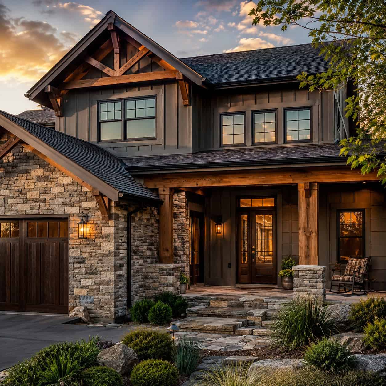
An all-brick, all-siding, or all-render facade reads flat. One material, one texture, one note.
The homes that stop you mix two or three — stone veneer at the base, timber accents on the gable, fiber cement for the body. The layers create depth and shadow the eye reads as intentional.
It’s one of the strongest curb-appeal moves going right now. And it works on almost any style.
Flat facades disappear. Layered ones get remembered.
29. Window Boxes and a Styled Porch

Window boxes add color exactly at eye level, and they suit almost any house — cottage, colonial, farmhouse, ranch.
Then finish the porch. Two chairs, a plant, a clean mat, a proper light by the door. That’s all it takes to turn an afterthought into an invitation.
A porch that says come sit is worth more than any square footage inside.
Make the outside welcome people before they ever reach the knob.
30. Picture-Frame Wall Molding

Applied panel molding — thin frames laid out in a grid on a flat wall — creates a tailored, European look for the price of a few sticks of trim.
It dresses formal dining rooms and entry walls beautifully. It’s a lighter, cheaper cousin of full wainscoting, and often the better fit above a chair rail or on a stairwell wall.
Paint the frames and the wall the same color for the richest effect. The shadow does the rest.
A quiet upgrade that looks like it cost far more than it did.
31. Warm-Metal Plumbing Fixtures

Builder chrome is fine. It’s also everywhere, and it reads as default.
Swap the kitchen faucet and the bath fixtures for brushed or aged brass and the whole room warms up. The metal catches light differently — softer, richer, more considered.
It’s the plumbing version of the hardware upgrade, and it lands the same way. A touchpoint you use every day, made worth using.
Match your fixture metals to your hardware and the whole space clicks into place.
None of this is about money, not really. It’s about intention — the difference between a house that was thrown up to a budget and a home that someone thought about.
Start with the cheap wins. Curtains hung high. Heavier cabinet knobs. A bold front door. A cleared-off surface. You’ll feel the shift before you spend real money.
Then work up to the trim, the doors, the ceilings — the details that make people stop in the doorway and not know why. Those are the ones that appraisers notice first, too.
A basic house holds you. A beautiful one welcomes you. The difference is almost always in the details nobody thinks to add.