


You know the wall. The one you walk past a hundred times a day and never quite finish.
Maybe there’s a single small frame floating in the middle of it, lonely and too high. Maybe there’s nothing at all — just a flat expanse of eggshell paint that makes the whole room feel like a rental waiting to be filled.
The good news is that the difference between a cheap-looking wall and an expensive-looking one almost never comes down to money. It comes down to scale, texture, and restraint.
A $30 box of trim can read like old-money paneling. A thrifted stack of plates can look like an heirloom collection. And a wall left deliberately blank can look more intentional than one crammed with clearance-rack art.
Here are 29 ways to fill an empty wall that make a room feel finished instead of furnished on a budget.
1. One Oversized Statement Piece (Go Bigger Than Feels Safe)

The number-one mistake that makes a wall look cheap is art that’s too small.
Designers see it constantly — a postcard-sized print stranded on a wall that needed something four times as large. A scatter of tiny frames reads cluttered. One big, confident piece reads intentional.
Go bigger than feels comfortable. When in doubt, size up, because the piece that looks huge leaning against the wall usually looks just right once it’s hung. Designers interviewed by Homes & Gardens point to undersized art as the fastest way to cheapen a room.
Anchor the wall. Let it own the space.
2. Nail the Scale: The Two-Thirds Rule

Budget art doesn’t look cheap because it’s cheap. It looks cheap because it’s the wrong size.
Two numbers fix that. Art or a grouping should fill roughly half to three-quarters of the open wall, and it should be about two-thirds as wide as the furniture underneath it.
There’s also a height rule worth knowing. Center your piece around 57 inches from the floor — Apartment Therapy calls it the 57-inch rule, and it matches average eye level in galleries.
Before you drill anything, cut craft paper to size and tape it up for a day. Live with it. You’ll know in an afternoon whether the proportion is right.
3. Picture-Frame Molding (Applied Wall Paneling)

This is the old-money wall treatment, and it costs almost nothing.
You’re framing rectangles of empty wall with thin trim, echoing the paneled rooms of historic homes. A few boxes of molding, some glue, a brad nailer, and a wall goes from builder-flat to formal.
Paint the trim high-sheen white against a matte wall and the frames catch light along every edge. Or paint everything one moody color for a richer, enveloping effect.
If you can measure and cut a straight line, this is a weekend you’ll be proud of. It’s a natural for anyone already into trim work with basic shop tools.
4. Board-and-Batten Accent Wall

Cut a straight line, and you can build this.
Board-and-batten runs vertical strips over a flat wall in an even grid, capped with a top rail. It’s one of the most beginner-friendly upgrades that still reads expensive and well-styled.
Height is flexible. Stop it at chair-rail level for a subtle wainscot, or run it floor-to-ceiling for real drama.
Cheap in materials. Rich in result.
5. Vertical Wood Slat / Fluted Wall

Narrow slats spaced evenly across a wall create rhythm, shadow, and depth that a flat surface never has.
Warm species sell the high-end look. Western red cedar, teak, or walnut read organic and custom rather than flat-pack.
It’s one of the biggest wood-forward trends heading into 2026, but restraint matters. Keep it to a single wall or a defined section.
Run it floor-to-ceiling across an entire room and it stops feeling calm and starts feeling busy. A wood accent wall works best as a focal point, not wallpaper.
6. Shiplap or Tongue-and-Groove Planking

Shiplap bends to whatever you want it to be.
Paint it a solid color and it reads clean and modern. Leave it natural or stained and it turns rustic and warm. Same boards, two completely different rooms.
It adds timeless character anywhere, and it doesn’t have to stop at the walls. Run it up onto the ceiling and you get a pleasant surprise every time someone looks up.
A shiplap wall from old fence panels proves you don’t need fresh lumber to pull it off.
7. Wainscoting & Beadboard

Lower-wall paneling does two jobs. It protects the wall from chairs and shoes, and it adds instant sophistication.
Dining rooms, hallways, and entries are where it earns its keep. High-traffic zones that take a beating look better wearing it.
To modernize without losing the charm, skip the default white. Paint it moody — slate blue, charcoal, sage.
The dark version is the one that reads current instead of colonial.
8. Reclaimed Wood Plank Wall

Some things you can’t fake, and age is one of them.
Boards pulled from old barns, factories, and warehouses carry knots, nail holes, and patina that no distressing kit reproduces. Each plank is a small piece of history, and the whole wall signals craftsmanship and salvage over mass production.
One warning. The rustic-wood look is easy to overdo, and a whole room of weathered gray tips fast into theme-restaurant territory.
One wall. Let the boards do the talking.
9. A Picture Ledge (Lean, Don’t Nail)

A narrow ledge turns a wall into a rotating gallery.
Art leans against the wall instead of hanging from it. You layer frames front to back, swap pieces on a whim, and never punch a fresh row of nail holes to do it.
Renters love it for the damage-free part. Everyone else loves it because a collected look builds over time instead of committing you to one arrangement forever.
Lean a big piece behind two smaller ones and let them overlap. That casual overlap is what reads expensive.
10. A Cohesive Gallery Wall (The Right Way)

Gallery walls go wrong when nothing ties them together.
Mismatched frames, clashing sizes, random subjects — that’s the dorm-room version. The curated version shares one unifying thread across every piece.
Pick a rule and hold it. All natural-wood frames. All black-and-white photos. Or generous white matting around everything, which does more heavy lifting than any single print.
The thread is the whole trick. According to Parachute, unity is what separates a designed wall from a cluttered one.
11. Styled Floating Shelves (Fill Only 60–70%)

Loaded shelves look like storage. Styled shelves look designed.
Here’s the fastest fix. Take everything off, then put back only 60 to 70 percent of what was there.
The empty space between objects is what makes the whole thing read intentional. Cram every inch and it turns into visual noise; leave gaps and it turns into a display.
Mix heights, lean one small piece of art, and let a stack of books sit horizontally. A set of strong floating shelves gives you the blank canvas to style against.
12. Floor-to-Ceiling Built-Ins with a Rolling Ladder

Few walls read more sophisticated than shelves that climb all the way to the ceiling.
Add a rolling library ladder and the whole thing tips into estate-library territory. It’s function and drama in the same footprint.
Style the books by spine color — neutrals, monochrome, or grouped tones — and storage becomes a designed backdrop instead of clutter.
Even a modest version anchors a wall better than almost anything else you can hang.
13. An Oversized Leaning Floor Mirror

Prop a tall mirror against the wall and skip the hammer entirely.
An oversized leaner bounces light, makes the room feel bigger, and reads architectural. It’s one of the easiest ways to make a small room feel bigger without touching a single stud.
Scale is everything here. A small mirror hung dead center reads like an afterthought; a floor-to-near-ceiling leaner reads like a design choice.
Go tall. Go wide. Lean it and walk away.
14. A Mirror Placed to Reflect Something Beautiful

The oldest designer trick with mirrors isn’t about the mirror. It’s about what it reflects.
Angle it to catch a window, a chandelier, or a styled console — never a blank opposite wall. A mirror that reflects nothing just doubles the emptiness.
Antiqued or smoked glass adds a warmth clear glass can’t touch, and it hides the fingerprints and dust that plain mirrors flaunt.
Place it for the view, not just the wall.
15. A Framed Textile, Tapestry, or Vintage Rug
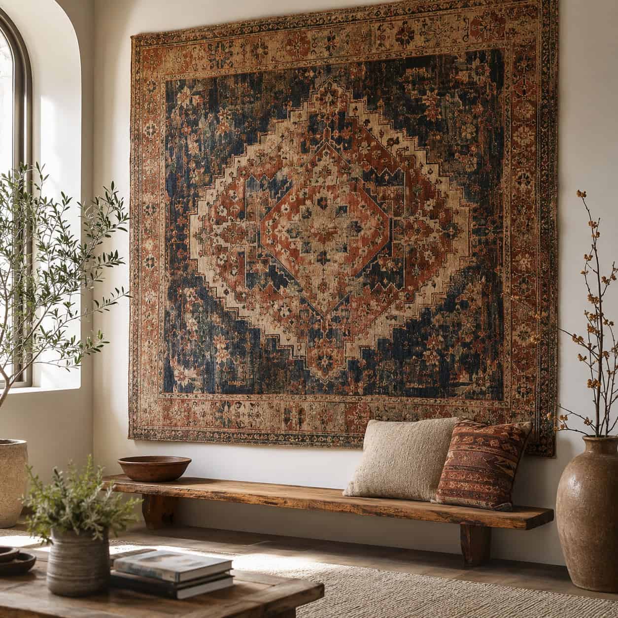
Fabric fills a big wall softly, without the cost of large-scale art.
A handwoven tapestry or a worn vintage rug adds texture and warmth that a flat print can’t. It carries a stately, collected pedigree — the same move you’d find in old palaces and manor houses.
Mount it on a rod or stretch it over a frame. Either way, it softens the acoustics and the look at once.
One large textile can do the work of a whole gallery wall.
16. Grasscloth or Textured Wallpaper Accent Wall

A single papered wall takes a room from unfinished to intentional in an afternoon.
Grasscloth and tonal, tone-on-tone patterns add tactile depth that flat paint simply can’t produce. The light catches the weave and the wall gets quietly interesting.
Renters aren’t left out. Peel-and-stick versions deliver the same effect and come right back off at move-out.
The design world circled back to grasscloth for a reason. It photographs flat but feels rich in person.
17. Framed Wallpaper Panels as Art

You don’t have to paper a whole wall to use wallpaper.
Frame remnants or a bold roll into large panels and hang them like oversized artwork. Two or three matching panels can fill a big wall for the price of a single roll.
Cheap material, custom result, zero permanent commitment. When you tire of it, you swap the paper, not the wall.
Bold botanicals and geometric prints work best at this scale.
18. A Vintage Plate Wall

Thrifted blue-and-white plates hung at varied heights read as an inherited collection, not a clearance bin.
The trick is the arrangement. Cluster them tight, vary the sizes, and let the eye travel across the grouping.
Layer them over a salvaged window sash and you add structure and a sense of history underneath the china. Command hooks keep the whole thing damage-free.
Grandma’s cabinet was right all along.
19. Architectural Salvage: Corbels, Pediments & Tin Tiles

A salvaged pediment mounted over a doorway does something no big-box decor can. It brings real age into the room.
Chippy corbels flanking a shelf. Reclaimed pressed-tin ceiling tiles hung as art. Every piece is one of a kind because it was cut for a building that no longer stands.
Salvage yards and architectural reclaim shops are full of these for a fraction of what the look suggests. The The Ponds Farmhouse makes a strong case for hunting them down.
Character you cannot manufacture, priced like clutter.
20. Old Windows & Shutters as Wall Art

An old six-pane window with the glass swapped for chicken wire or a mirror fills an awkward stairwell wall with instant texture.
Vintage shutters do the same, and adding a row of pegs turns them functional. Both usually run about $20 a piece at a flea market.
There’s a practical bonus, too. A hung window or shutter can disguise an ugly vent or air exchange while it decorates.
Awkward walls, meet your fix.
21. Add a Picture Light Above the Art

Lighting is the detail that separates a museum wall from a bare one.
A picture light over a large piece, a pair of sconces flanking it, or a hidden LED strip behind a shelf — any of them instantly elevates the whole treatment.
Battery and plug-in picture lights mean no wiring required. Clip one on, and cheap art starts looking curated.
It’s the last five percent that makes the other ninety-five look expensive.
22. Limewash or Textured Plaster Finish

Flat paint is flat. Limewash breathes.
Both limewash and troweled plaster add a cloudy, hand-applied depth — soft movement across the surface that a roller can’t replicate. It’s central to the 2026 move toward soft whites and grounded earth tones.
Research in Frontiers in Psychology ties wall color and finish directly to how a room feels, which is exactly why these Old-World textures land the way they do.
The look reads custom and European. The price is a bucket and a brush.
23. A Console Table, Lamps & Art Vignette

Sometimes a wall needs furniture, not just art.
Anchor it with a console table, top it with a pair of matching lamps, and hang a piece above. Suddenly the empty space has function and finish.
In pass-throughs and entries, this vignette reads far more complete than art hanging alone over nothing. A simple console table from two boards is an easy build to start with.
Lamps on, and the wall stops being a wall and becomes a moment.
24. A Triptych or Set of Three (The Rule of Threes)

Odd numbers just look better on a wall.
A set of three framed pieces fills a span with rhythm and looks deliberately composed in a way a lone frame never manages. The eye likes the count.
Space them evenly, keep the frames identical, and you’ve got a foolproof arrangement that dodges the lonely-single-frame problem entirely.
Three panels of one wide image. Three related prints. Either way, it works.
25. A Painted Arch or Geometric Shape

No art? Paint the shape instead.
A soft arch or a block of color behind a bed or console frames the space and creates a focal point for the cost of a sample pot. It’s a favorite budget and renter move that still reads intentional.
Color does real work here. Bright, warm tones can actually make a surface feel farther away, according to a study in PLOS ONE — useful in a tight room.
Tape it, paint it, done in an afternoon.
26. Know When to Leave It Blank (Negative Space)

Sometimes the most expensive-looking choice is nothing at all.
Designers treat negative space as essential, not empty. The eye needs somewhere to rest, especially on a wall you only ever see in passing.
A wall you’re forever tempted to fill might already be doing its job by staying quiet. Cramming it just to fill it is what cheapens the room.
Here’s a quick gut-check on whether to fill a wall or leave it be:
| Fill It | Leave It Blank | |
|---|---|---|
| Traffic | Main focal wall | Seen only in passing |
| Nearby walls | Mostly bare | Already busy |
| Room feel | Cold, unfinished | Calm, balanced |
| Furniture below | Anchoring a piece | Standalone span |
When the surrounding room is already working hard, restraint is the move that reads luxurious.
27. A Statement Wall Clock

Oversized clocks are back, and a good one earns its wall.
The right piece is decor and function at once — a genuine vintage face or a bold modern design that commands attention from across the room.
But choose carefully. A generic big-box clock tips cheap fast, and the look lives or dies on the design itself.
Vintage or bold, or skip it. A geometric clock made from 2x4s is one way to guarantee it looks custom.
28. A Curated Hat Wall or Functional Collection

A row of wide-brim hats hung across an entry wall reads charming and personal.
The same goes for a collection of old tools, woven baskets, or copper pans — anything with shape and history displayed with a little intention.
This one skews casual, so read the room. It shines in a mudroom or entry, where lifestyle beats design-forward.
Personal, warm, and lived-in — as long as the pieces feel collected, not clearance.
29. Ceiling-Height Drapery Behind a Bed or Window

A soaring two-story wall can feel cold and unfinished. Fabric warms it up.
Hang floor-to-ceiling drapes and the eye follows them straight up, softening all that vertical emptiness. Mount the rod near the ceiling, not the window frame, and let the panels puddle slightly at the floor.
It’s a supporting move more than a standalone one, but behind a bed or a tall window it does exactly what a bare wall can’t.
Height and softness, in one pull of the rod.
Conclusion
Notice what almost none of these required. A big budget.
The wall that looks expensive is the one that gets scale right, adds a little texture, and knows when to stop. A box of trim, a thrifted window, a bucket of limewash — these beat a wall full of tiny frames every time.
Pick one wall. Tape up some craft paper. Live with it for a day before you commit.
Empty isn’t the problem. Filling it without a plan is.