


The first thing anyone learns about your home happens in about four seconds. Before the living room. Before the kitchen. Right there at the door.
Most entries get treated like a hallway you pass through. A pile of shoes, a coat draped over the newel post, a single builder-grade light overhead doing nothing.
But a good entry does real work. It slows people down. It tells them what kind of house they’ve walked into.
And the best part — none of it takes a renovation. Most of these you can knock out in a weekend, some in an afternoon, a couple in five minutes flat.
Here are 29 entryway ideas that change the first impression, starting outside the door and working all the way in.
1. Paint the front door a saturated, confident color

The impression starts before anyone touches the knob.
Soft blush, greige, faded taupe — those read tired the moment paint fades in the sun. Designers reach for depth instead: forest green, navy, oxblood, a real black. Colors with conviction.
A quart of exterior paint and a free Saturday does it. Benjamin Moore leans hard on saturated hues for front doors, and there’s a reason — a bold door photographs like a design decision, not an accident.
Prime the bare spots. Two coats. Done by dinner.
2. Treat door hardware like jewelry
Every single guest touches the handle. It’s the one piece of your house everyone puts their hand on.
So why leave the shiny builder-grade lever that came in a blister pack?
A weighty knob, an unusual knocker, a clean matte-black smart lock — any one of them lifts the whole door. Cheap hardware quietly undercuts an expensive paint job.
Swap it. Fifteen minutes with a screwdriver.
3. Layer in a quality doormat
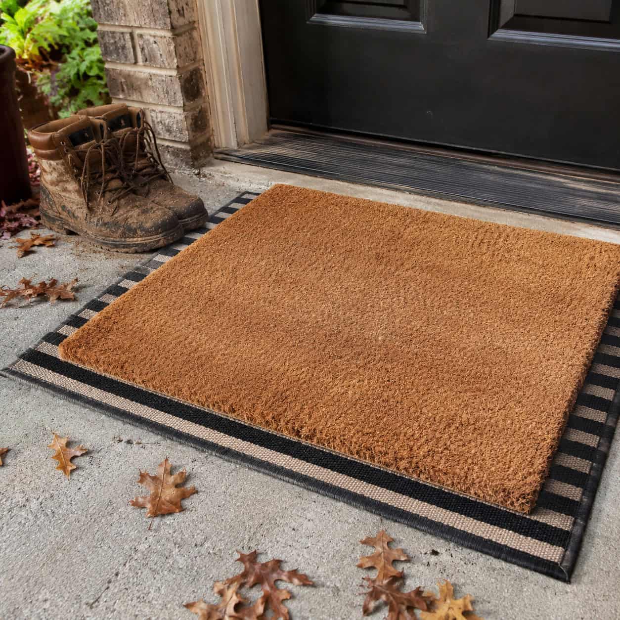
A generous, heavy mat says the home is cared for before the door even opens.
A curled-up dollar-store mat, or worse, no mat at all, reads as an afterthought right at the moment of arrival. It also lets every bit of grit track straight inside.
Go oversized. Coir, rubber-backed, something built to take a beating in weather.
Bonus points for layering a low-profile mat under a patterned one.
4. Anchor with a right-sized console table

Most people buy the console too small. Way too small.
A skinny little table floating on a big wall makes the whole entry feel lost. The piece should fill roughly 50 to 75 percent of the wall it sits against, and land around 30 to 36 inches high.
Scale is the trick. A console that reads intentional anchors everything you set on top of it.
If you’re building your own, a rustic entryway table is a straightforward weekend build that lets you dial the dimensions to your exact wall.
5. Float a slim console in tight entries

Not every entry has room for a full table. Apartment hallways, narrow foyers, a door that opens straight into the living room.
The fix is a slim-profile or wall-mounted floating console. Ten or twelve inches deep is plenty.
It keeps the walkway clear while still giving you a landing spot for keys and mail. Mount it, and the floor underneath stays open — the room breathes.
Form and function, no crowding.
6. Anchor a grand entry with a round center table

If you’re lucky enough to have a big open foyer, put something in the middle of it.
A round center table is one of the moves top designers are pushing for 2026. It marks arrival. It slows people down and gives the space a true center of gravity.
Homedit frames it as a presence-and-proportion choice — chosen for how it fills the room, not for storage.
Top it with a big vessel of branches and let it command the space.
7. Pull the console off the wall (the shadow gap)

Here’s the move almost nobody makes.
Furniture shoved flat against the wall flattens the whole room. Pull the console out half an inch to an inch and you create a shadow line — a reveal — that gives the piece depth.
It’s the same reason good millwork sits proud of a wall instead of flush. That thin band of shadow reads as craftsmanship, even if no one can name why.
Try it. Slide the table forward an inch and stand back. The difference is real.
8. Hang a mirror at eye level

A mirror is the hardest-working object in an entry. It bounces light, doubles as a focal point, and lets people do a last-look before they head out.
But height matters more than people think. Hang it so most faces land in the glass — too high or too low creates that awkward crouch-and-tilt moment.
Center it around 57 to 60 inches off the floor for the typical household.
Over a console, a mirror also visually stretches a cramped foyer.
9. Ditch recessed-only lighting for a statement fixture

Filling the ceiling with recessed cans leaves an entry flat and forgettable. Designers have a nickname for it — Swiss cheese lighting.
All those little holes throw even, boring light and nothing to look at.
Swap in one sculptural piece. A semi-flush lantern, a small chandelier, a flush-mount with real shape. That fixture becomes the thing people notice the second they step in.
Even a low ceiling can carry a good flush-mount.
10. Layer your lighting with sconces and a lamp

One light source makes a room feel flat and unevenly lit. Always.
Stack them instead. Overhead fixture, a pair of sconces, a small table lamp on the console. Three layers at three heights.
To keep it from looking chaotic, tie the fixtures together with a shared metal finish and the same bulb color temperature. Livingetc flags mismatched temperatures as one of the fastest ways to make layered lighting look accidental.
Warm, even, dimensional. That’s the goal.
11. Warm your bulbs to 2700–3000K

Cool, blue-white bulbs turn an entry into a hospital waiting room. Nobody wants to be greeted by that.
Look at the box. You want 2700K to 3000K — soft warm white.
That range gives you the cozy, golden glow that reads as welcoming. It’s a five-minute fix that costs a few dollars.
And make every bulb match. One cool bulb in a warm room looks broken.
12. Add board-and-batten or wainscoting

A plain drywall entry has nothing to hold your eye. Paneling fixes that in a weekend.
Board-and-batten adds vertical rhythm and texture. Wainscoting brings a lower band of architecture that plain walls never had.
Designers love pairing board-and-batten with a moody paint color for a first impression people actually talk about. It’s some of the most satisfying small home upgrades you can tackle with basic tools.
Primed MDF strips, a brad nailer, caulk, paint. That’s the whole kit.
13. Go bold with paint or wallpaper on the walls

A blank white entry feels sterile. It says nothing.
Pick a saturated color — emerald, navy, charcoal — or a patterned wallpaper and the smallest foyer becomes a statement.
Dark colors don’t shrink a tiny entry the way people fear. Often they make it feel intimate and deliberate.
You’re moving through fast anyway. Give people something to remember on the way past.
14. Don’t forget the ceiling — the fifth wall

Look up. That surface overhead is doing nothing.
Paint it a deep color or paper it with a pattern and you get a jolt of drama nobody expects. Entries often have the tallest ceilings in the house, which makes them the perfect place for it.
A painted ceiling pulls the eye upward and makes the space feel considered top to bottom.
It’s the detail guests can’t quite place but definitely feel.
15. Keep paint transitions cohesive

When an entry opens straight into another room, an abrupt color break looks cheap. The eye snags on it.
Carry one wall color through the arrival zone and into the adjoining space. The flow reads as intentional and, honestly, expensive.
Save the bold contrast for a room with a real doorway to frame it.
Cohesion is a quiet trick, but it’s the kind of thing appraisers notice first when they walk a house.
16. Build in a storage bench
This is the workhorse of any entry.
A built-in bench with a lift-up seat hides shoes and bags while looking like custom furniture. Add cubbies below and you’ve solved the mess and gained a place to sit and pull off boots.
Plywood, some trim, a piano hinge on the lid — it’s a weekend project, not a contractor bill. The Woodshop Diaries build shows how far basic sheet goods can go here.
Prefer to skip the build? A walnut storage bench with hidden drawers covers the same ground with more polish.
17. Install coat hooks or a hall tree

Get the coats off the floor and off the bench. Go vertical.
A row of sturdy wall hooks turns a bare stretch of wall into a drop zone. A freestanding hall tree does the same for a corner without a stitch of construction.
You don’t need a dedicated mudroom to have a functional one. As the Architectural Foundation points out, even a single wall of hooks handles the daily coat-and-bag pileup.
Mount them into studs. Loaded coats are heavier than they look.
18. Ground the console with baskets for shoes

An open-leg console looks great but leaves an empty gap underneath. Fill it.
Two substantial woven baskets tucked below balance the visual weight of the table and add warm texture. They also swallow shoes whole.
It’s a Studio McGee staple — beauty and function in a single move. The eye sees texture; the shoes disappear.
Match the basket tone to the wood and it looks styled, not stashed.
19. Add a catchall tray for keys

The daily “where are my keys” problem ends with one small object.
A shallow tray or a low bowl on the console gives keys, sunglasses, and loose change a single home. It also keeps the tabletop from turning into visual clutter.
Brass, marble, a hand-turned wooden dish — pick something you like touching.
Small object. Outsized daily payoff.
20. Lay down a durable runner or rug

The wrong rug throws off the whole entry. No rug leaves it feeling unfinished.
Size it right — it should relate to the console and reach into the walkway, not hide under it like a coaster. And pick something tough.
This spot takes wet boots, dropped bags, and daily foot traffic. You want a low-pile, easy-clean weave that survives the abuse.
Indoor-outdoor rugs are underrated here.
21. Consider a patterned floor

If you’re touching the flooring anyway, make it count underfoot.
Herringbone brick-style tile gives an entry a courtyard feel. Classic black-and-white checkerboard reads timeless and slightly grand.
A patterned floor photographs beautifully and does the decorating for you — the pattern becomes the statement.
It’s the kind of hard-flooring detail that quietly tells people the house was thought through.
22. Style with the rule of three

Beginners freeze when it’s time to arrange things. The rule of three gives you a formula.
Start with three foundational pieces and three visual layers, roughly like this:
| Foundation | Layers | |
|---|---|---|
| Piece 1 | Console or bench | Lamp or light |
| Piece 2 | Mirror or art | Greenery or stems |
| Piece 3 | Tray or bowl | Books or an object |
Build the foundation first, then add the layers on top. It’s a repeatable structure that lands looking designer-styled every time.
23. Guide the eye with the triangle rule

Once your pieces are down, arrange them in heights, not a straight line.
Place a tall object, a medium one, and a low one so they form an invisible triangle across the console. A lamp, a stack of books, a small dish.
That rise and fall creates natural flow — the eye travels instead of scanning a flat row.
It’s the difference between a styled vignette and a store shelf.
24. Create symmetry with paired lamps

Want instant calm? Go symmetrical.
A matched pair of lamps flanking a mirror is a designer classic. So is a pair of urns or matching topiaries. Set the balance and you barely need anything else.
Symmetry reads as order the moment someone walks in.
Prefer something looser? Asymmetry is the modern counter-move — one tall lamp, one low stack — but master the balanced version first.
25. Include one conversation piece

Every memorable entry has one thing that stops you.
A striking sculpture. A bold piece of art. An odd vintage object with a story. Put it where the eye naturally lands and keep everything around it simple.
The restraint is what makes it work. One standout with quiet surroundings beats a shelf crammed with trinkets.
That’s the “where did you get that?” moment.
26. Bring in greenery or fresh flowers

The entry is the bridge to the outdoors, so let something living cross it.
Foraged branches in a tall vase. A potted plant on the floor. A few fresh stems in a bowl. Anything organic makes the space feel alive instead of staged.
And it rotates with the seasons for free — bare branches in winter, blooms in spring.
Even a single sprig of eucalyptus changes the air of the room.
27. Mix vintage with modern

The most interesting entries never look like a showroom set.
Pair a clean modern console with a vintage vase, an old tray, a mirror with some age on it. The old and new play off each other and neither feels flat.
In an older home, this move connects the entry to the house’s own history. A flea-market find beside a crisp new piece feels current and rooted at once.
Hunt the estate sales. One good vintage object does a lot of heavy lifting.
28. Layer in a signature scent

First impressions aren’t only what people see.
A candle or a reed diffuser near the door gives a sensory hit the instant someone steps in. Cedar, fig, a little woodsmoke — pick something that feels like your house.
Scent is the detail that turns a threshold into an arrival. It’s also the one thing guests remember without knowing why.
Keep it subtle. You’re hinting, not fogging the room.
29. Declutter the drop zone first

Before any of this, clear the mess.
Designers name clutter as the number-one reason an entry makes a bad first impression. Piled mail, a wall of jackets, six pairs of shoes in a tumble.
No paint color or fancy console overcomes that pile. Clear the surfaces:
- Corral shoes into a basket or bench
- Hang every coat that lives out here
- Sort mail the day it lands
- Leave the console 70 percent empty
Do this first. Everything else lands better on a clean slate.
Conclusion
You don’t need all 29. You need three or four that fit your space.
Start where it’s cheap and fast — the door color, the bulbs, the clutter. Then add the anchor piece and the light. The rest is styling you can tweak forever.
The entry is the handshake of the house. Make it a good one, and everything past it feels like it belongs.