

Small rooms have a way of feeling smaller than they are.
The furniture edges in. The corners fill up. You walk in and your shoulders pull in a little without you even noticing.
But square footage isn’t the whole story. A lot of what makes a room feel cramped is visual — where the eye stops, where the light dies, where a line breaks. Fix those, and a tight room breathes.
None of this requires a sledgehammer. Most of it costs a weekend and a can of paint. Some of it costs nothing at all.
Here are 29 ways to make a small room look bigger, from the counterintuitive to the free.
1. Color-drench the whole room in one shade
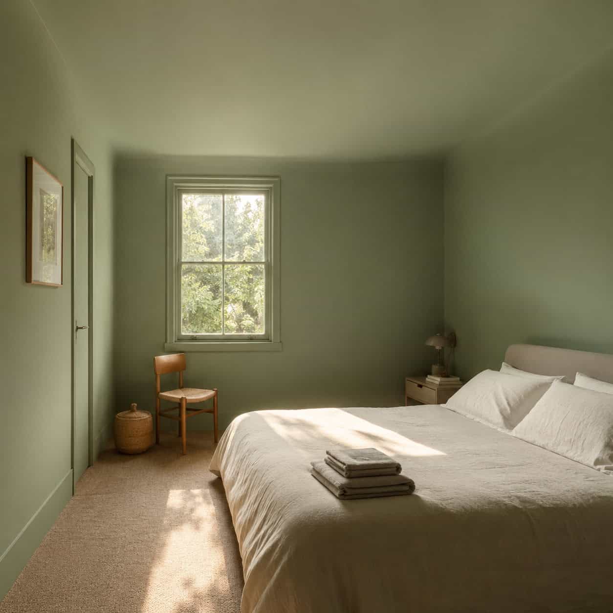
Paint the walls. Then keep going.
Take that same color across the ceiling, the trim, the baseboards, the window casings — everything. When there’s no contrast between the wall and the molding, the eye stops finding edges to trip on.
Those little breaks are what chop a room into pieces. Remove them and the walls read as farther away because nothing tells your brain where they stop.
It feels like a bold move on paper. In the room, it’s the opposite — the space quiets down and seems to expand. Designers at Little Greene lean on this trick for exactly that reason.
2. Reach for warm light neutrals, not stark white
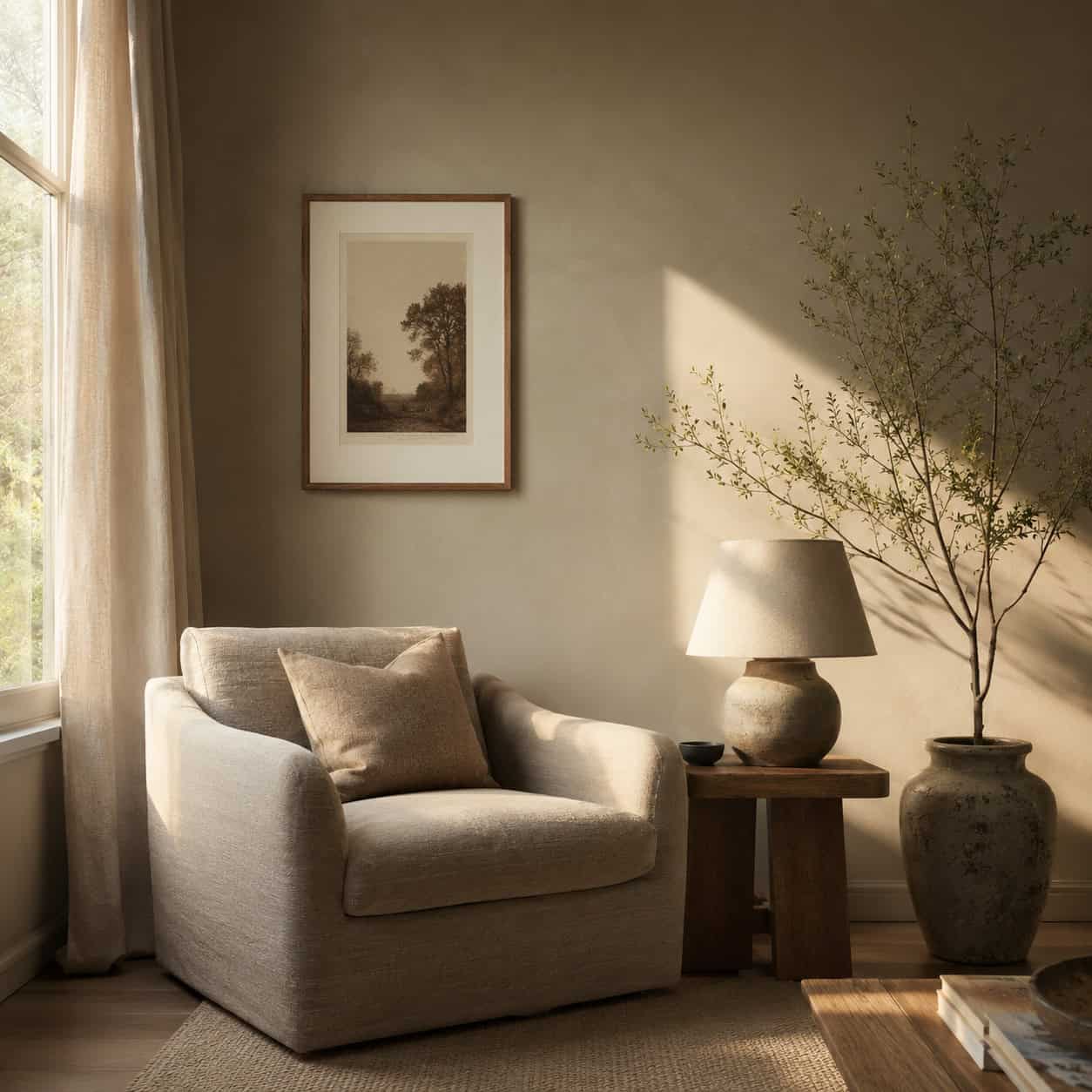
Pale colors reflect light. That part everyone knows.
But bright, clinical white can backfire. In a poorly lit or north-facing room, pure white goes cold and flat and starts looking gray by mid-afternoon.
Pick a neutral with a whisper of yellow or red in the undertone instead. It still bounces light and reads airy — it just does it with warmth, so the room feels bigger and inviting at the same time.
Test the swatch on the actual wall at 4 p.m. before you commit. Undertones lie in the can.
3. Let a cool color pull the walls back
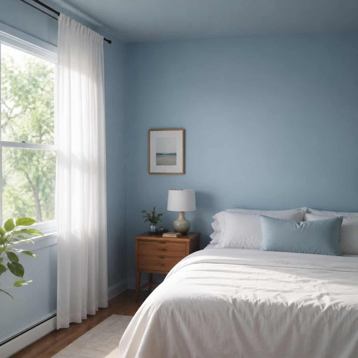
Cool colors recede. It’s a quirk of how eyes read depth.
An airy blue or a soft, dusty green visually drifts away from you, so the walls feel farther apart than the tape measure says. Benjamin Moore builds a whole small-room strategy around this — Benjamin Moore calls these receding hues, and they’re gold in a cramped bedroom.
Warm reds and oranges do the reverse. They advance toward you and close the walls in.
Want distance? Go cool.
4. Don’t be scared of a dark, enveloping color
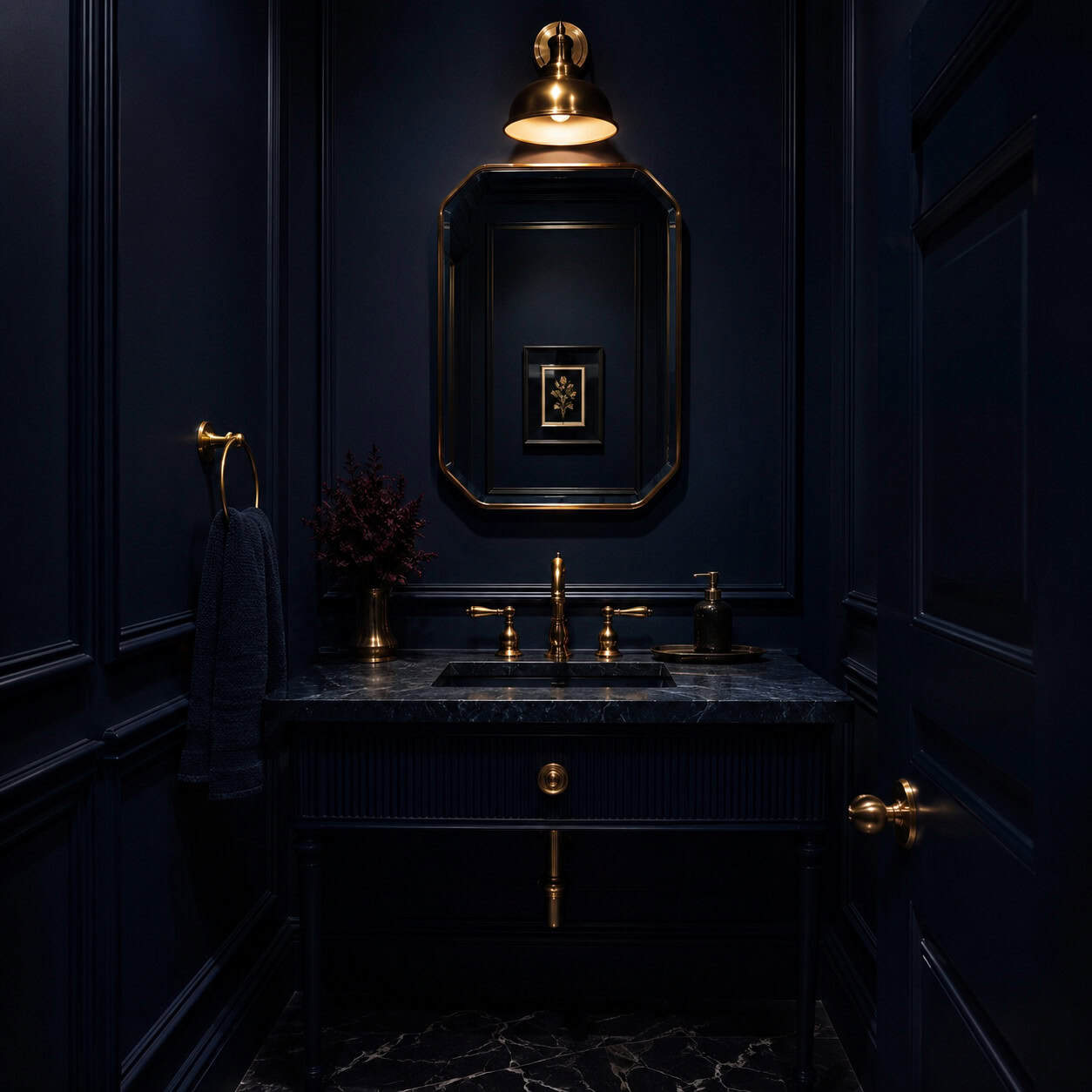
Here’s the twist nobody expects.
An inky navy or a deep forest green, drenched over every surface, doesn’t shrink a room — it dissolves the edges. The color goes so deep and so even that your eye can’t find where the wall ends.
The corners vanish. The room takes on a kind of bottomless quality, like the walls just keep going into shadow.
It works best in a den, a powder room, a bedroom — anywhere you’re chasing cozy over bright. Pair it with the color-drench approach and the effect doubles.
5. Retire the accent wall
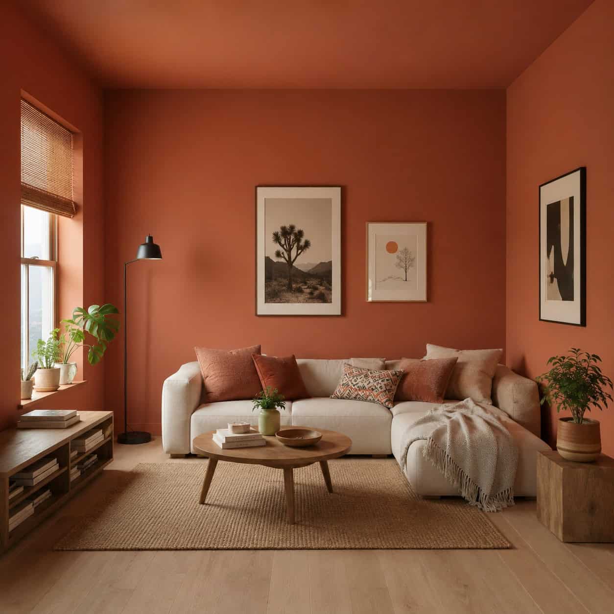
The single feature wall had its run. In a small room, it’s working against you.
One wall in a bolder color slices the room into visual chunks — this section, that section — and every division makes the whole thing read smaller.
Designers have quietly shifted on this. One consistent color across all four walls has more impact and makes the space feel larger, a point the design team at WYPR makes plainly.
Save the drama for a big room.
6. Hang curtains high and wide so they kiss the floor
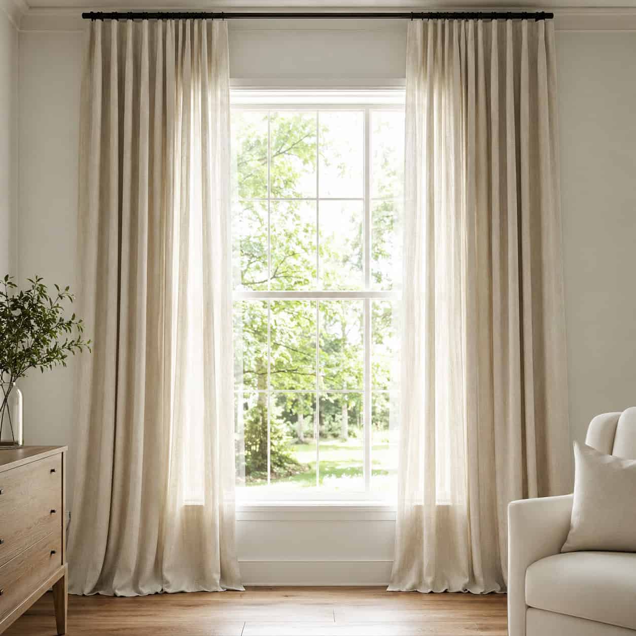
This is the trick every designer repeats, and for good reason.
Mount the rod just below the ceiling — not at the top of the window frame. Then run the panels wide, past the window edges, and let them just graze the floor.
The vertical line draws the eye all the way up and fakes a taller ceiling. The wide rod makes the window look bigger than it is.
The floor-grazing detail matters. Curtains that stop short at the sill look like high-waters and pull everything down. Long and lean is the whole point.
7. Keep window dressings sheer and light
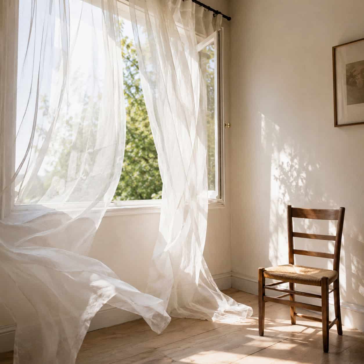
Heavy drapes are room-killers in a small space.
Dark, dense fabric swallows daylight and hangs there with real visual weight, like a wall of its own. Everything behind it feels dimmer and tighter.
Swap in sheer, pale panels that let light flood through. Or skip curtains entirely if privacy allows.
Light comes in. Weight goes out. The room opens.
8. Hang a big mirror opposite a window
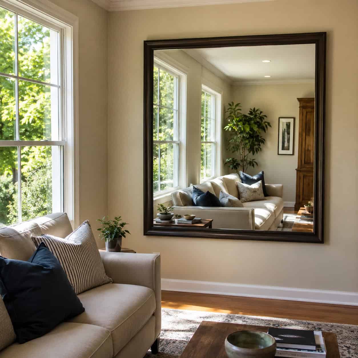
Call it the golden rule of mirrors.
Put a large mirror on the wall facing a window and it catches the daylight, then throws it deep into the room. Perceived space nearly doubles, which is why Apartment Therapy ranks it as the single best mirror move.
One catch. Check what the mirror actually reflects before you hang it.
Reflect a leafy view, some art, a bright corner — not a closet door or a pile of laundry. A mirror doubles whatever it sees.
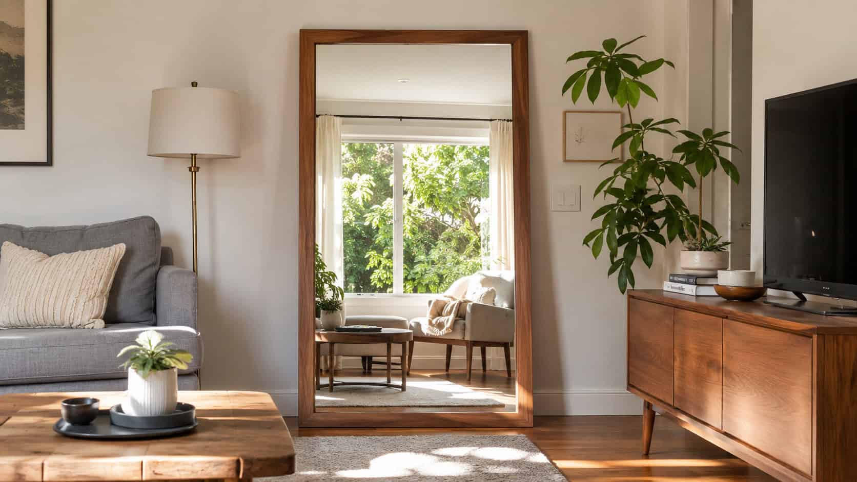
9. Lean an oversized floor mirror against the wall
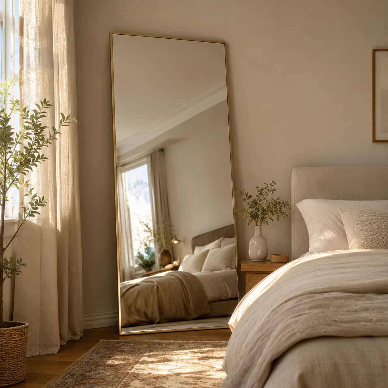
No drill required. No holes in the plaster.
A full-height mirror leaned against the wall stretches the room upward and folds in a sense of depth. It’s the renter’s best friend and it takes about ten seconds to place.
Go big and keep the frame simple. A slim frame or none at all makes the reflection read as more room and less object.
Tuck it in a corner or beside the bed. Instant breathing space.
10. Put a mirror at the end of a hallway or entry
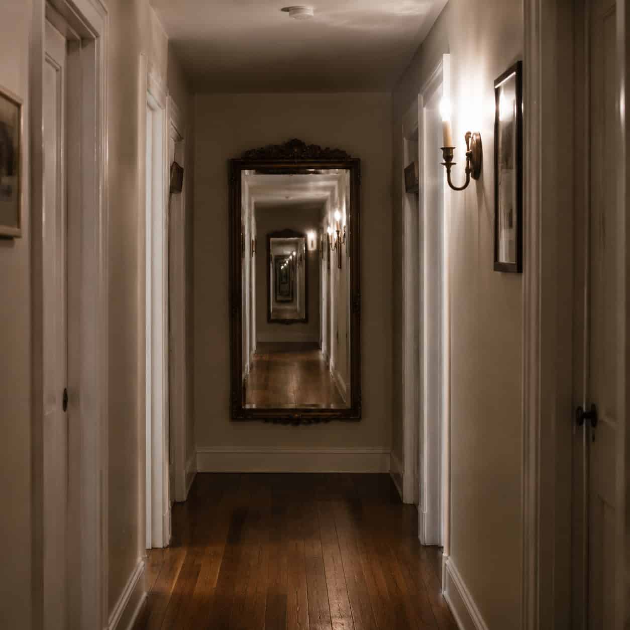
Narrow halls have a tunnel problem.
You look down a tight corridor and the walls seem to squeeze toward a dead end. It’s a common headache in older homes with skinny passages.
A mirror straight ahead breaks the spell. The brain reads the reflection as the space continuing, so the tunnel opens up instead of closing off.
Same move works in a cramped entryway. Hang it at the far end and the whole approach feels less boxed in.
11. Choose furniture that stands on legs
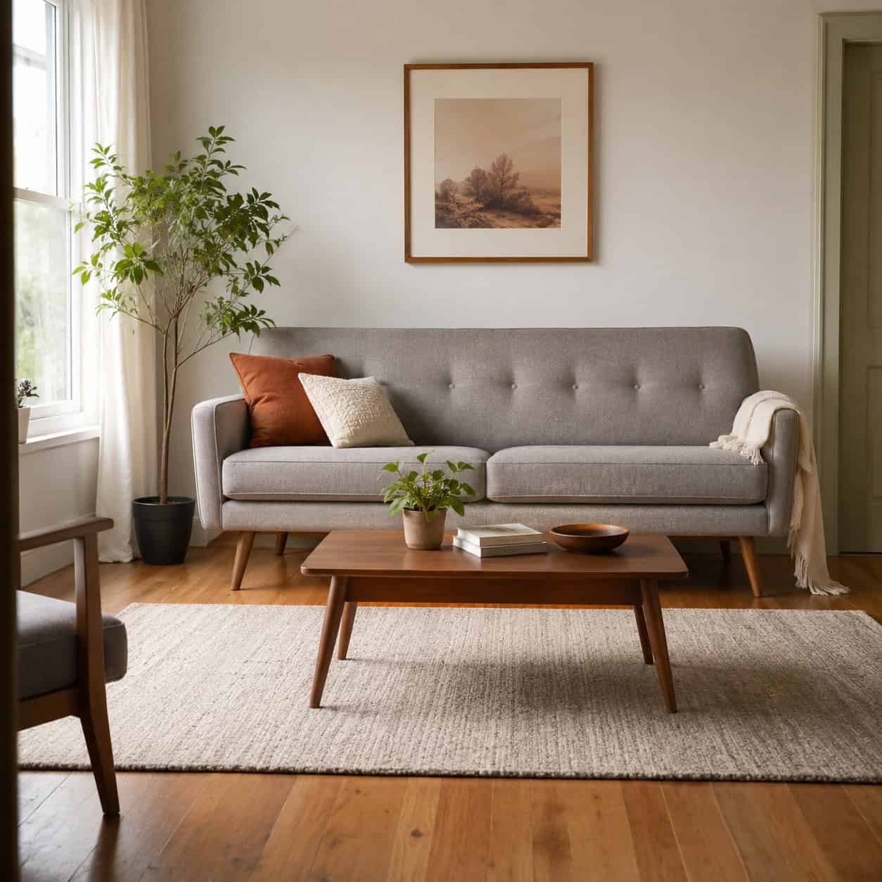
Skirted sofas sit heavy. Legs let a room breathe.
When a couch or a dresser or a bed stands on visible legs, the floor keeps running underneath it. That sliver of visible floor tricks the eye into reading more open space.
Even a few inches of exposed leg makes a difference. The piece looks like it’s floating instead of squatting.
Tapered wood legs, thin metal legs, hairpin legs — any of them beat a base that hits the floor like a brick.
12. Bring in see-through pieces
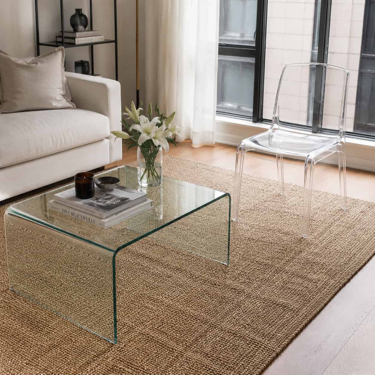
Some furniture earns its keep by disappearing.
A glass coffee table, an acrylic side chair, a lucite console — they do their job without adding visual bulk. Light passes right through them and your eye barely registers they’re there.
You get the function and skip the weight. In a tight living room, a glass-top table can hold your coffee and still let you see the rug underneath.
It photographs beautifully, too. The room looks emptier than it is.
13. Scale furniture right — skip the dollhouse effect
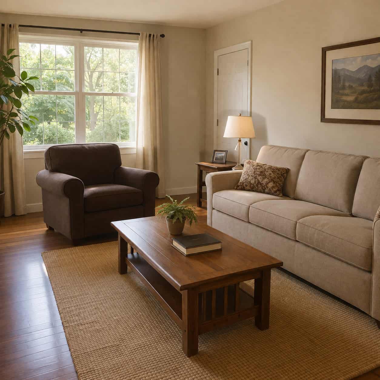
The instinct in a small room is to buy small everything. It’s the wrong instinct.
Cram in a bunch of tiny pieces and you get clutter — a fussy jumble designers call the dollhouse effect. Lots of little things read as busy and cramped.
A few properly scaled pieces actually feel more generous. One real sofa beats a loveseat and three poufs. The WYPR design roundup calls this out directly.
Fewer things, sized right. That’s the move.
14. Hang one oversized piece of art
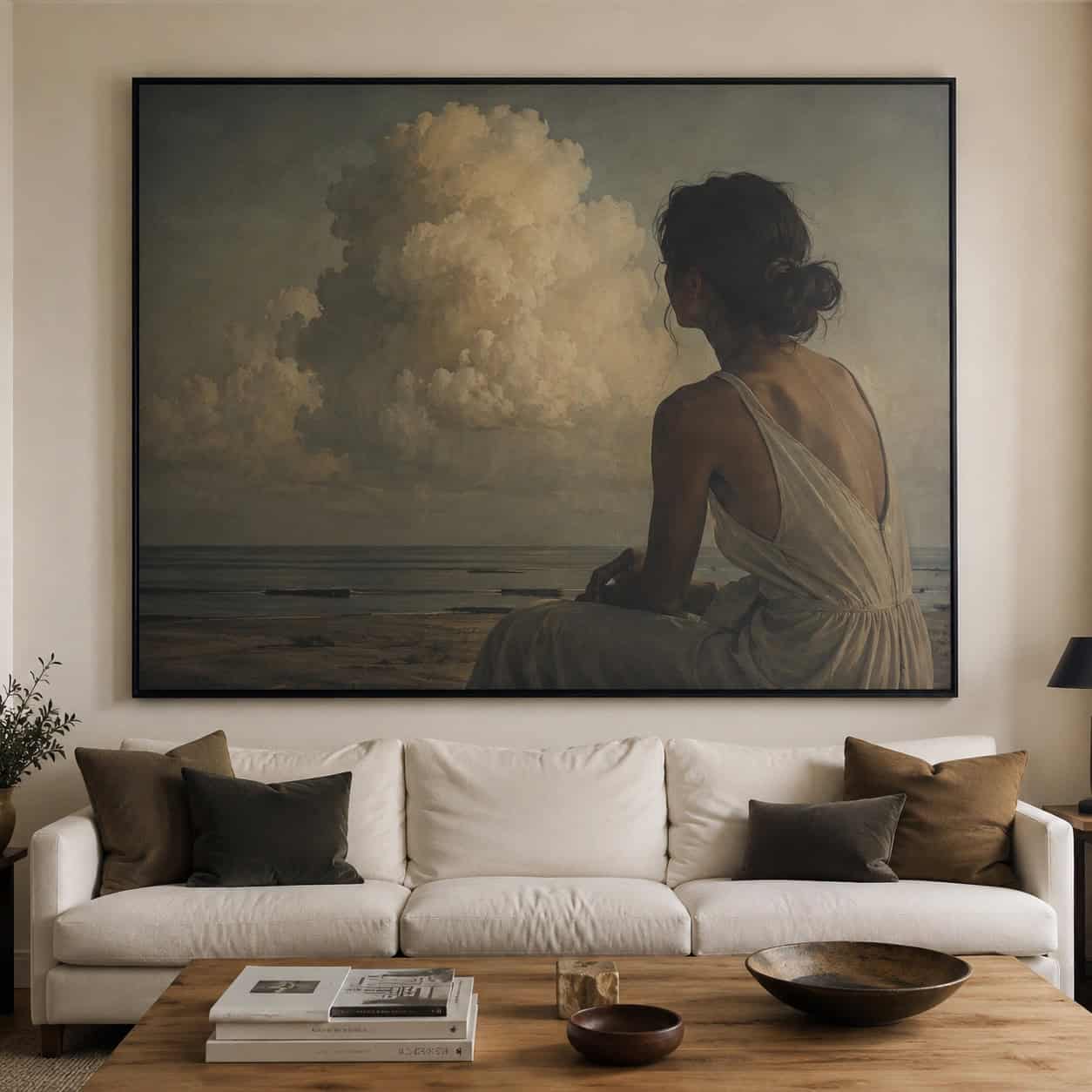
A wall of tiny frames looks puny. Worse, it looks busy.
One large piece of art does the opposite — it makes the whole wall feel expansive and intentional, like the room was built to hold it.
The scatter of little frames chops the wall into fragments. A single big work reads as confidence and space.
Go bigger than feels comfortable. That’s usually the right size.
15. Layer your lighting and kill the single ceiling fixture
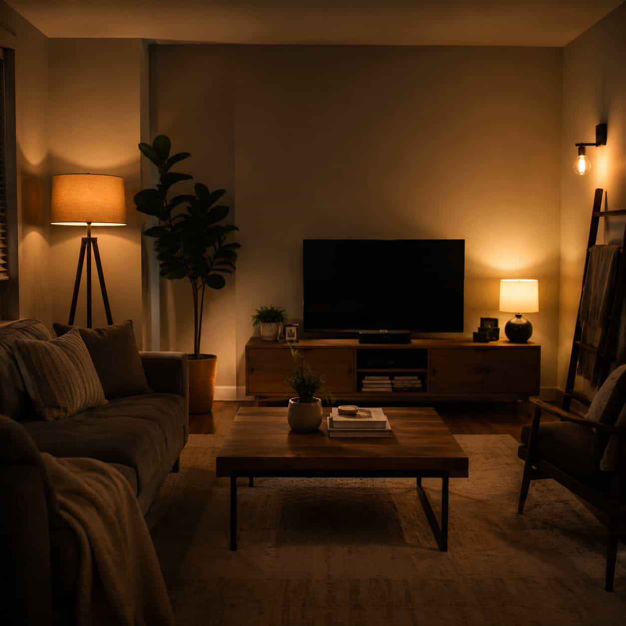
One central light flattens everything.
That lone ceiling fixture — the builder-grade dome everyone calls the boob light — throws even, shadowless light that announces exactly how small the room is. No depth, no drama, no mystery.
Layer instead. A lamp in the corner, a sconce on the wall, some light down low — the mix creates pools of brightness and shadow that give a room dimension. Light falls off fast with distance, and that falloff is what your eye reads as depth, a point Marymount University gets into.
Contrast makes a room feel deeper. Flat light makes it feel like a box.
16. Draw the eye up with floor-to-ceiling shelving
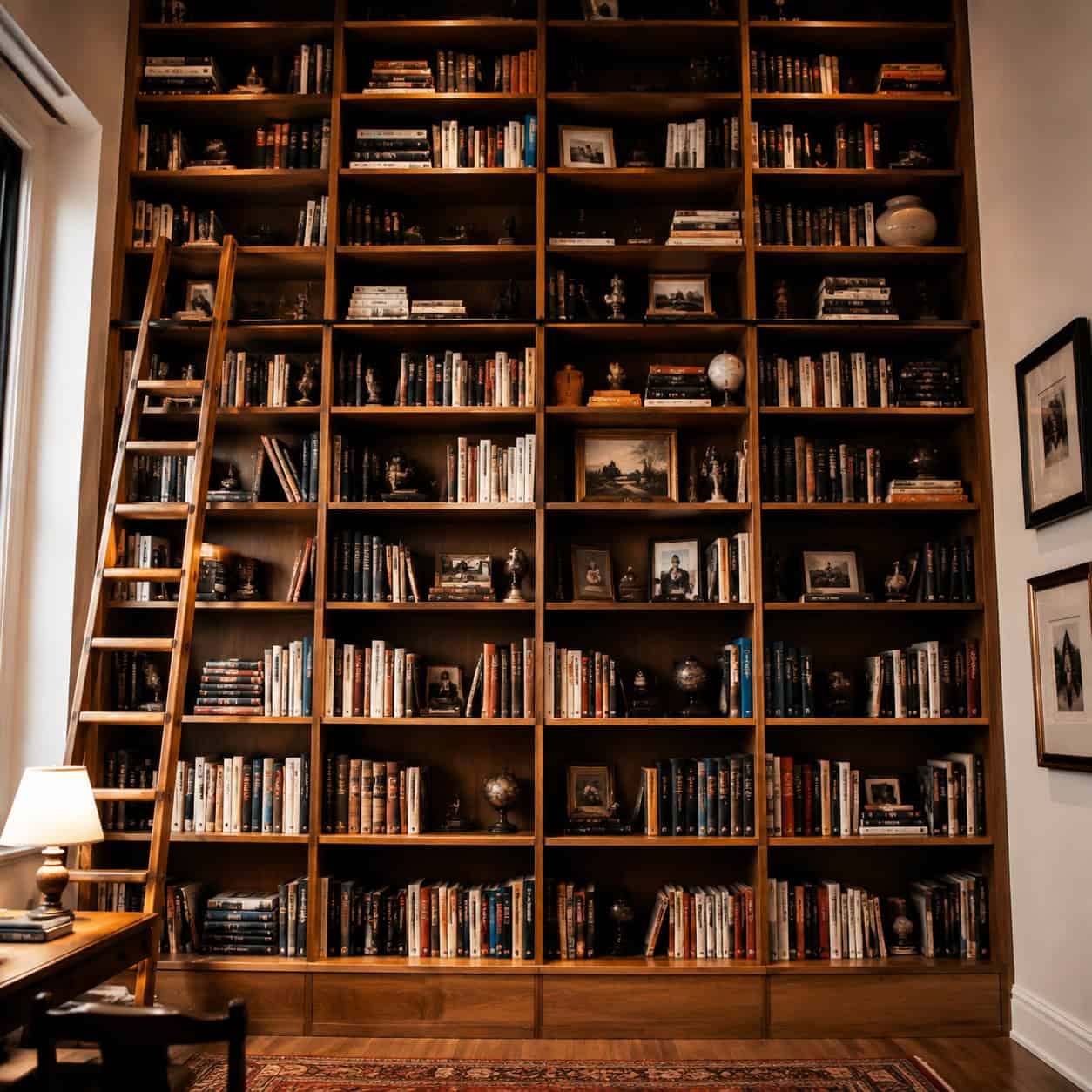
Tall storage does two jobs at once.
A bookcase that runs to the ceiling pulls the gaze upward, which reads as height. And it packs a serious amount of storage into a tiny footprint on the floor.
Built-ins take it further by claiming the dead corners and awkward nooks a small room usually wastes. If you’re handy, this is prime territory — a set of DIY shelves that look custom costs a fraction of a store-bought unit.
Up is the direction small rooms forget they have.
17. Float your furniture off the floor
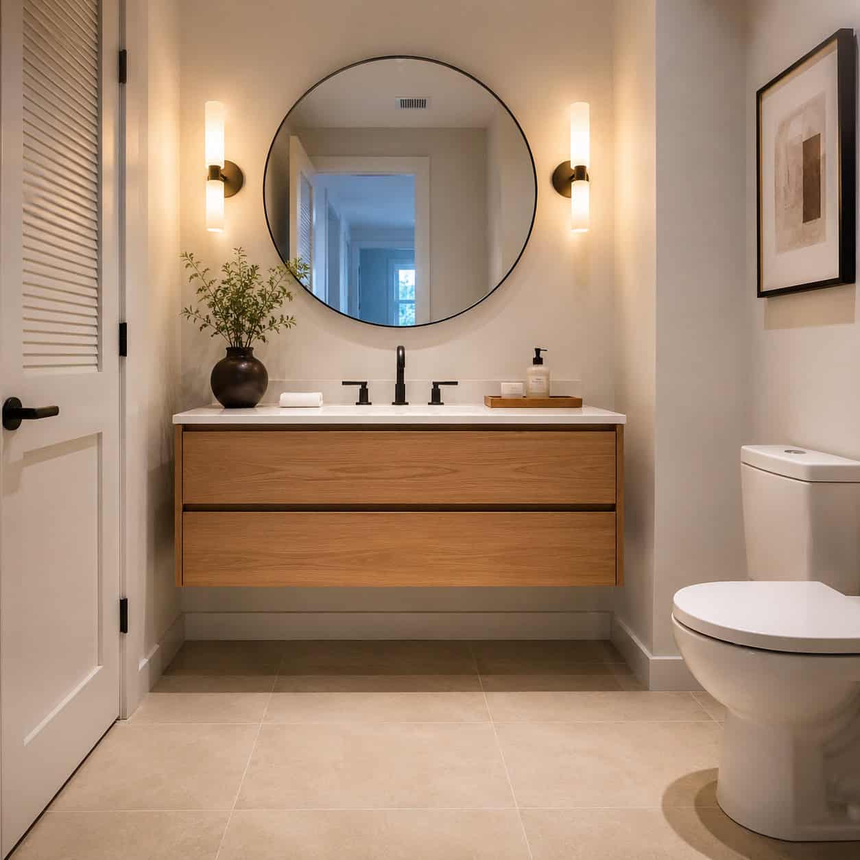
Legs help. Mounting to the wall helps more.
A wall-mounted vanity, a floating nightstand, a suspended cabinet — none of them touch the floor, so the floor stays fully visible underneath. The brain reads all that uninterrupted surface as more room.
Bathrooms win big here. A floating vanity makes a cramped bath feel a size larger the moment it goes up.
Nothing on the floor means nothing to trip the eye.
18. Put multifunctional, hidden-storage furniture to work
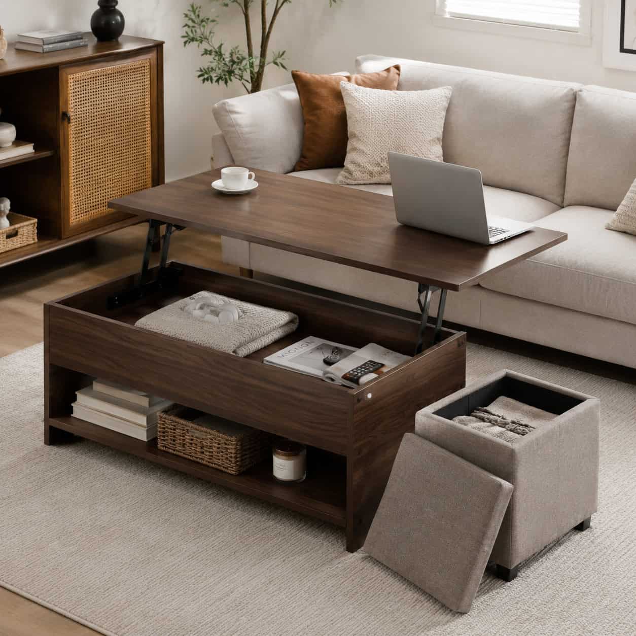
Clutter is what actually shrinks a room. Furniture that hides it earns its spot twice.
A storage ottoman swallows blankets. A lift-top coffee table hides the remotes and the mess. A bed frame with drawers replaces a whole dresser.
A Murphy bed folds an entire mattress into the wall and hands you back the floor during the day. Consolidate the clutter into one footprint and every surface stays clear — which is what keeps a small room feeling open.
Surfaces stay empty. The room stays big.
19. Anchor the room with one large rug
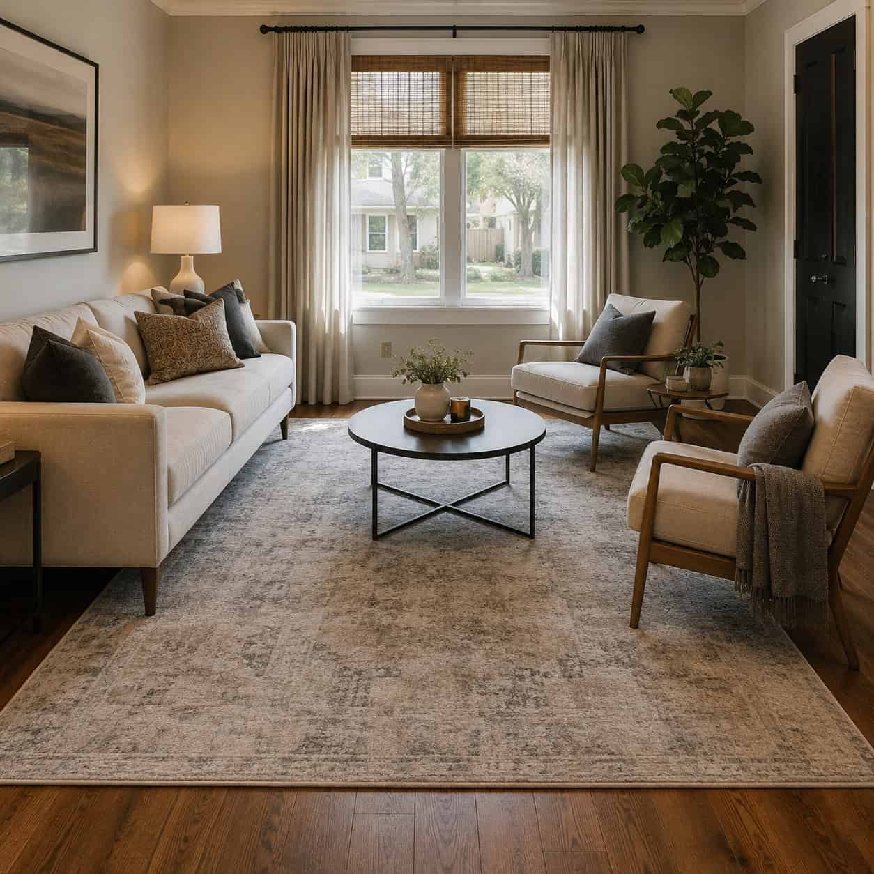
The most common rug mistake makes rooms look smaller, not bigger.
A too-small rug floats in the middle of the floor like a lonely island. It chops the floor into a rug-part and a bare-part, and every division shrinks the space.
Go bigger. Get the front legs of your furniture onto the rug and leave roughly 10 to 12 inches of bare floor as a border all around. The design writers at Jaipur Rugs spell out that proportion.
A big rug pulls the eye to the corners and unifies the whole floor. That’s the effect you want.
20. Pick a light or striped rug to stretch the floor
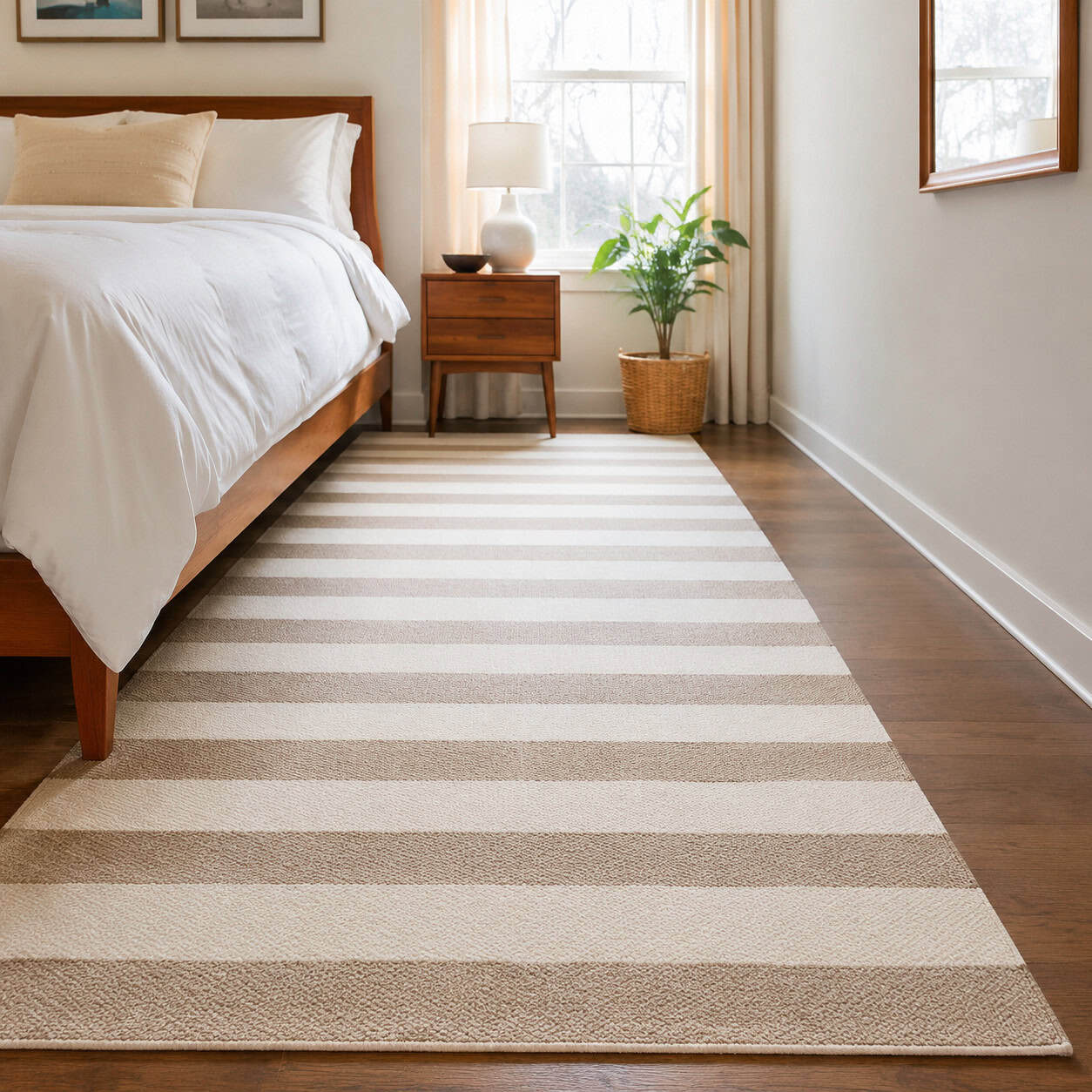
Color and pattern do work here too.
A pale rug reflects light and blurs the boundary between floor and wall, so the edges soften instead of announcing themselves. Instant openness.
Stripes are a directional tool. Run them across the short wall to widen a narrow room, or lengthwise to stretch it out. Even a subtle diagonal can loosen up a boxy space.
Dark, dense, small — that’s the combination to avoid. Light and directional is the combination to chase.
21. Run the same flooring throughout
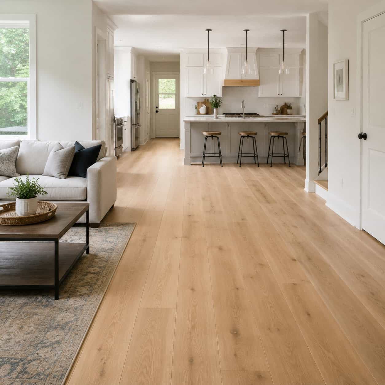
Every flooring transition is a visual stop sign.
Carpet to tile to laminate, room to room, tells the eye where each space ends. All those stops make a small home read as a series of little boxes.
Run one continuous floor throughout and the boxes merge into one flowing, larger-feeling space. Water-resistant vinyl plank or laminate lets you carry the same look right into the kitchen and bath without worrying about spills.
One floor. One space. Bigger read.
22. Go wide-plank or lay floors on the diagonal
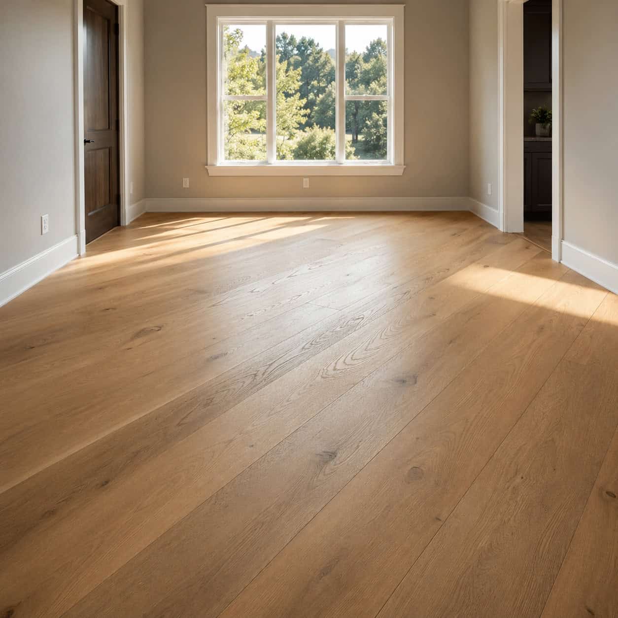
The floor has a longest sightline. Use it.
Wide planks — 7 inches and up — long boards, and big tiles all mean fewer seams, and fewer seams read as more space. Small tiles with grout lines everywhere do the opposite.
Lay the boards on a diagonal, or in a herringbone, and you exploit the longest line across the room. The eye travels the full distance instead of stopping at the near wall.
It’s a detail the woodworking crowd appreciates, and Floor Factors backs the geometry.
23. Declutter ruthlessly
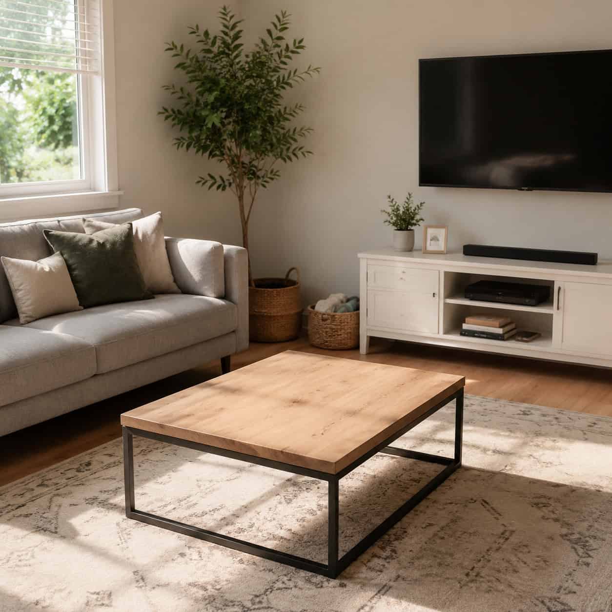
Nothing shrinks a room faster than too much stuff.
It’s the unglamorous first step every designer starts with, and it costs nothing. Clear the surfaces. Pull the excess off the counters, the coffee table, the windowsills.
Whatever has to stay, corral it into baskets and closed storage so it stops reading as chaos.
A room with breathing room feels bigger than a room the same size buried in clutter. Every time.
24. Add height with vertical stripes or tall wainscoting
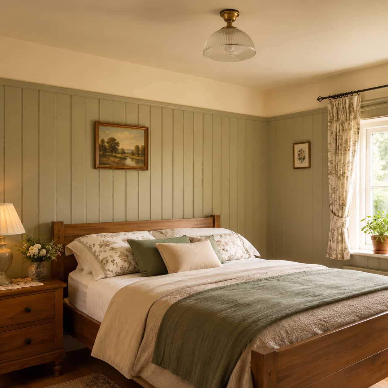
Low ceilings respond to vertical lines.
Vertical striped wallpaper draws the eye straight up and adds instant height to an attic room or a cottage bedroom. The stripes do the lifting.
Wainscoting does it too, if you cheat the proportion. Take the paneling or tongue-and-groove three-quarters of the way up the wall instead of halfway — that higher line lifts the whole ceiling.
Old-home owners already know the material. This is just where you stop it.
25. Use glossy, reflective finishes
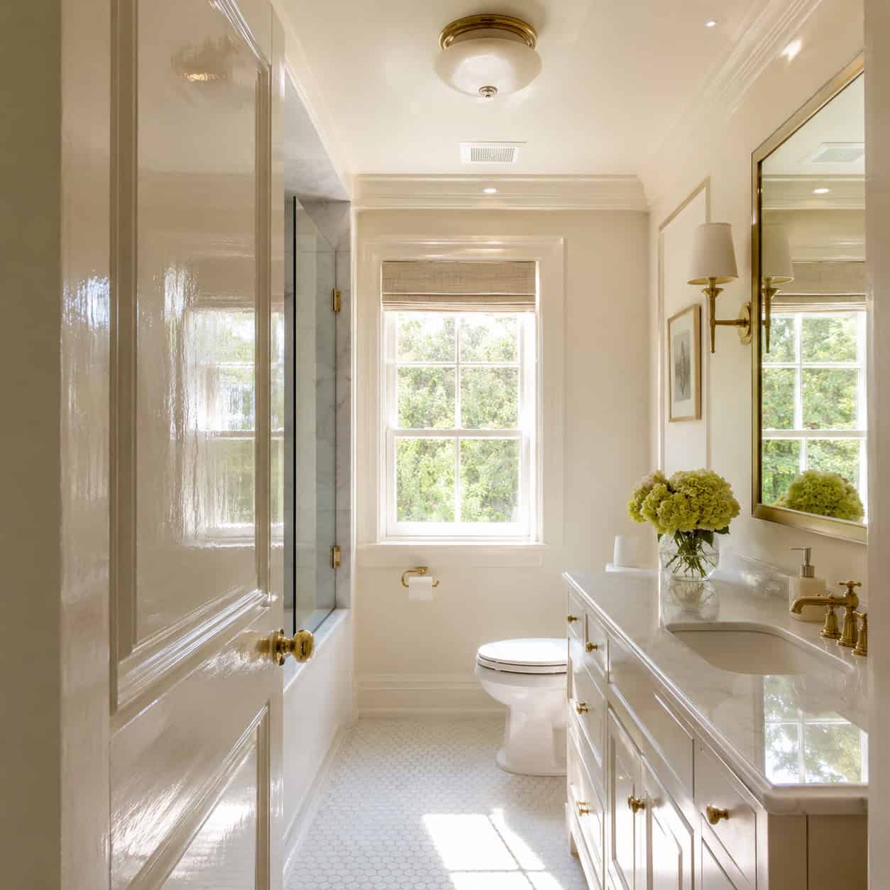
Flat paint absorbs light. Gloss throws it back.
Semi-gloss and high-gloss finishes bounce light around the room like a soft mirror, adding brightness and a sense of depth that a matte wall can’t touch.
Try it on the ceiling, the trim, or the cabinetry in a small bath. The reflection makes a tight space feel lighter and larger.
One caution — gloss shows every wall flaw. Prep the surface smooth first, then let it shine.
26. Leave breathing room and clear pathways
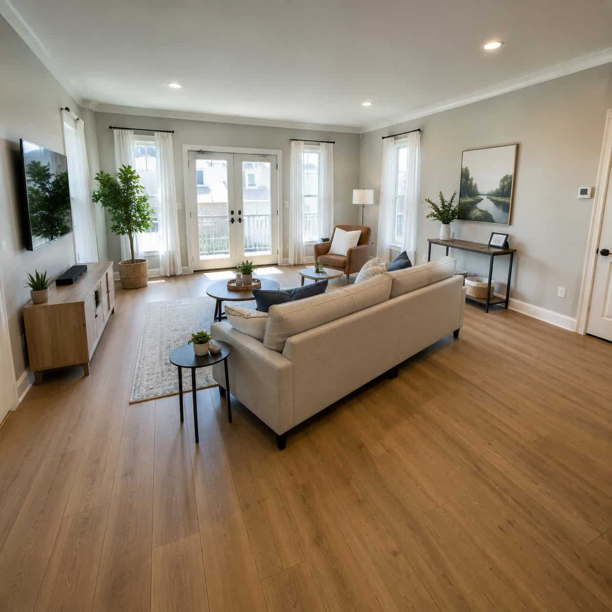
Layout costs nothing and fixes plenty.
Leave 18 to 24 inches of walking room behind sofas and chairs. That gap does something sneaky — the space around the furniture reads as depth, so the room feels roomier than a wall-to-wall packed layout ever could.
Keep the walkways clear, too. When you can move through a room without weaving around furniture, it stops feeling boxed in. It’s a spatial fix the WYPR designers keep coming back to.
Push everything to the walls and you’d think you’d gain space. You lose it.
27. Layer in tall greenery and reflect it in a mirror
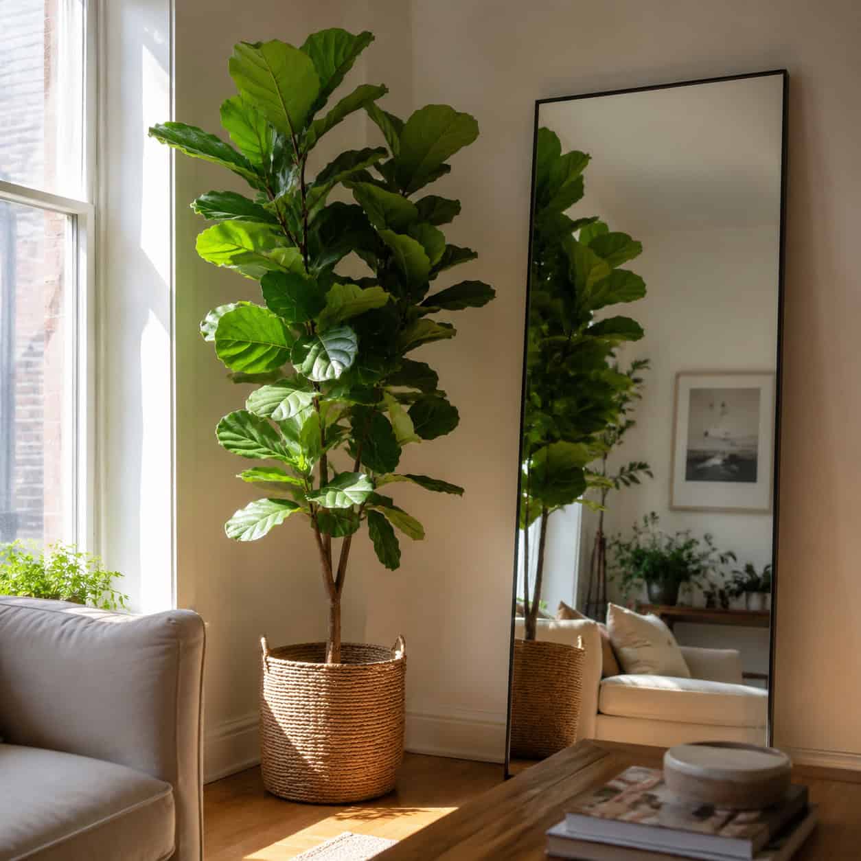
A tall plant is a vertical line you can water.
A fiddle-leaf fig or a big snake plant draws the eye upward and adds height, the same way tall shelving does — just softer and greener.
Set it near a mirror or a window and the effect compounds. The reflection reads as depth, the leaves read as life, and the corner that used to sit dead comes alive.
Greenery makes a room feel cared for. Cared-for rooms feel bigger.
28. Work a tonal, monochromatic layered scheme
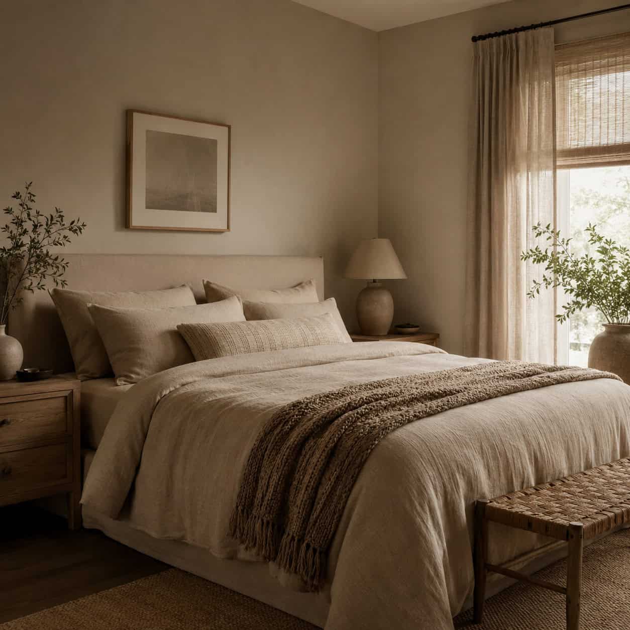
Color-drenching one flat shade is powerful. This is its softer cousin.
Pull several shades and textures of the same color through the room — a pale wall, a slightly deeper sofa, a woven throw a notch darker still. The contrast stays low, so nothing jumps out to break the space.
Low contrast keeps the walls reading as taller and the room reading as calm.
Here’s how the two approaches stack up when you’re deciding which way to go:
| Full Color-Drench | Tonal Layered | |
|---|---|---|
| Contrast level | None, one flat shade | Low, several shades |
| Best feel | Bold, enveloping | Calm, textured |
| Effort | Paint everything | Layer over time |
| Risk | Can feel heavy | Can feel flat |
Pick the drench when you want drama, the tonal layer when you want subtlety. Both make a small room read larger.
29. Keep a low-profile furniture silhouette
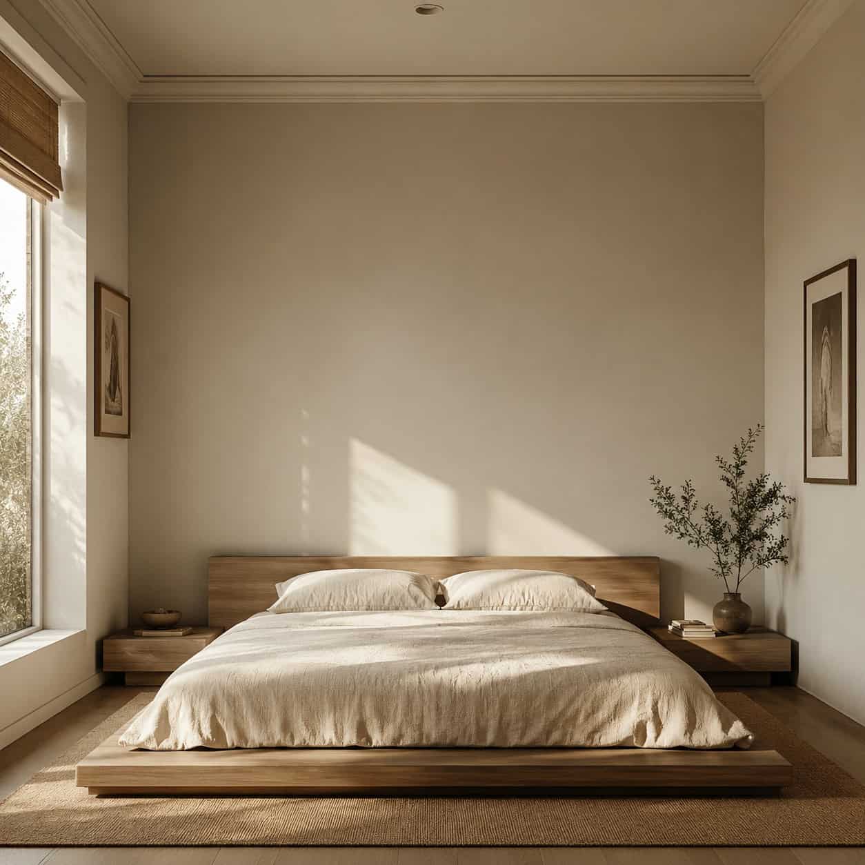
Height above the furniture is height the room gets to keep.
A low-slung sofa or a platform bed sits closer to the floor, which leaves more bare wall above it. That stretch of empty wall exaggerates the ceiling height and makes the room feel taller.
Tall-backed chairs and high headboards do the reverse. They eat the wall and press the ceiling down.
In a room with low ceilings, keep the furniture low. Let the walls do the reaching.
Conclusion
None of these tricks add a single square foot. They just stop the room from spending the space it already has.
Start with the free ones. Declutter, rehang the curtains higher, lean a mirror against the wall, pull the furniture off the wall a few inches. You’ll feel the difference before you spend a dime.
Then reach for the paint and the shelving when you’re ready. A small room isn’t a problem to solve — it’s a puzzle, and the eye is easy to fool.
The walls never actually move. They just learn to stay out of your way.