


Walk a designer into your living room and the assessment starts before they’ve taken a single step past the door.
They’re not looking at your sofa yet. Not the art, not the paint color. Something faster is already happening.
Trained eyes read a room the way a mechanic hears an engine — in seconds, from a hundred tiny signals most people stopped noticing years ago. The rod that’s hung two inches too low. The rug your furniture is floating on top of. The one cool-white bulb glaring next to three warm ones.
None of it is about money. Plenty of expensive homes read as flat and generic, while a modest one layered with care feels alive the moment you cross the threshold.
Here are 23 things designers clock the instant they enter a home — and what each one quietly says about the space.
1. The Smell Before You See Anything

The eyes are slow. The nose gets there first.
Scent runs on a direct neural line to the brain’s emotional center, which is why a room registers as pleasant or off before you’ve focused on a single object. Designers know this and lean into it.
Stale, closed-up air reads as neglect. An overpowering plug-in air freshener reads as something being covered up. Neither is what you want.
What signals a cared-for home is subtle and clean — fresh air, maybe coffee, maybe nothing at all. According to Homes & Gardens, scent is often the very first thing pros process when they walk in. Open a window before guests arrive.
2. Whether the Entryway Welcomes or Warns

The foyer is the handshake of the house.
In the first three feet, a designer reads whether the space was thought about or just accumulated. A bench, a hook, a place for keys — that’s intention. A pile of shoes and a drift of junk mail on the console — that’s an afterthought.
The entry sets the emotional tone for everything past it. Land somewhere chaotic and your brain braces for more of the same.
It doesn’t take much. One clear surface and a spot for the daily clutter changes the whole read.
3. Does the Room Actually Breathe

The most-cited thing designers notice isn’t a thing at all.
It’s whether a space pulls you in or holds you at the door. Some rooms feel like they’re exhaling — light moves, air moves, there’s room to stand. Others feel like they’re holding their breath.
That feeling comes from negative space. Empty floor, blank stretches of wall, a little air around the furniture — the parts most people rush to fill.
A room that breathes doesn’t need more stuff. It usually needs less.
4. The Sightlines and Traffic Flow

Watch where a designer’s eyes go when they enter. They’re tracing the path.
Can you walk a clean line from the door to the seating without turning sideways? Or is there a sofa you squeeze past and a coffee table that clips your shin every time?
Furniture arranged around the walkway — instead of dumped across it — reads as resolved. Blocked paths read as guesswork.
Awkward furniture arrangement sits near the top of every pro’s list of instant cringes. The fix costs nothing. Just move the sofa.
5. Mismatched Lightbulb Temperatures

This one separates the trained eye from everyone else.
One lamp glowing warm and yellow, one throwing cold blue-white daylight, all in the same room. Most homeowners never register it. A designer sees it the second the lights are on.
The measurement is Kelvin. Warm bulbs sit around 2700K to 3000K; cool “daylight” bulbs climb to 5000K and beyond. Mixing them makes a room look accidental and unfinished.
Pick one temperature and commit. For living rooms and bedrooms, warm — 2700K to 3000K — is the standard, and it should stay consistent from lamp to lamp to ceiling.
6. A Ceiling Full of Recessed ‘Swiss Cheese’

Overhead cans do one job: flat, even, top-down light. On their own, they flatten a room like a fluorescent office.
Designers immediately miss the other layers — the low glow of a table lamp, a sconce on the wall, a picture light over the art. Good lighting works in tiers: ambient, task, and accent, each doing something the others can’t. Lighting brands like Lutron build entire systems around exactly that layering.
A room lit only from the ceiling has one dimension. Add a couple of lamps at eye level and it suddenly has depth.
Skip the “more cans” instinct. Reach for a lamp instead.
7. Curtains Hung Too Low and Too Narrow

The single most common curtain mistake, and the one with the most dramatic effect.
Rods bolted right to the top of the window frame chop the wall in half and make the window look smaller than it is. Rods jammed tight to the frame’s edges do the same thing horizontally.
The rule pros use: hang the rod high, close to the ceiling, and extend it 8 to 12 inches past the frame on each side. Suddenly the window looks taller and wider, and the ceiling looks higher.
Same curtains. Same window. Two screw holes in a better spot.
8. Skimpy, Flat Curtain Panels

Hang the rod perfectly and you can still get it wrong.
Thin panels stretched flat across a wide window look like bedsheets tacked up in a hurry. There’s no gather, no fold, no weight.
The fabric should measure roughly twice the width of the window so it bunches into rich vertical folds even when the curtains are open. That fullness is what reads as finished.
One generous panel beats two skimpy ones. Buy more fabric than feels necessary.
9. The Undersized ‘Floating Island’ Rug

Designers call the too-small rug the number-one avoidable mistake in a living room, and they call it constantly.
A little rug marooned in the center of the floor makes the furniture look like it’s drifting on a raft. Nothing feels connected. The room reads as a collection of pieces instead of one space.
The rule: at least the front legs of every seating piece should sit on the rug. For most living rooms that means an 8×10 or a 9×12 — bigger than people expect, almost every time.
If your only option is going small, pros say skip the rug entirely. A bare floor beats a postage stamp.
10. Art Hung Too High (‘Floating Art Syndrome’)

It even has a nickname among designers, because they see it that often.
Homeowners hang art for the drywall — wherever the nail lands feels right. Galleries hang for the people, centering each piece at 57 inches, which is average human eye level.
Above a sofa or console, the rule shifts: the bottom of the frame should land 6 to 8 inches above the furniture, so the art relates to the piece instead of floating off toward the ceiling.
Grab a tape measure. Fifty-seven inches to the center. That’s the whole trick.
11. The Matching Furniture Set

Sofa, loveseat, matching end tables, matching coffee table — all bought together, all the same wood tone.
It reads instantly as “the showroom display, delivered.” Not a home. A catalog page reassembled in your living room.
When every piece repeats the same leg, the same finish, the same visual weight, there’s nowhere for the eye to rest and nothing to discover. Depth dies.
Even expensive matched sets look generic. Mix an older wood piece with a newer upholstered one and the room starts to feel like a person lives there.
12. Furniture That’s the Wrong Scale

A designer feels scale before they can explain it.
A sectional swallowing a small den. A tiny credenza stranded on a long blank wall. A coffee table half the length of the sofa it serves. Each one makes a room feel unresolved even when every individual piece is nice.
Proportion is the quiet backbone of a room that “just works.” Get it wrong and no amount of styling saves it.
And the classic pro horror story never dies — the beautiful sofa that won’t fit through the door. Measure the doorway before you fall in love.
13. Surfaces Buried in Visual Noise

Designers don’t see clutter as mess. They see visual noise — a dozen objects all shouting for attention at once.
Every surface covered, every shelf full, nothing given room to be seen. Even a beautifully decorated home starts to feel chaotic when nothing can breathe.
The nuance most people miss: a personality-packed room can still feel calm if the objects are grouped and arranged with intention. It’s not about owning less. It’s about editing.
Clear one surface completely. The room exhales.
14. Whether the Home Has Any Soul

Pros actively hunt for it — the pot from a trip, the chair from a grandparent, the stack of actual read books.
These are the things a catalog can’t sell you. A room assembled entirely from one store’s floor set always reads flatter than one layered slowly over years.
Soul is the evidence that a real life happens here. It’s the difference between a set and a home.
You can’t buy it in a weekend. You collect it. Start with the one object you’d grab in a fire and build outward — filling a home with living plants and personal finds reads warmer than anything bought all at once.
15. The Forgotten Fifth Wall (the Ceiling)

Designers look up the moment they walk in. Most homeowners never do.
A flat white ceiling is a missed chance. Popcorn texture dates a room to a decade ago in one glance. A builder-grade fan with brass blades tells its own story.
The ceiling is the fifth wall, and it’s the one amateurs stop decorating. A coat of soft color, a better fixture, or even a simple flush mount instantly reads as intentional.
Nobody expects the ceiling to be considered. That’s exactly why it lands when it is.
16. Mixed Metals That Don’t Speak the Same Language

Cabinet pulls, faucet, light fixtures, table legs — a designer clocks whether they relate to each other.
Mixing metals is fine. Encouraged, even. But it has to look chosen, not accidental — two finishes repeated deliberately, tied together by a common thread.
What reads as a mistake is one random chrome, one lonely brass, one brushed nickel, all fighting. That’s not a mix. That’s whatever was on sale.
Pick a lead metal and a supporting one. Repeat each at least twice. That’s the whole grammar.
17. Sloppy Trim, Baseboards, and Paint Lines

This is the close-range read, and it’s brutal.
Wavy cut-in lines where the wall meets the ceiling. Scuffed, scratched baseboards. Caulk gaps around the trim. A designer catches all of it, even when the furniture is gorgeous.
Finish quality is the thing homeowners stop seeing after a few months. The eye adjusts. A pro’s never does.
Sharp lines and clean baseboards make cheap furniture look better. Sloppy ones make expensive furniture look worse. Watch for:
- Paint bleeding onto the ceiling or trim
- Scuffed or chipped baseboards along walkways
- Open caulk gaps at corners and seams
- Nail holes that were never filled
18. The TV as the Default Focal Point

Every chair aimed at a black rectangle.
Designers notice immediately when the entire seating plan orbits the television instead of a fireplace, a window with a view, or simply each other. The room announces what it values, and too often it’s the screen.
A focal point can be a mantel, a piece of art, a big window. The TV can still be in the room — it just doesn’t have to run the room.
Angle two chairs toward each other. Watch the space change what it’s about.
19. Living Plants vs. Dusty Fakes

Greenery is one of the first things a designer registers, right alongside light and furniture.
A healthy plant signals a home that’s tended — someone waters it, turns it, keeps it alive. That care reads across the whole room.
A dusty silk fern does the opposite. So does one sad, browning plant gasping in a corner. Fake greenery caked in dust is worse than no plant at all.
One thriving pothos beats a shelf of plastic every time. If you can’t keep it alive, don’t fake it — and if you want easy wins, start with the hardest-to-kill indoor plants.
20. Texture and Layering — or the Absence of It
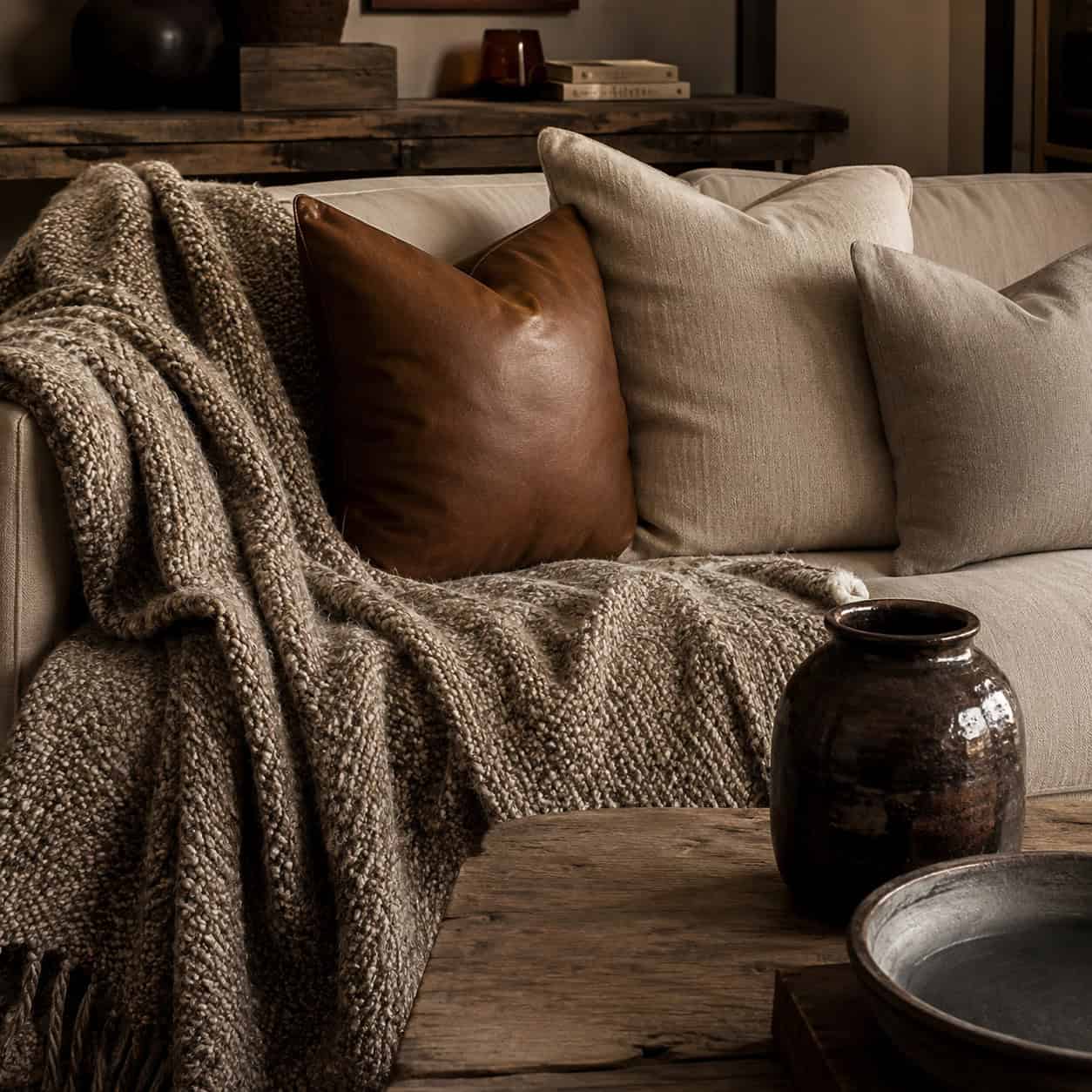
Some rooms are a single note held too long.
Same color rug, sofa, walls, and pillows — all in one flat tone, all one texture. It looks tidy in a photo and lifeless in person.
Designers read the absence of layering instantly. A room comes alive when materials play against each other: nubby wool by smooth leather, matte linen by a glossy ceramic, rough wood by soft velvet.
Texture is what gives a room rhythm. Same color is fine. Same texture is where it goes flat.
21. Visible Cords and Cable Clutter

A nest of charger cables spilling off the console. TV cords dangling down the wall like vines.
It undercuts an otherwise polished room in half a second. All that intentional styling, undone by a tangle of black wires.
Designers notice because cords are the one thing homeowners genuinely stop seeing. Your eye edits them out. A guest’s doesn’t.
Run them behind the wall, tuck them in a channel, zip-tie the mess out of sight. Ten minutes, meaningful payoff.
22. Big, Bare, Undecorated Walls

A vast empty wall tells a designer the room was moved into but never finished.
It’s the “we’ll get to it” wall. Months pass, then years, and the blank plaster becomes invisible to the people who live with it — and glaring to anyone new.
Bare doesn’t mean minimal. Minimal is a deliberate choice with breathing room. Bare is an unfinished thought.
One large piece beats a scatter of tiny ones. Go bigger than feels safe.
23. The Condition of the Sofa

In a living room, the eye lands on the sofa first — guests and designers alike.
It’s the most-used piece in the house, and it shows. Sagging cushions, flattened pillows, arms worn shiny, a slipcover that never sits right — it all tells a story before anyone sits down.
A tired couch drags down everything around it, no matter how nice the rest of the room is. It’s the anchor, and a sinking anchor pulls the whole space with it.
Fluff the cushions. Replace the flat ones. And when a sofa’s truly done, know that it’s done.
Conclusion
None of this is about spending more. Most of it is free — a rod moved higher, a plant that gets watered, a wall of cords finally hidden.
What designers actually read in those first seconds is care. Whether the space was thought about or just filled. Whether someone lives here on purpose.
You already own everything you need to fix most of this. The trick is seeing your own rooms the way a stranger does — for the first three seconds, before your eyes edit out the parts you stopped noticing.
Walk in your own front door tomorrow like you’ve never been there. You’ll spot half this list before you take off your shoes.